MUSIC FOR MUSIC LOVERS
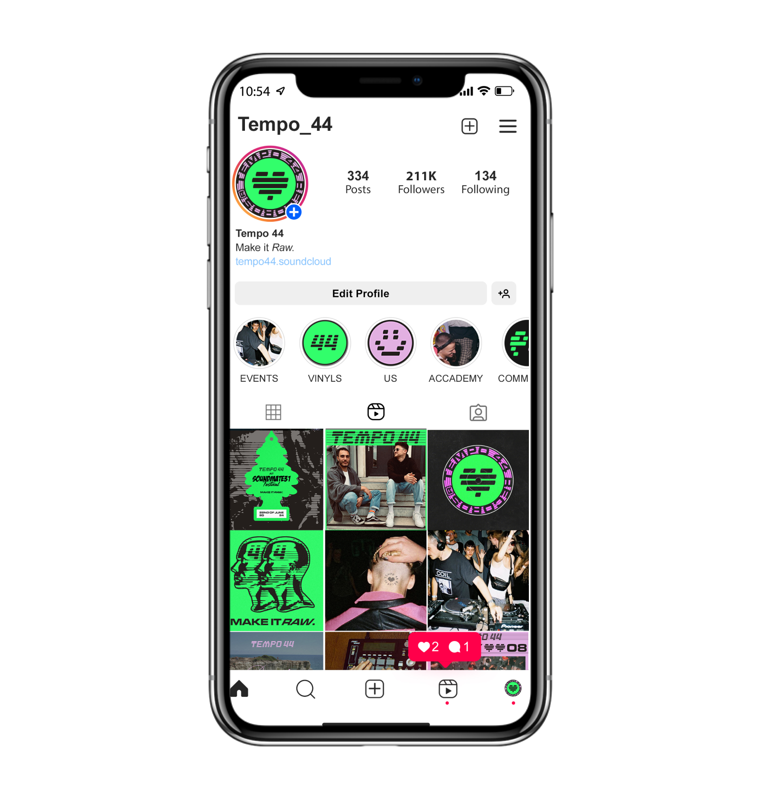
Tempo 44 is a community of electronic music enthusiasts curated by @vandi___ and @just.marco whose goal is to spread their passion for quality beats. Through music production and gigs, they aim to revive the principles of the rave and electronic music concept.
a strong brand concept
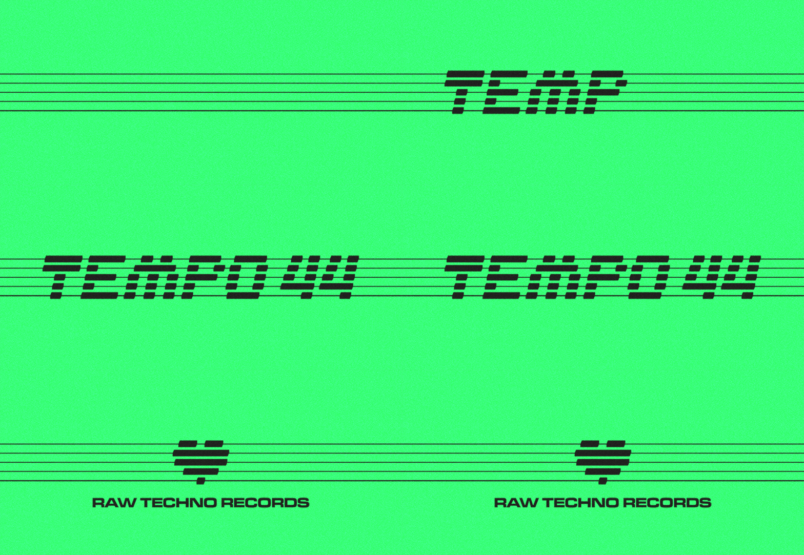
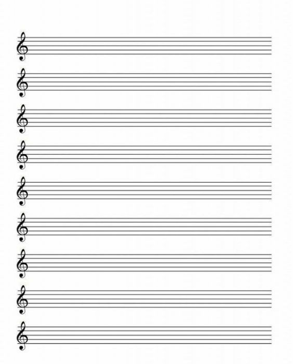
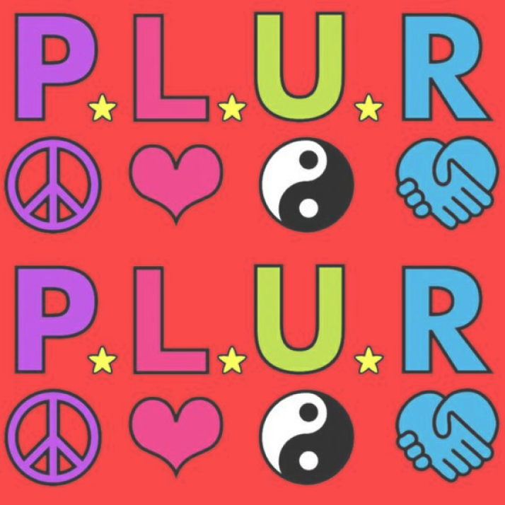
Tempo 44 identity is based on PLUR concept and the original “tempo” word meaning. The client didn't really know what they needed, but they were clear that they wanted something related to time. What they weren't aware of is that tempo is the unit that measures the succession of sounds in a given time. This inspired me to draw the logo using a musical staff as a grid.
As for the overall aesthetic, I had to explore techno culture and draw inspiration from the futuristic and revolutionary graphics of the PLUR movement.
BRAND CONSTRUCTION
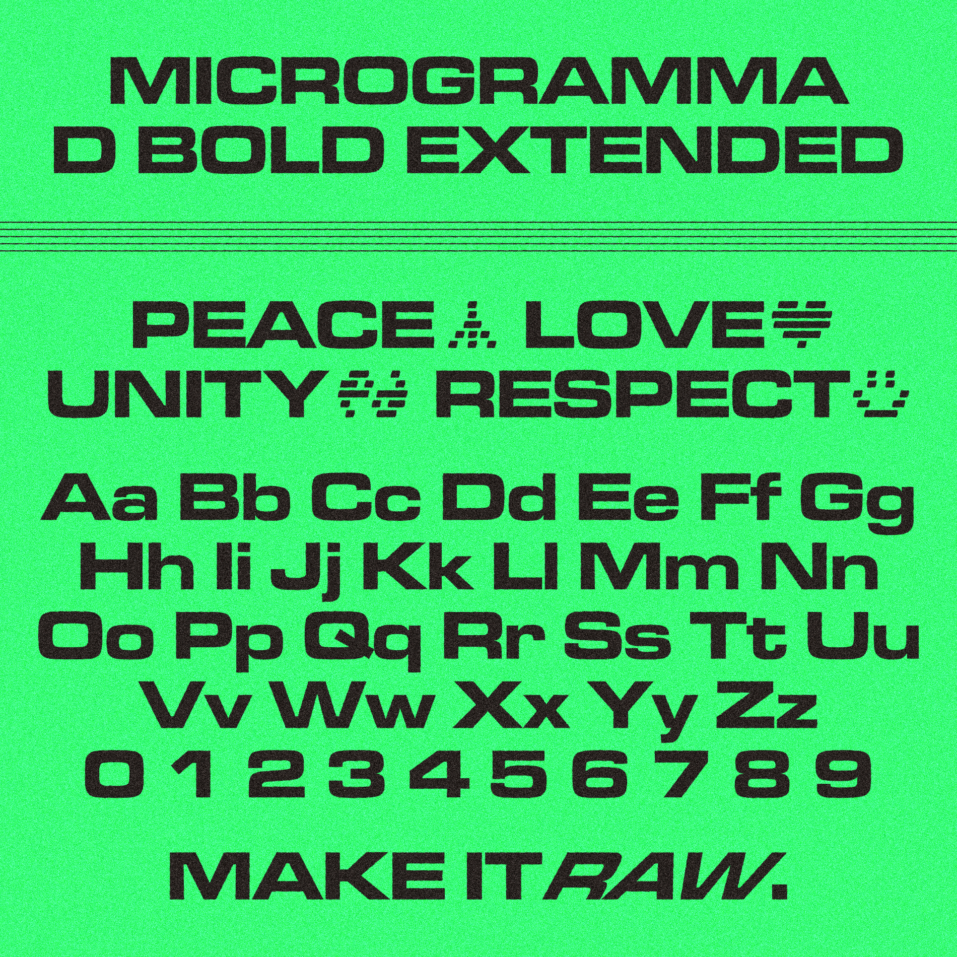
I designed a graphic system based on 5 lines drawn by a musical staff. As I started constructing shapes, I realized that the generated elements gave a retro look that worked very well with the brand values. To add dynamism, I decided to tilt the glyphs and give a wave shape to the endings.
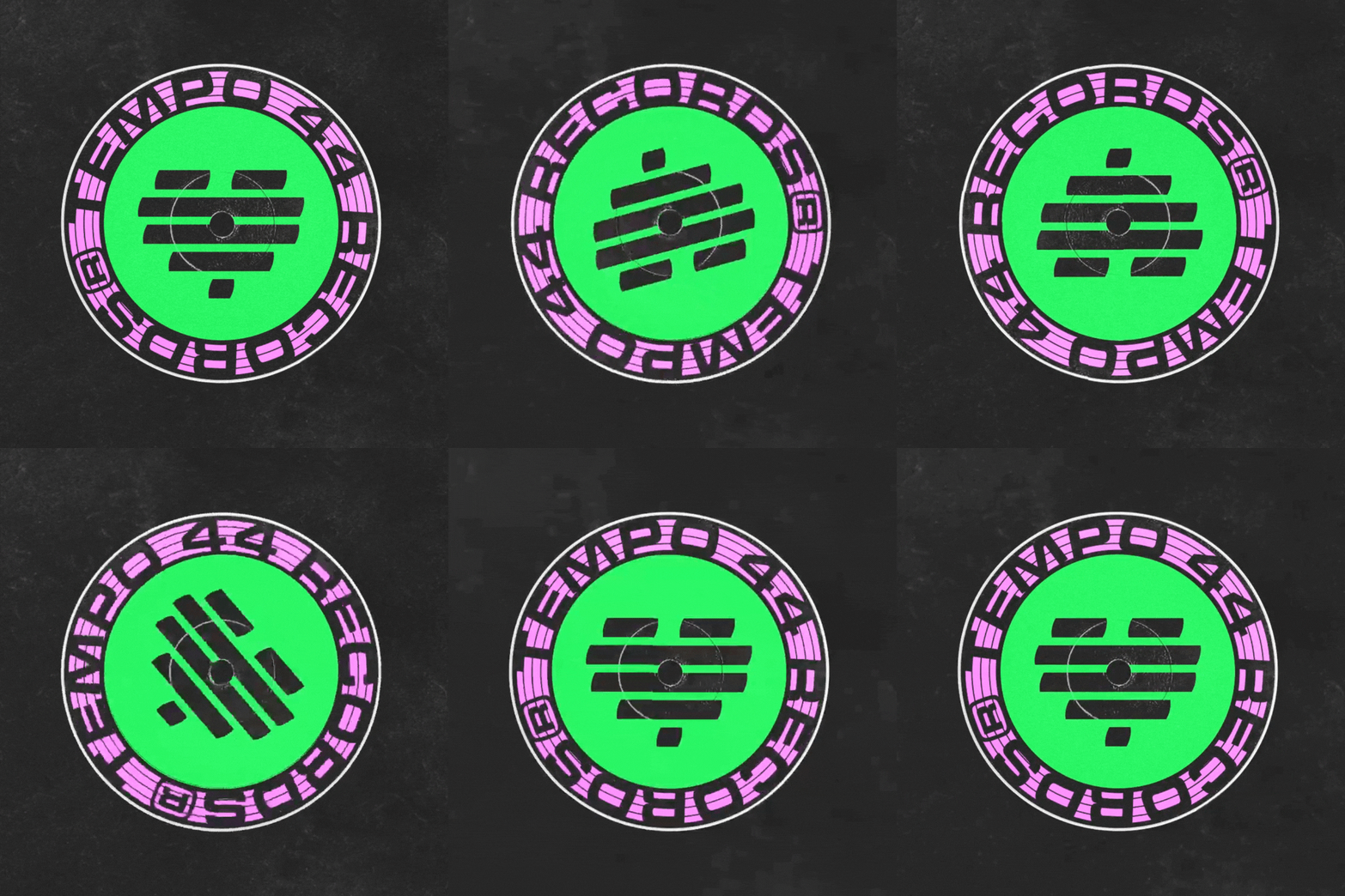
Regarding the color, the client wanted to convey the concept of "ACID" due to the style of techno they produce, so I used the color that best connects with acid, fluorescent green. I also added pink as a secondary color to bring more diversity to the brand and tone down its masculinity.

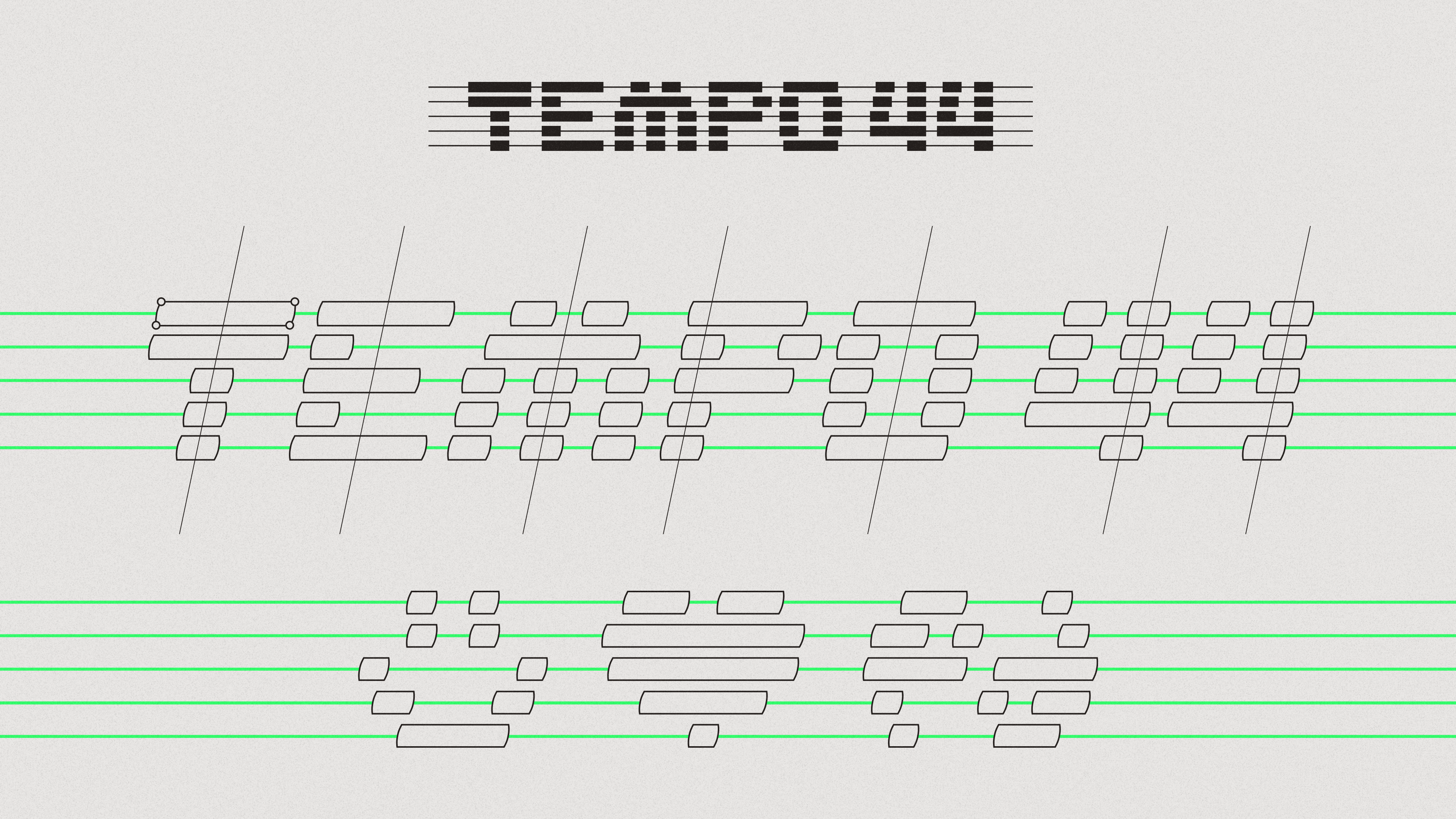



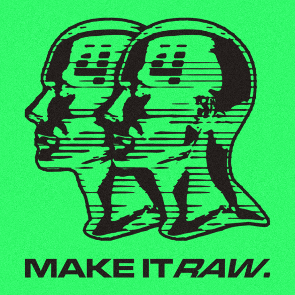
IMAGE TEXTURE

THE NEW RAW ELECTRONIC RECORDS
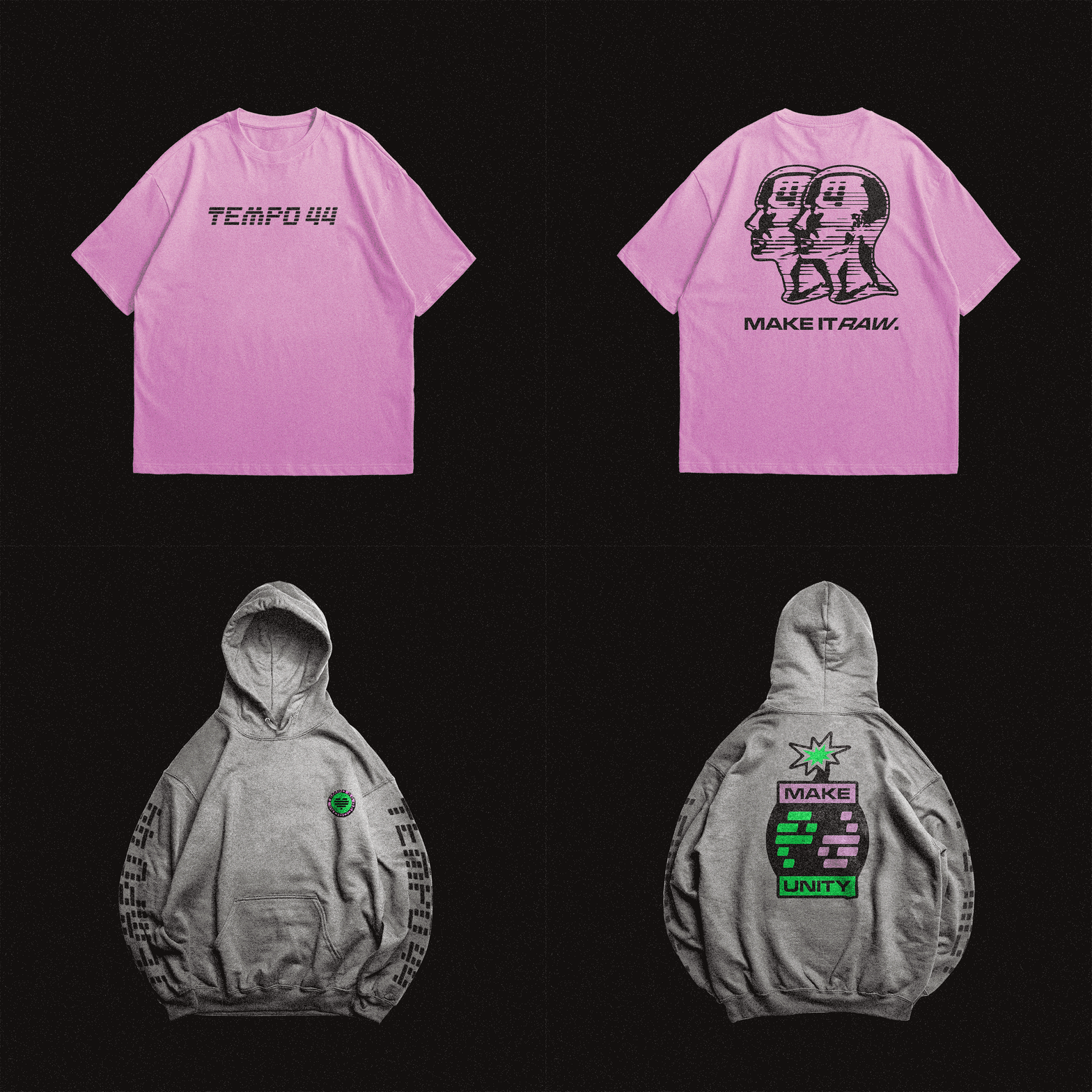
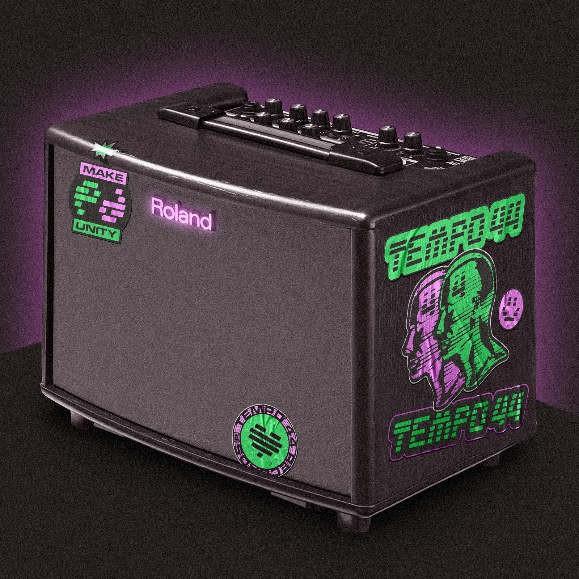
The final result is a modern brand with a 90s vibe, dynamic and memorable. The set of resources leads to impactful graphic compositions that are easily linked to the main theme, which is why the client was very satisfied.
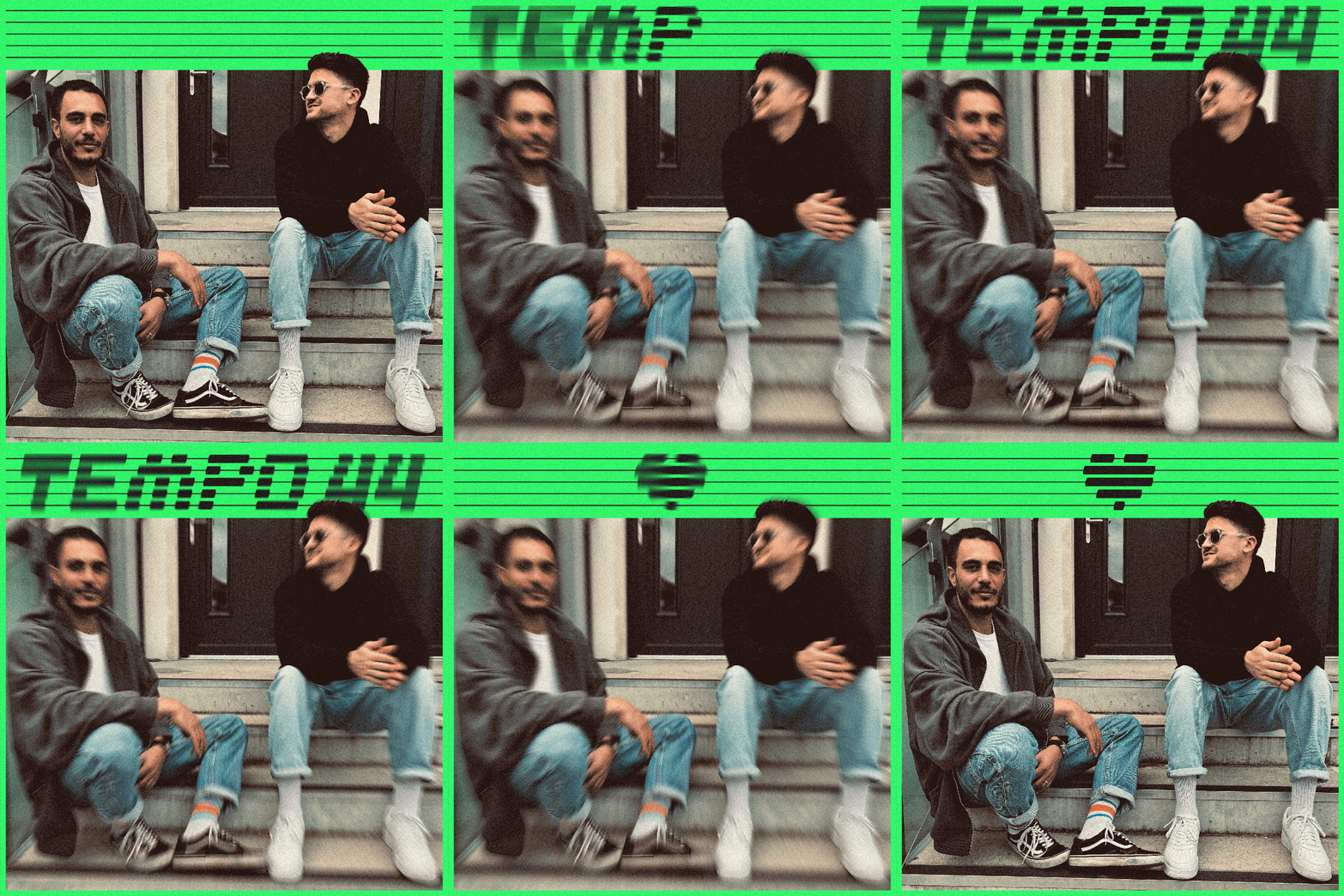
YOU CAN CHECK THE FINAL RESULT AT @TEMPO_44 ON IG
