
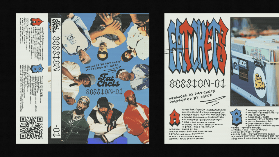
FAT CHETS - SESSIONS 01
TAPE DESIGN
I was commissioned to design a cassette for a hip-hop DJ set, and I created a proposal inspired by collage and graffiti art. The design has a grunge yet polished aesthetic, and the client was very satisfied with the final result.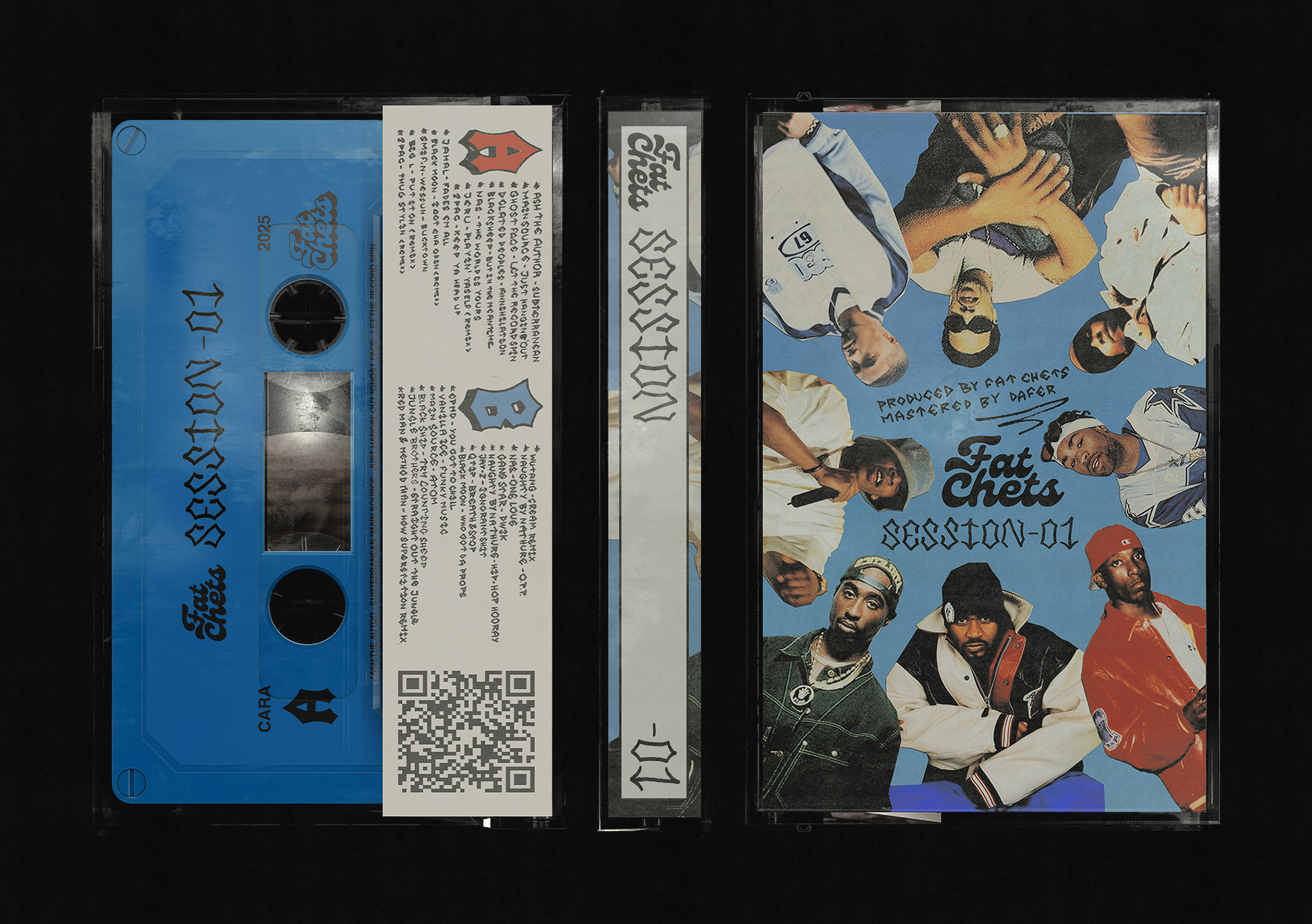
I handcrafted all graphic elements, including the collage. For the lettering, I drew inspiration from one of the most iconic signatures of 90s American rappers and developed a custom 'typeface family' based on its distinctive strokes and finishes. Additionally, I used a two-color scheme to distinguish between side A and side B of the cassette. I chose primary blue and red – tones heavily featured in urban signage – reinforcing the connection with hip-hop's street aesthetic.

THE ESSENCE OF HIP HOP ON A TAPE
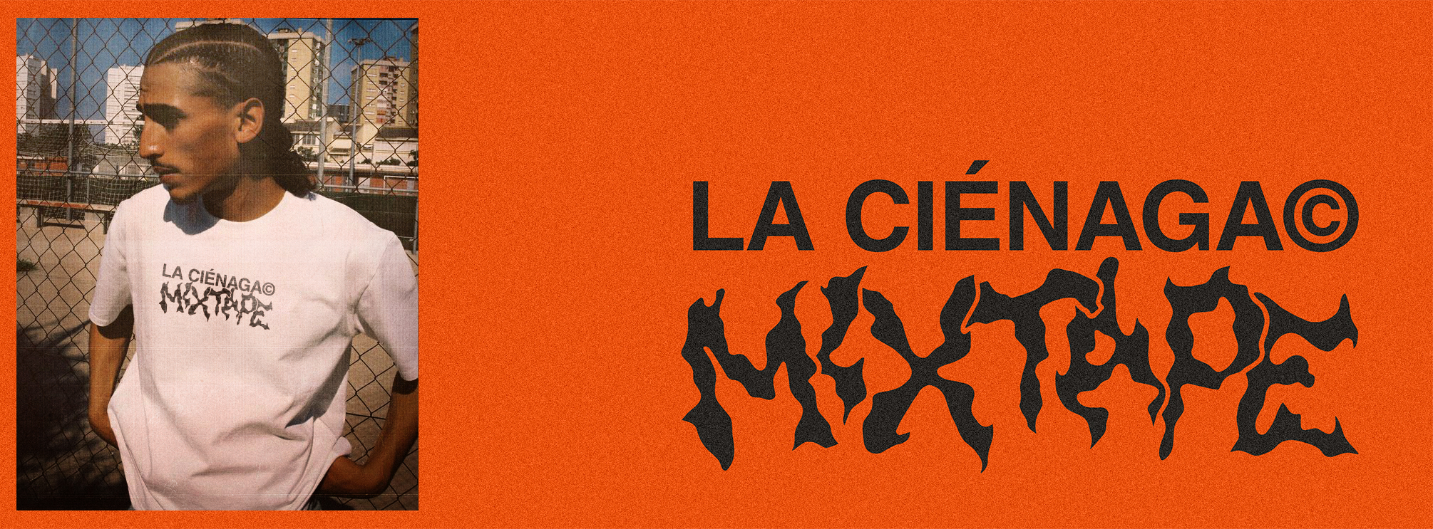
This design is perhaps one of the most personal facets of DONE. We are known for adapting to any type of project, concept, and therefore, graphic result. However, we love everything related to urban and '90s culture. In this case, a combination of fun illustration and typographic composition applied to a memorable object like a cassette.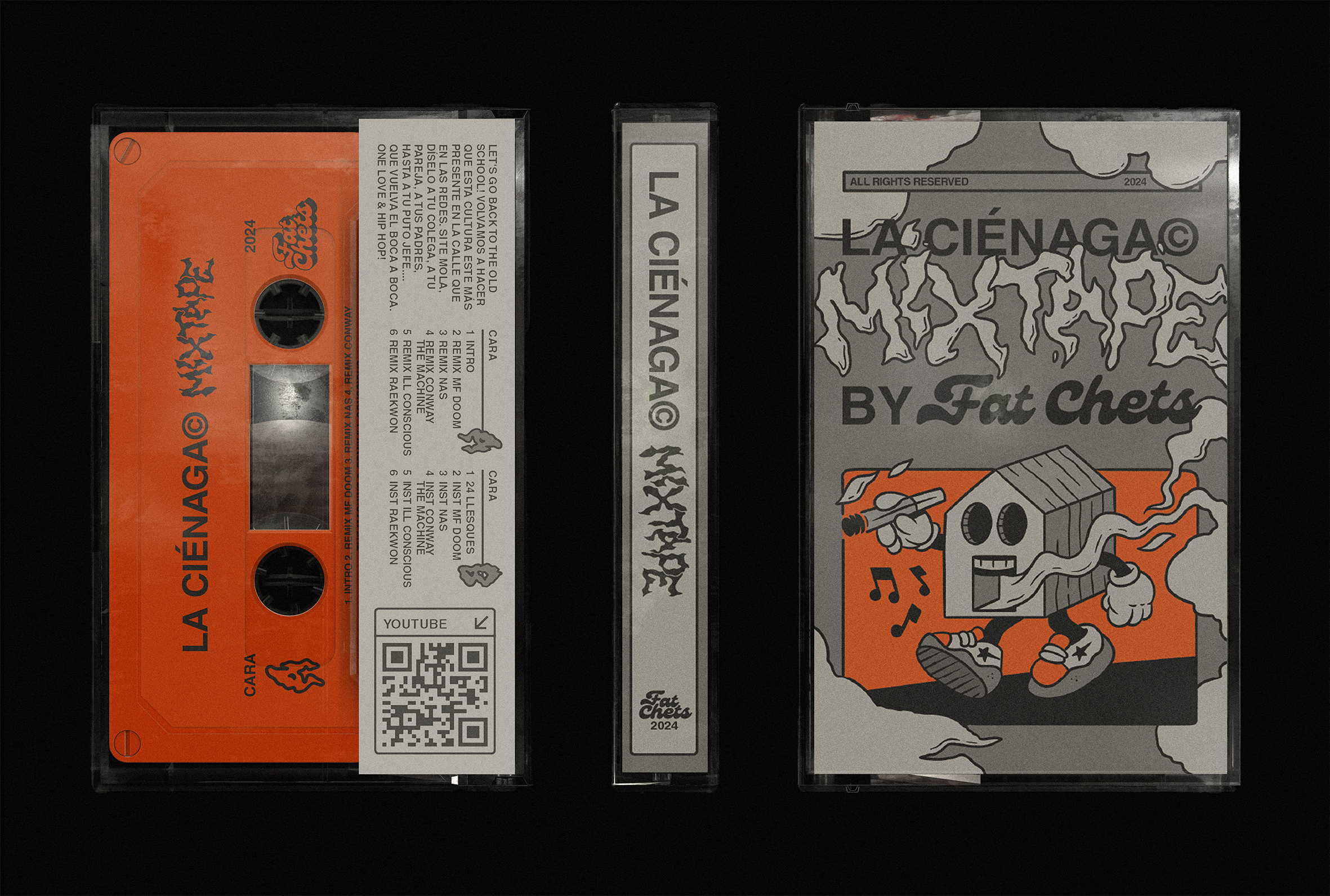
We chose the color orange because the client's recording studio had a very representative orange graffiti, as indicated by its name "Fat Chets," which originates from the name of the famous snack. To provide more contrast and a more urban, less digital feel, we used a range of grays that complement the main color well. We also took the opportunity to design the author's signature "Fat Chets" as well as the name of the cassette, which was supposed to be the first in a collection.
Additionally, we illustrated a cartoon character on the front, representing "the swamp" where the music of the Barcelona-based record label originates.
Additionally, we illustrated a cartoon character on the front, representing "the swamp" where the music of the Barcelona-based record label originates.

Regarding the typographic composition, we have mixed the timelessness and neutrality of Helvetica Neue Bold. It helped us a lot to control the contents of the object and maintain a certain order in the composition.
For the song titles, we have brought back the Original Typography with which we had designed the signature. These letters are more friendly and make a very good reference to the Funk & Groove movement that inspires the DJ's rhythms.
For the song titles, we have brought back the Original Typography with which we had designed the signature. These letters are more friendly and make a very good reference to the Funk & Groove movement that inspires the DJ's rhythms.