A BRAND AS A FORM OF EXPRESSION
NO NUTS® is a clothing brand creation project. The client wanted a brand with a strong message, inspired by the revolutionary Hip Hop movement of the 90s. My mission was to generate both the brand voice and its identity.
THE BRAND MUST BE ALIVE
My main approach was to think of a dynamic brand that could adapt to the different messages each clothing collection needed to convey. Therefore, I designed a simple logo that could transform into anything without losing its identity.

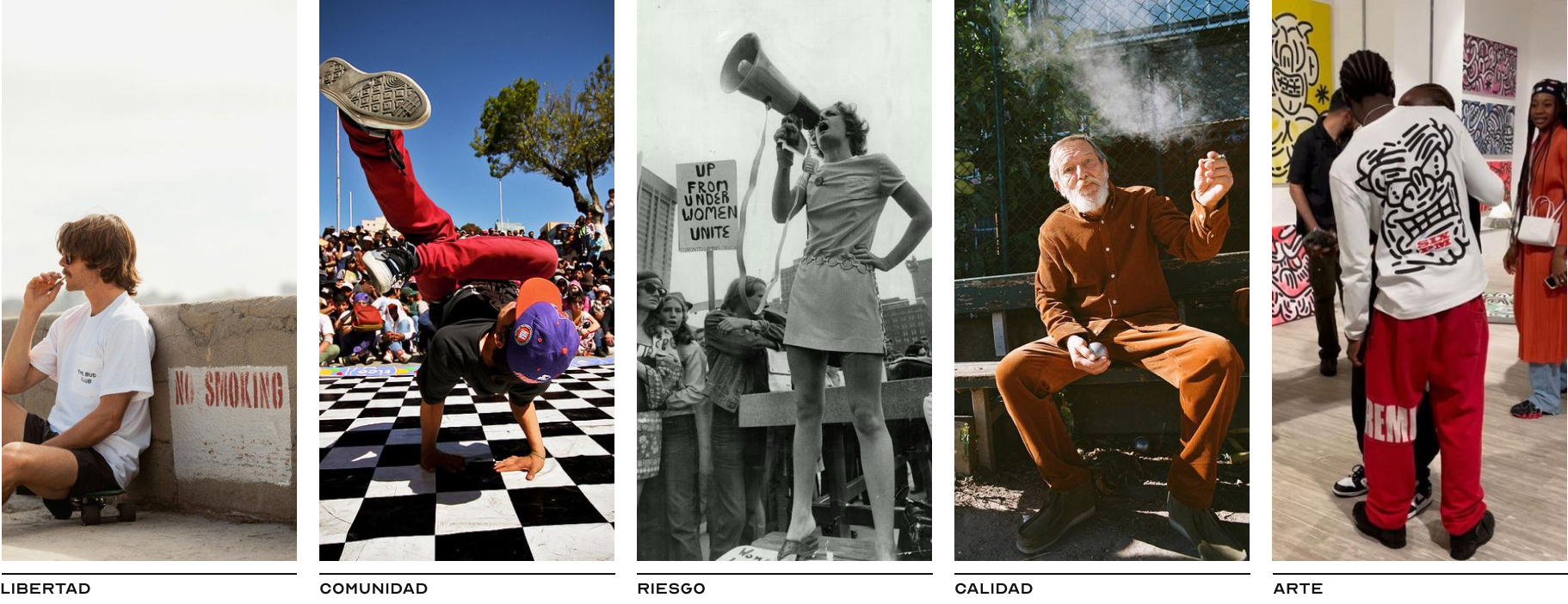
The meaning of the name proposed by the client means "having no guts." He wanted a squirrel as the main brand image, but in my imagination, this idea didn't align with the brand values he wanted to convey. Therefore, before designing, we developed the brand voice to clarify the project's concept. The most notable aspect is its values, which definitely break away from the idea of having such a comical animal as the main image.
LET'S MAKE IT RAW
The brand values suggest that it should be a brand with a lot of attitude and rebellion, so I decided to graphically represent what it really was: "No guts" NO NUTS®
That's when I took two empty eggs (since there are no guts) as a starting point, and by placing them at different heights, they formed an N, corresponding to the initials of the words NO NUTS. To give it more character and dynamism, I tilted the ellipses and finally created variations of the logo to see the different possibilities it had to adapt to different themes or styles depending on the message we wanted to convey.

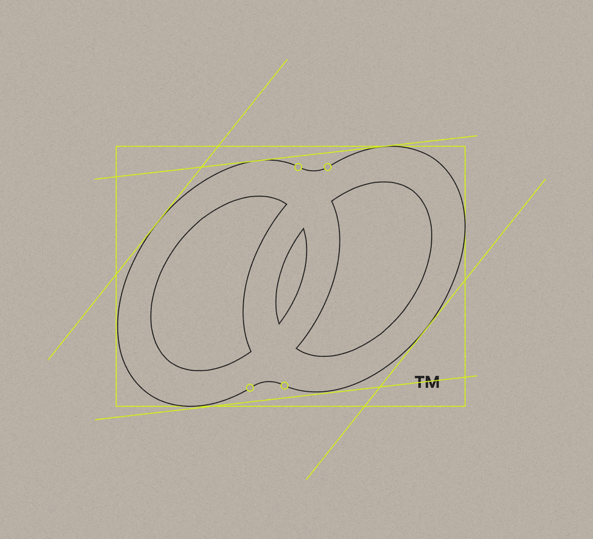
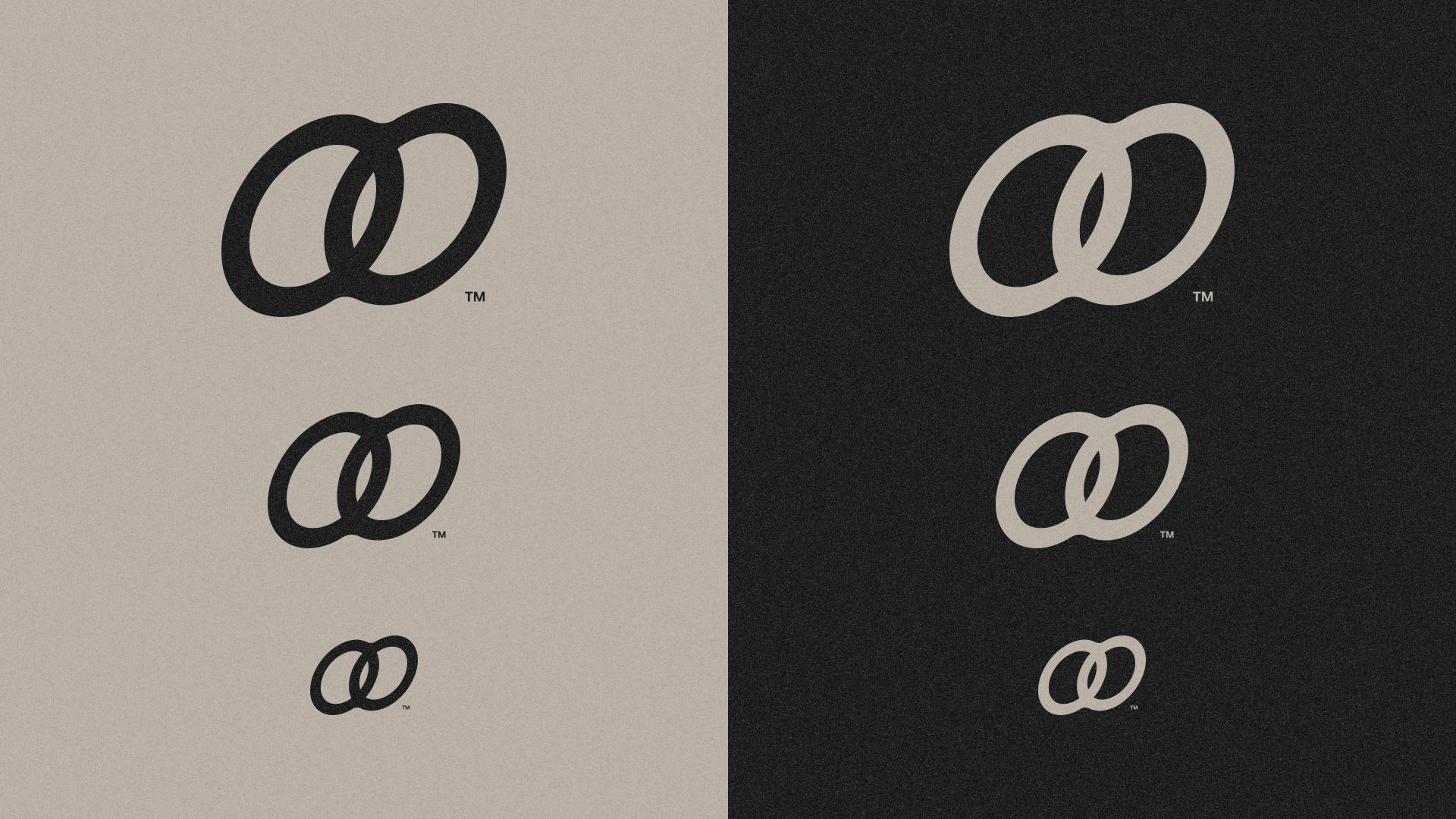
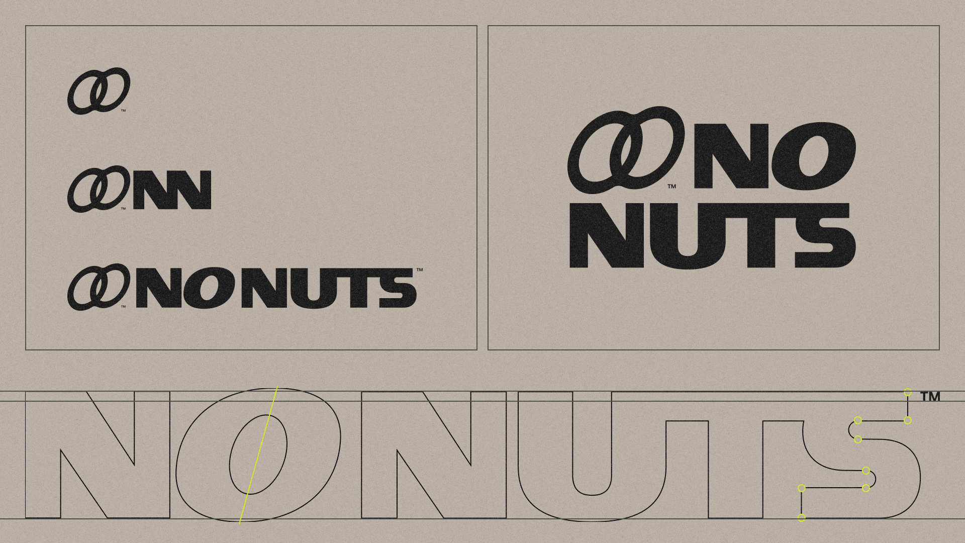
Continuing with the construction of the logo, I developed a logotype that needed to be strong, timeless, and slightly sporty. I designed the letters of No Nuts from scratch, integrating the gesture of the logo into the O, giving it a slight tilt. We can also see the different compositions that can be generated with these two brand elements.
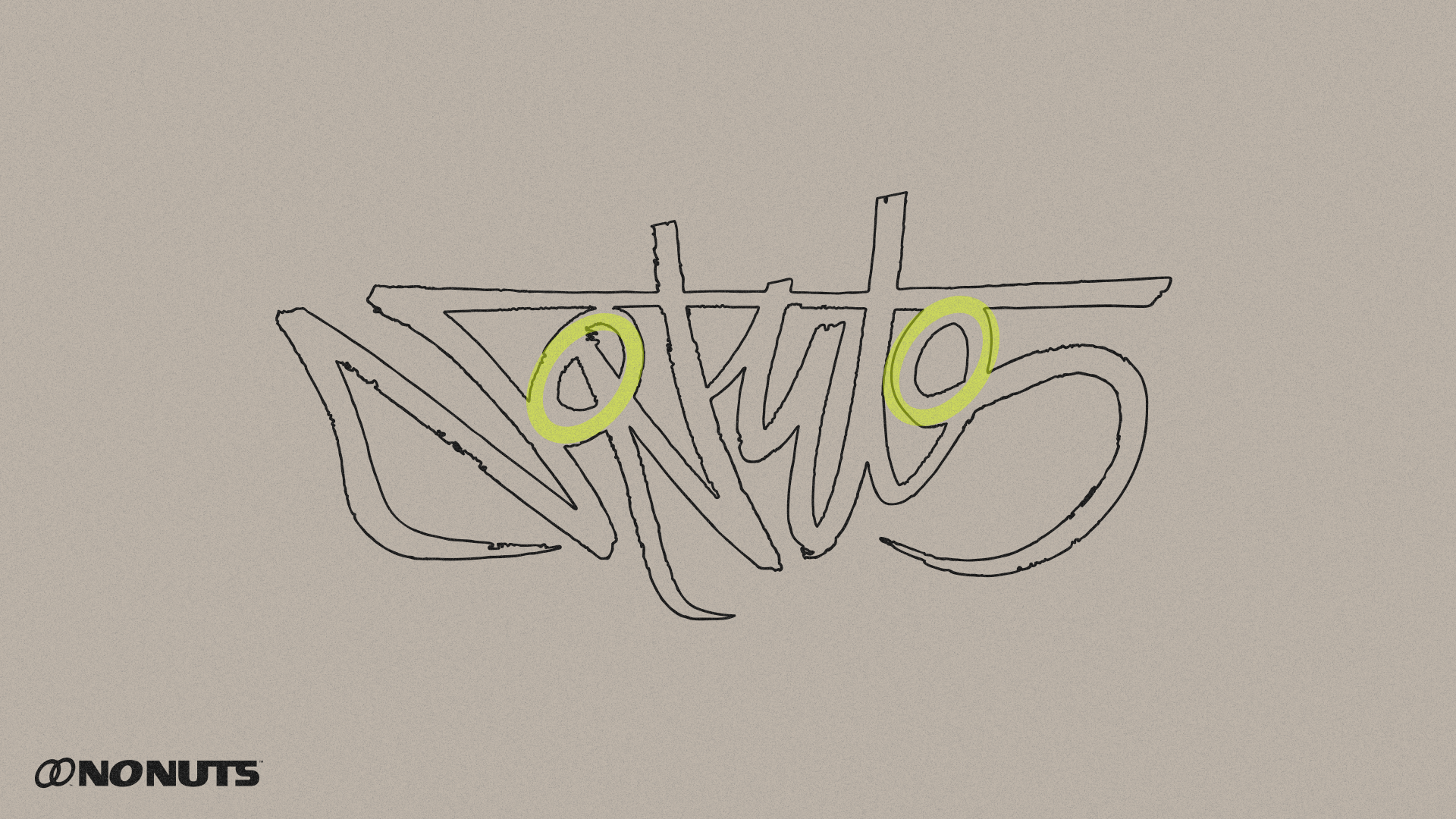
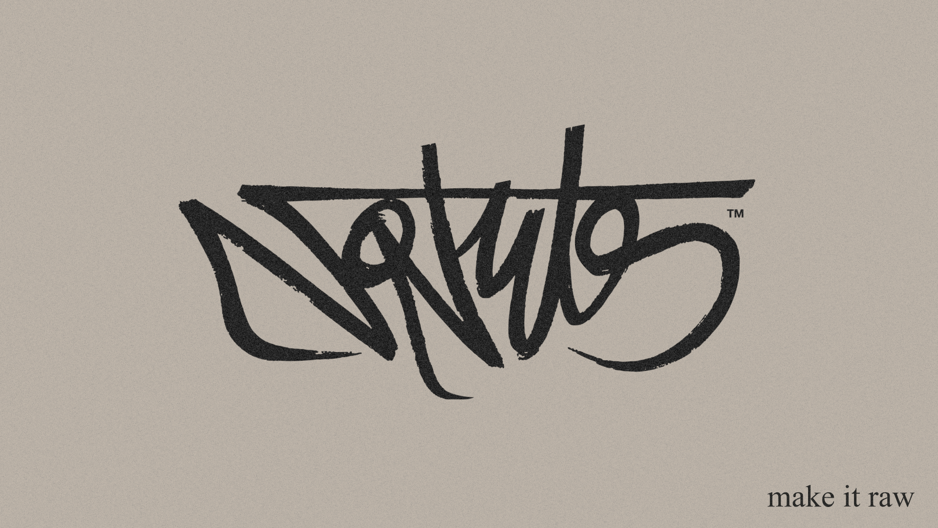
Another element of the brand identity is the design of a signature. The brand must also be conveyed through graffiti, one of the four elements of Hip Hop, so I found it essential to create this resource. Obviously, it follows the guiding thread of the identity, and we can see the gesture of the eggs reflected in the signature.
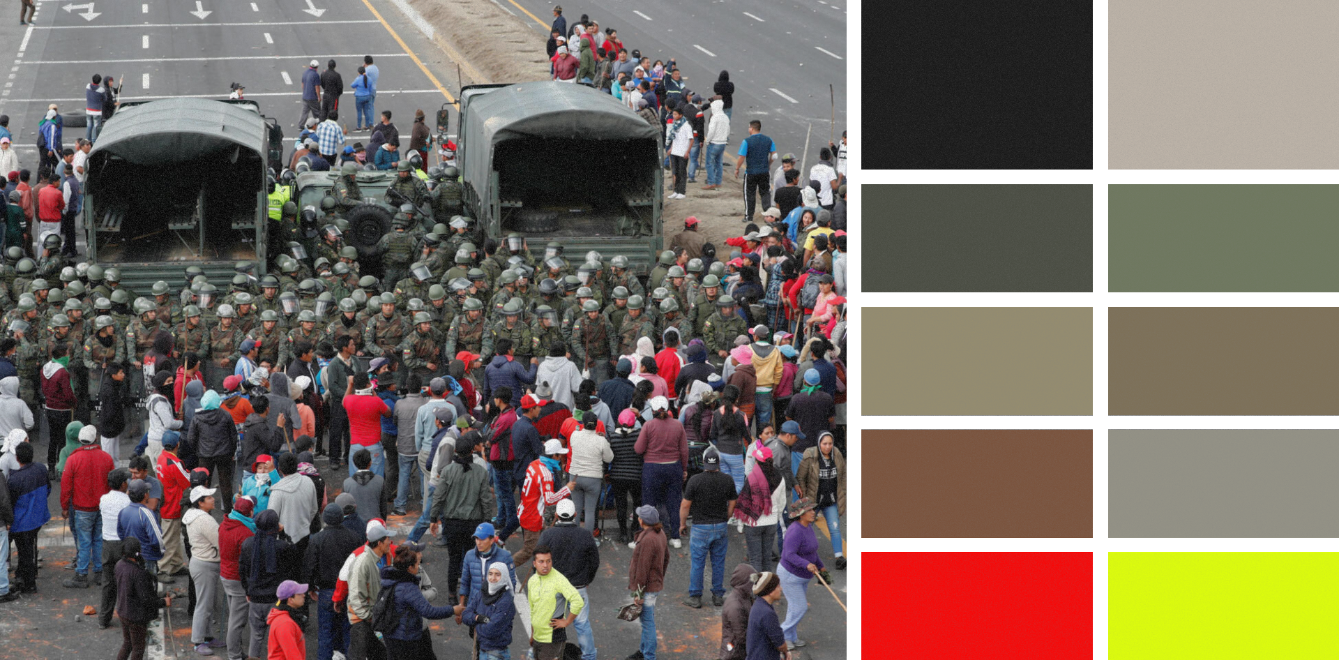
For the color palette, I was inspired by the confrontation between the people and the state. The brand is a clear statement of intent, and colors are one of the best resources to graphically shout this message.
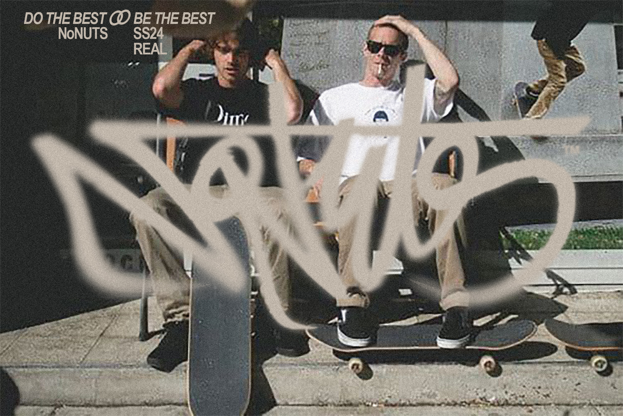
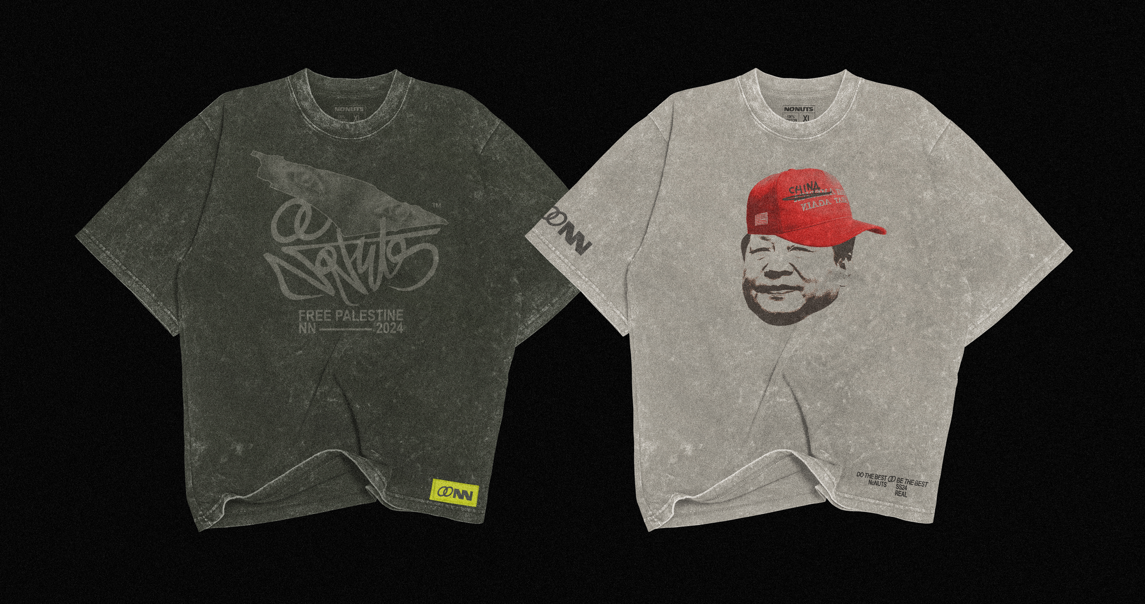
SOME APPLICATIONS:


EXTRA: THE SECOND PROPOSAL
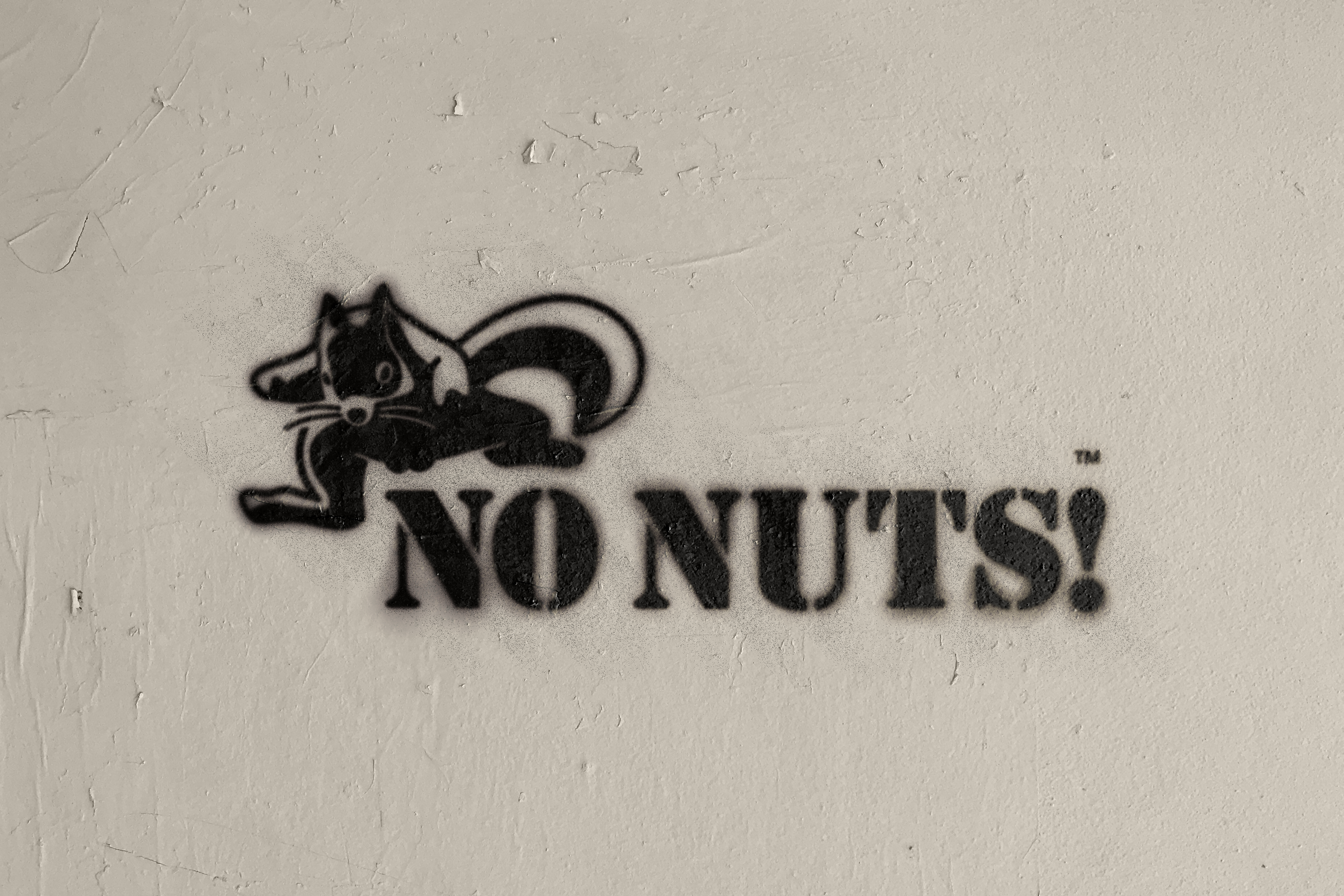
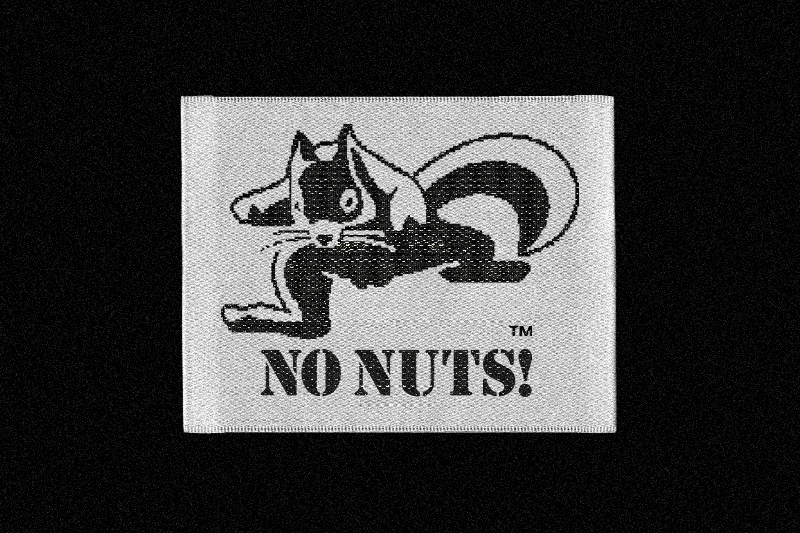
We usually present two project proposals to the client. Both were well received, but this one was chosen due to its more contemporary aesthetic. However, from the beginning, the client wanted a squirrel as the logo, so we designed the following proposal: a No Nuts squirrel with character, avoiding stereotypes and ridicule of this animal.
