A MINIMALIST MODULAR SYSTEM
I was tasked with redesigning the visual identity for a Greek hotel group. The brief specified that the brand needed to be simple to coexist with the existing hotel brands within the business.The main concept of the brand is that Agora is always present in any type of hotel, apartment, or resort within the business. Therefore, I had to design a modular and minimalist graphic system.

INSPIRED BY CLASSIC GREEK COLUMNS
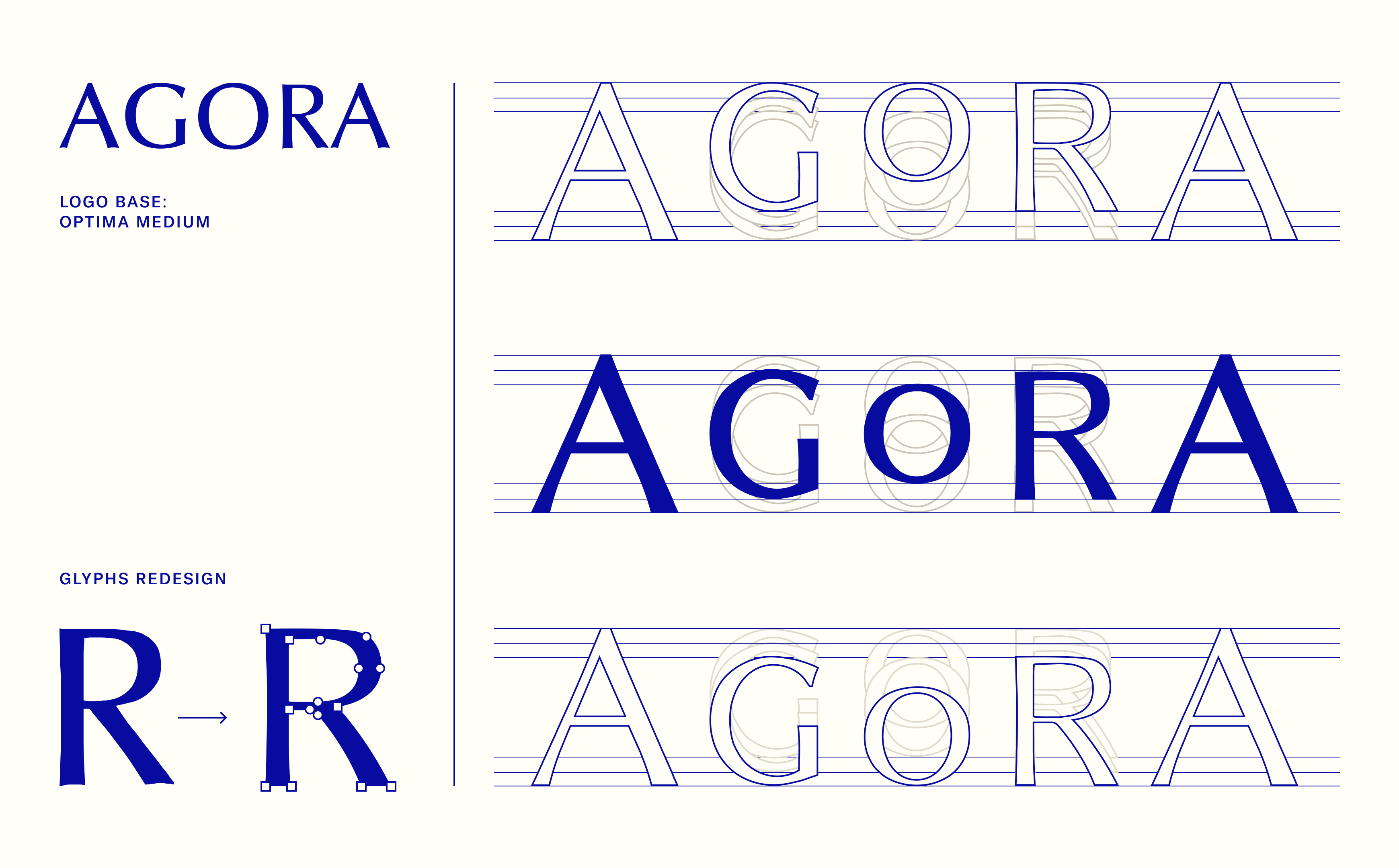
I wanted a simple, modern identity with a strong conceptual foundation. When we think of Greece and buildings, the first thing that comes to mind is what we learned in school: the famous Greek columns. This was the basis for constructing the logo.
The challenge was to give depth to the letters of the word Agora, so through a grid, I adapted each letter to create a vanishing point in the center. The most difficult part was achieving visual harmony among all the letters, as they had to be completely modified to balance the weights and spaces.
To add more dynamism to the brand and build a graphic system, Agora adapts to any position by modifying its vanishing point depending on its location or the elements involved. In other words, Agora adapts to any situation and any type of hotel.


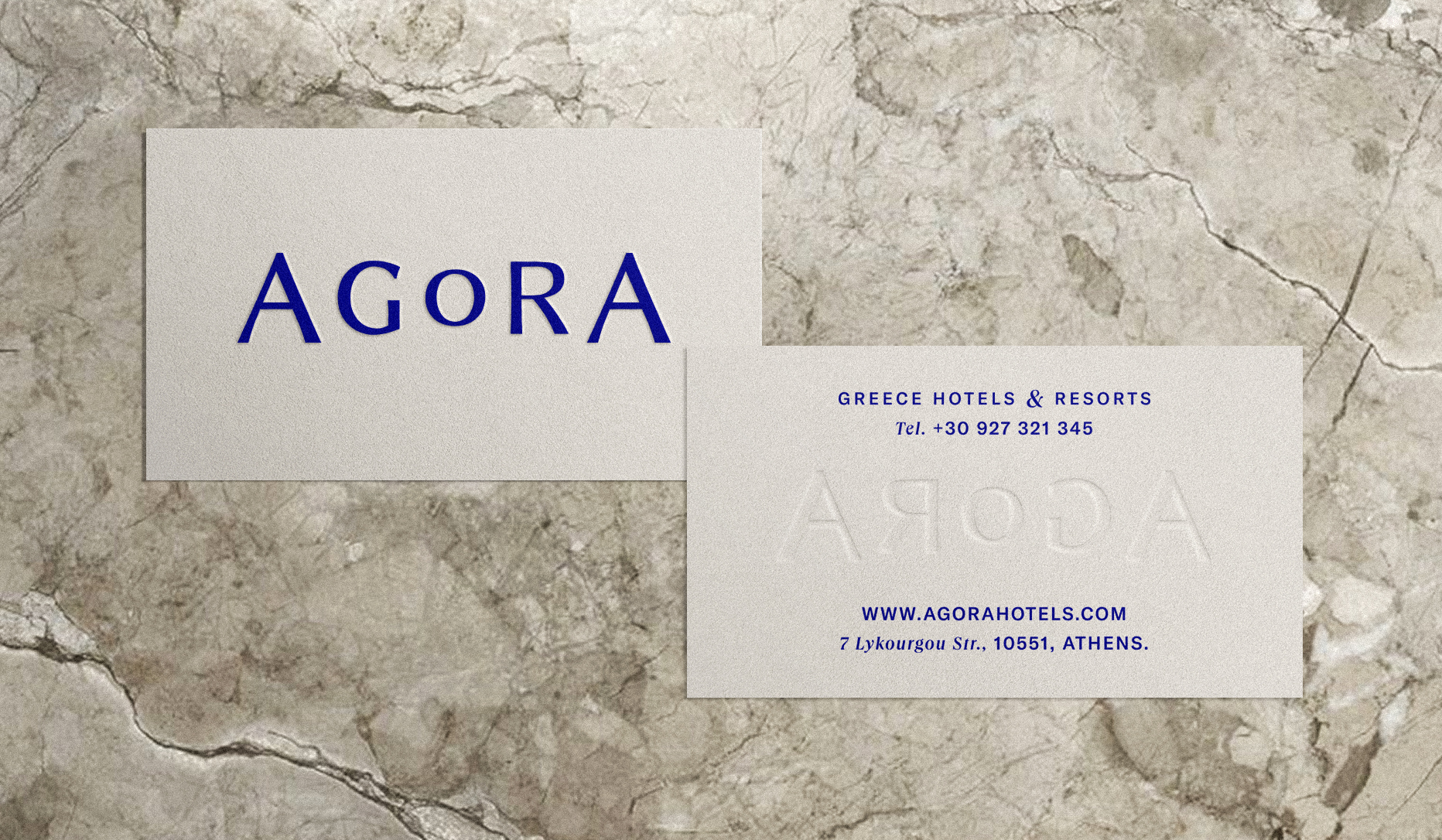
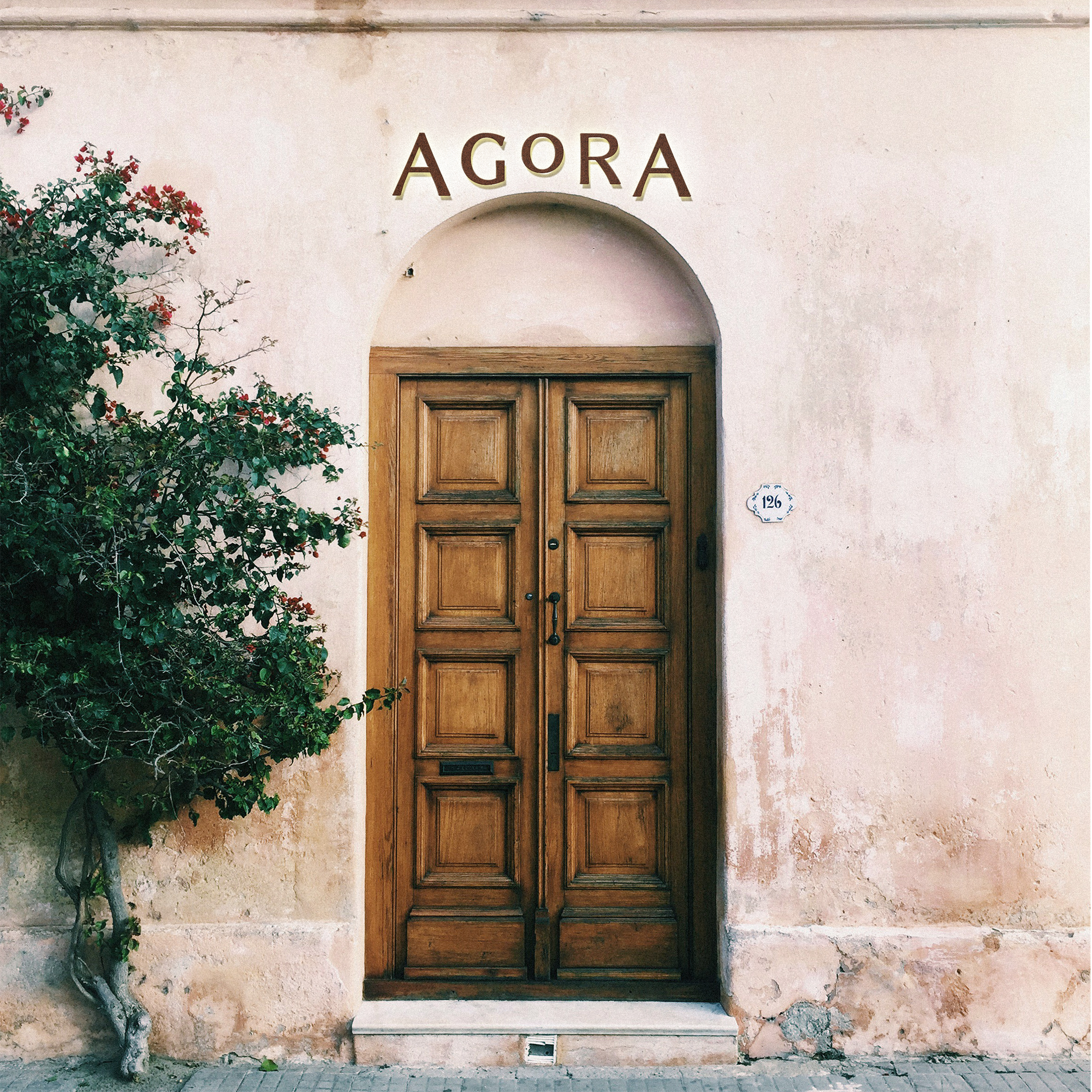
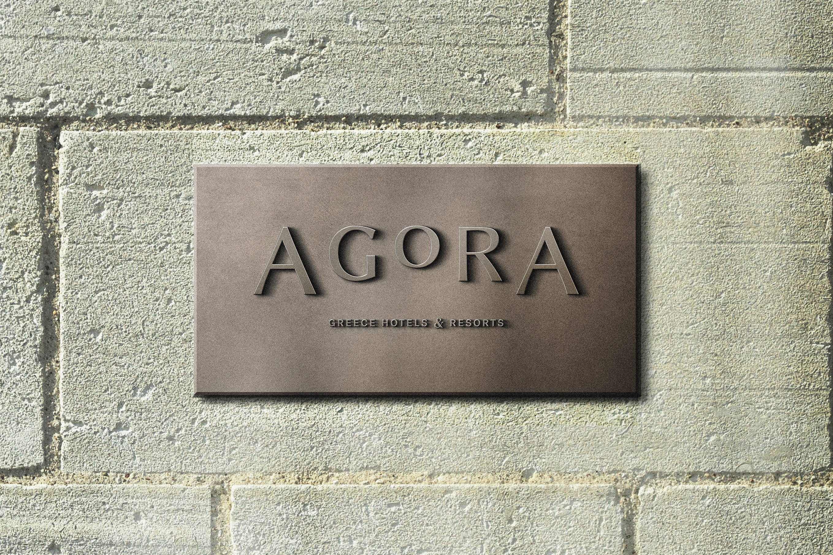
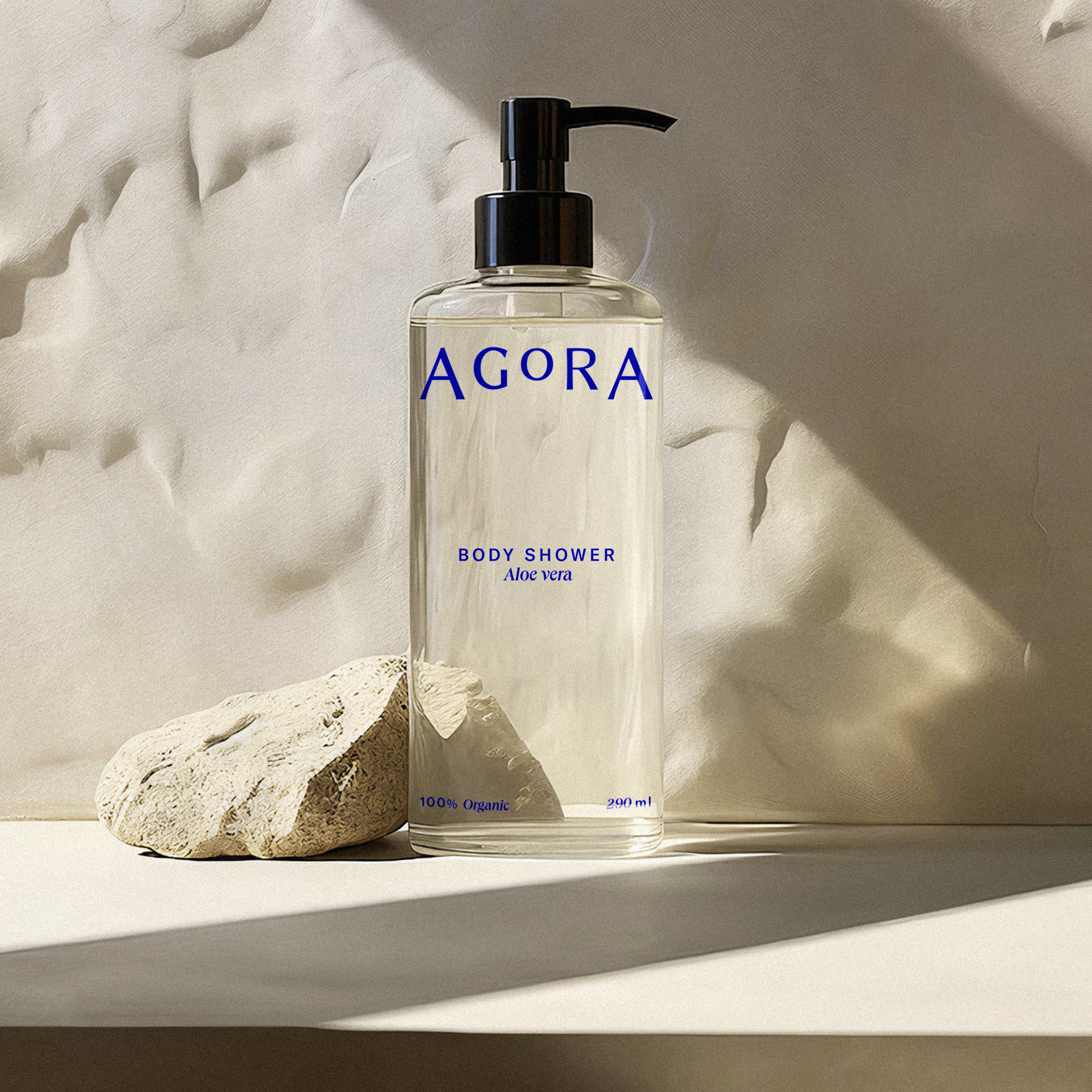
some agora applications:
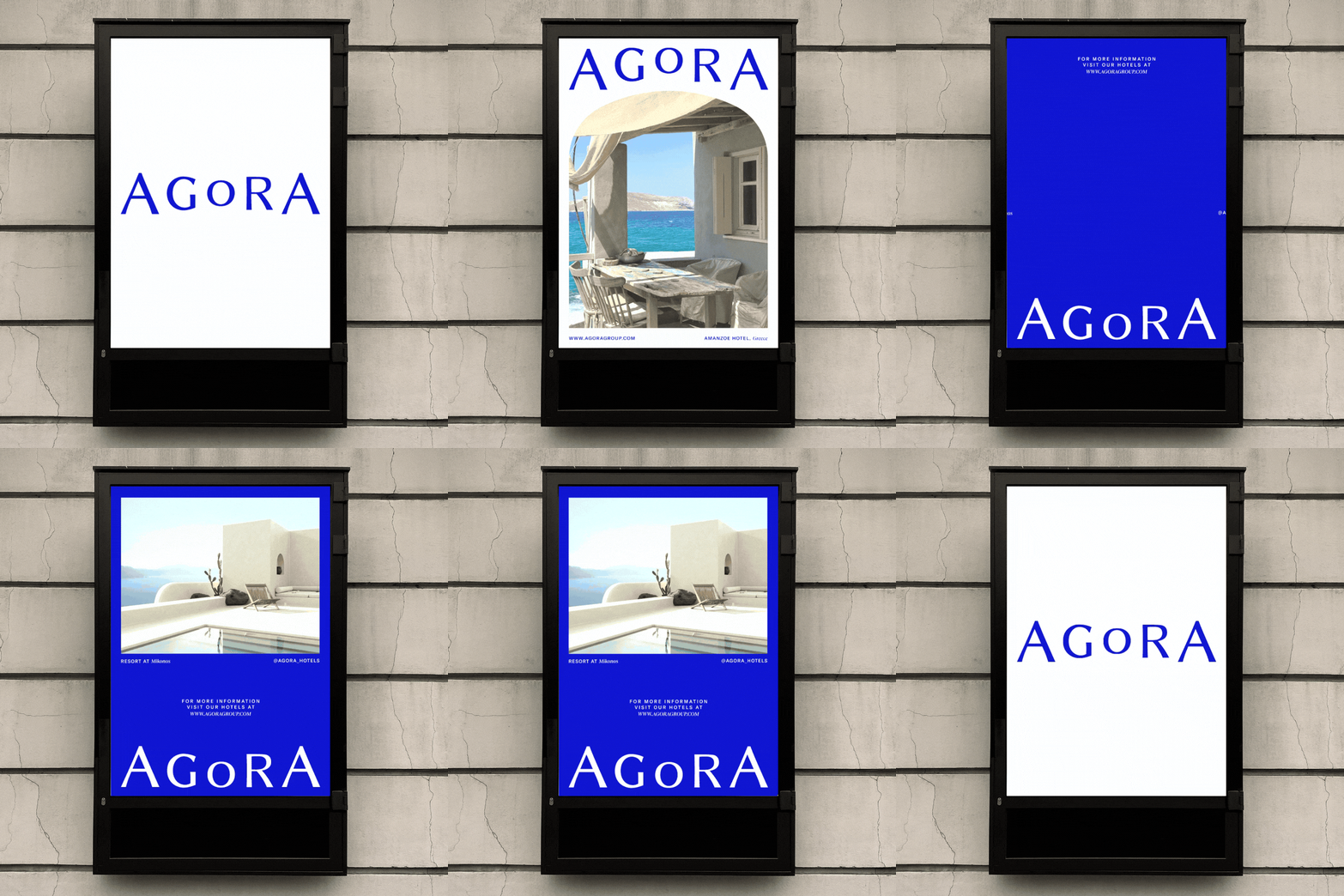
The brand applications are simple and place great importance on the impact of the blue color and the logo, maintaining a minimalist and clean aesthetic.
DIGITAL APPLICATIONS
La idea de esta propuesta, era dar complejidad a la marca con animaciones suaves de elementos que se reparten harmoniosamente en el espacio. Esperamos que en un futuro, sigamos trabajando en la marca para darle más recursos y vida al branding.
