ECOAIgua rebranding starts with a new name
The project aimed to modernize a water recycling services brand that lacked personality. The biggest challenge was finding a new, registerable name that brought a more impactful and awareness-raising concept. "Water of Tomorrow" perfectly aligned with the brand's values. It is a strong, contemporary name that, due to the power of its message, needed to be accompanied by a simple and effective graphic identity. Thus, the water of the future is born—a new formula that transforms wasted water into drinking water. H2O is now WoT because water is the vital element of our planet, and we must preserve it.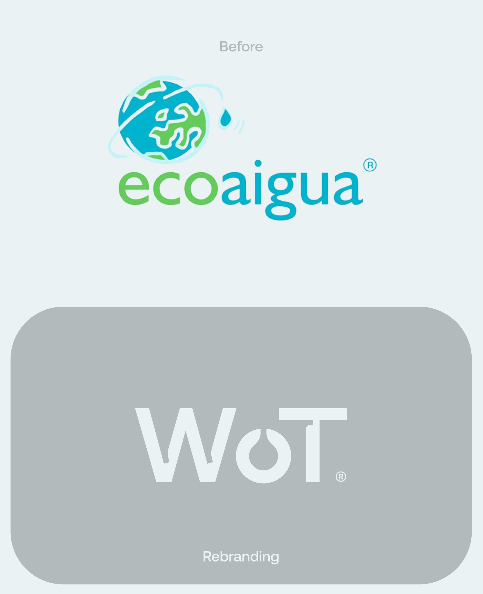

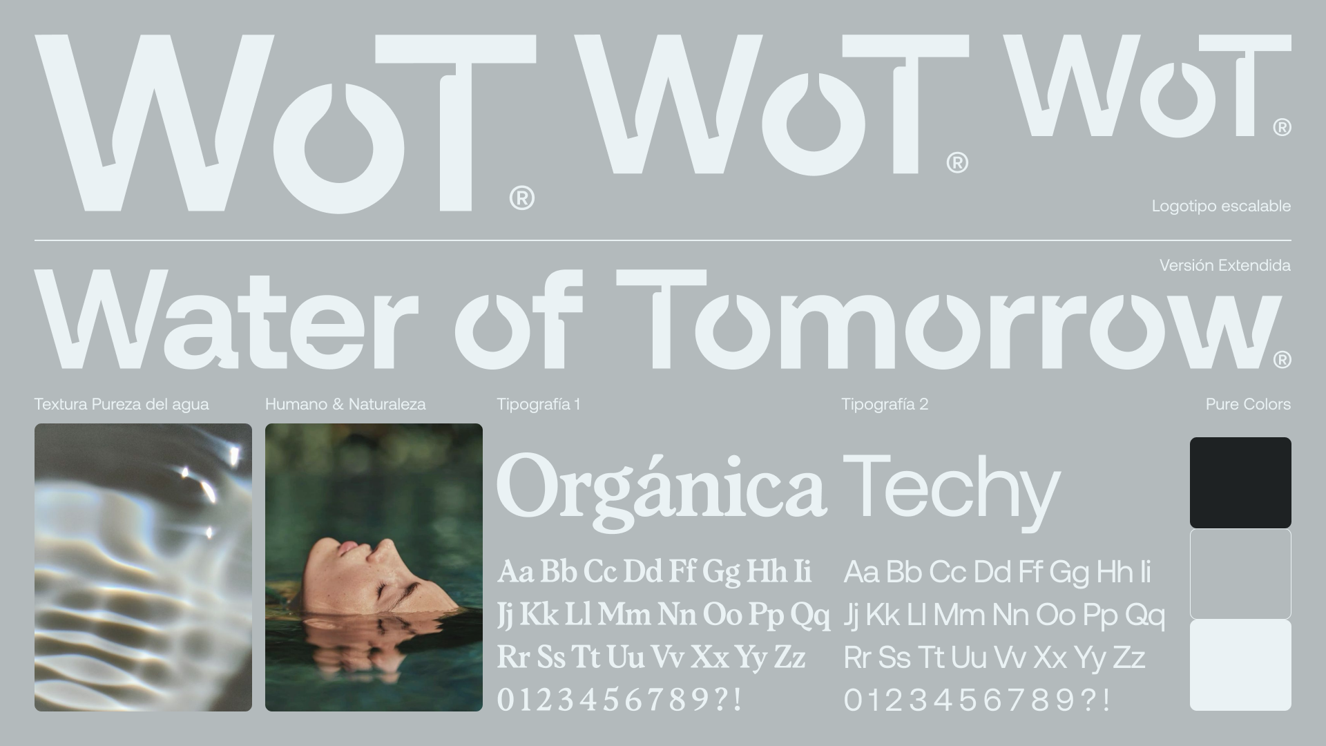
The primary element of the brand is constructed similarly to how H₂O is written in chemistry, where the 2 representing the two hydrogen atoms is smaller than the letters of the elements. The logo design mirrors this construction with the brand's new initials (WoT).
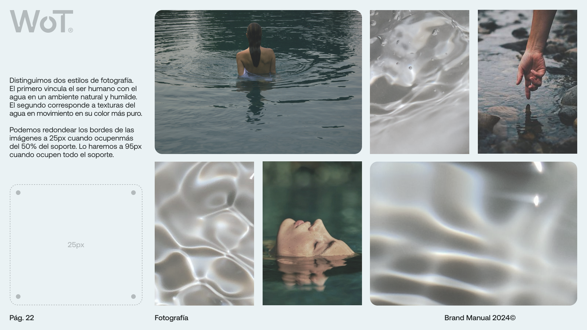
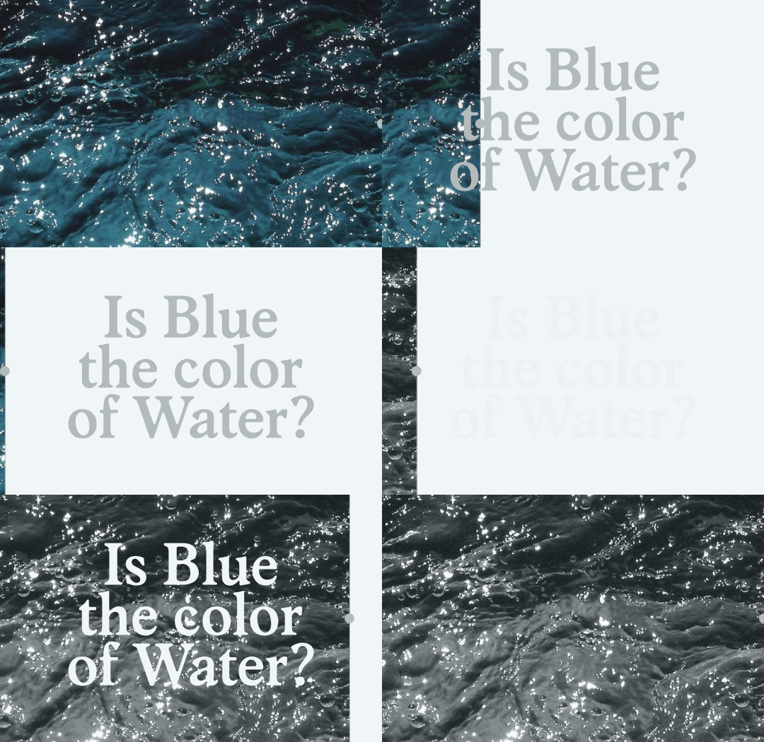
The second most important element is the color palette. The obvious choice for this brand would be blue, as it's the color most people associate with water. However, blue isn't the actual color of water, and we wanted to emphasize the value of purity. When we talk about purity, we need to show things as they are, and water is transparent. Therefore, we use gray and white as neutral colors that we consider purer in relation to the concept of water.
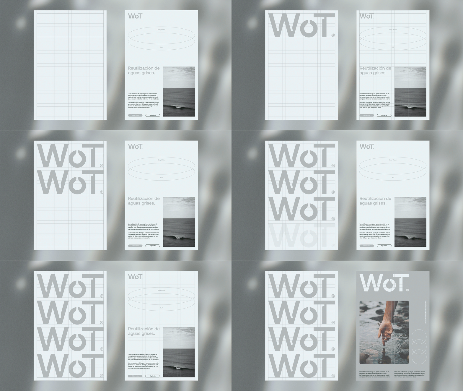
Another crucial element of the brand is the grids I've designed to achieve original and coherent compositions. Regardless of the format, the grids are segmented proportionally to the logo's space. This ensures that the brand is always applied proportionally.
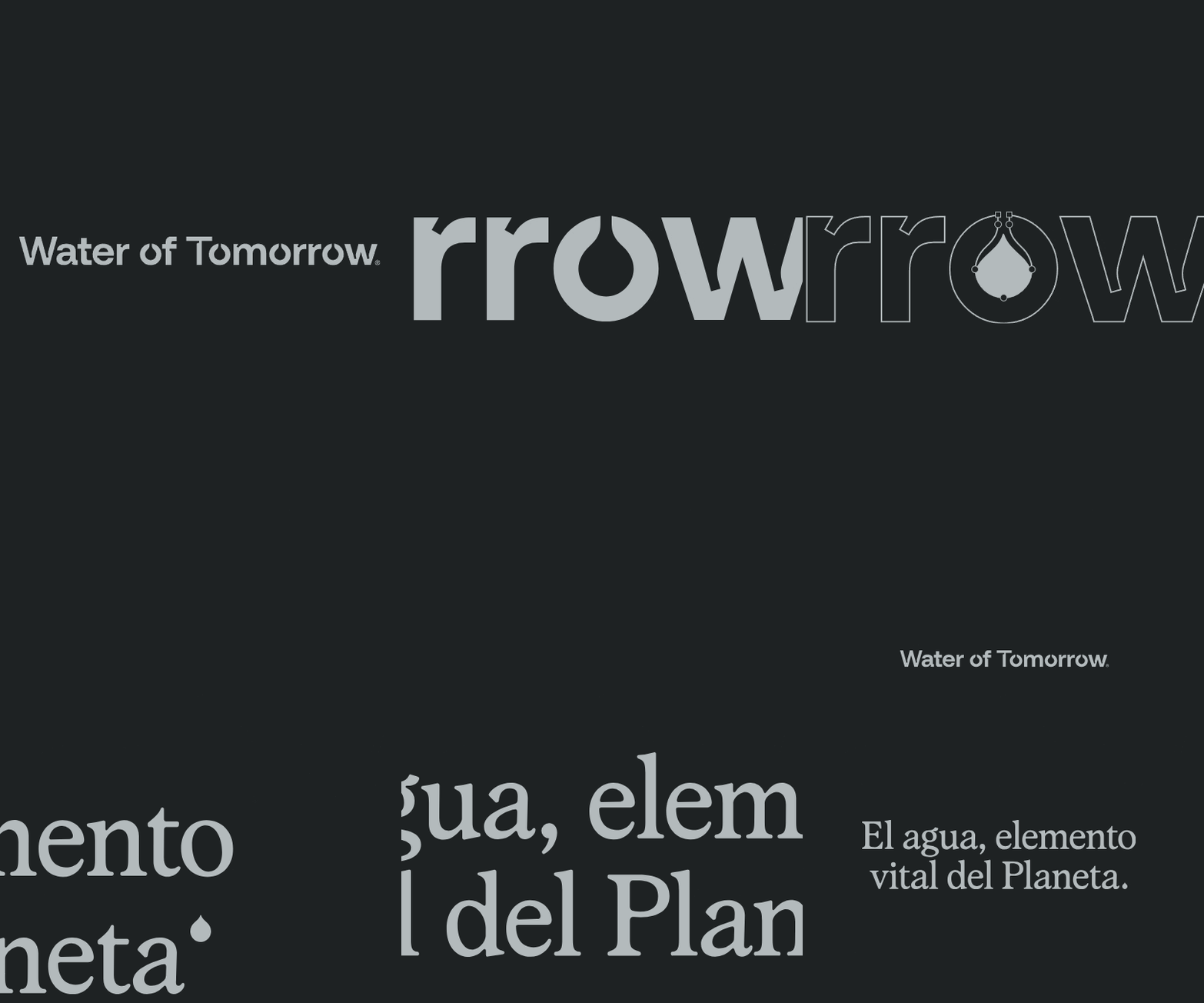
each drop counts.
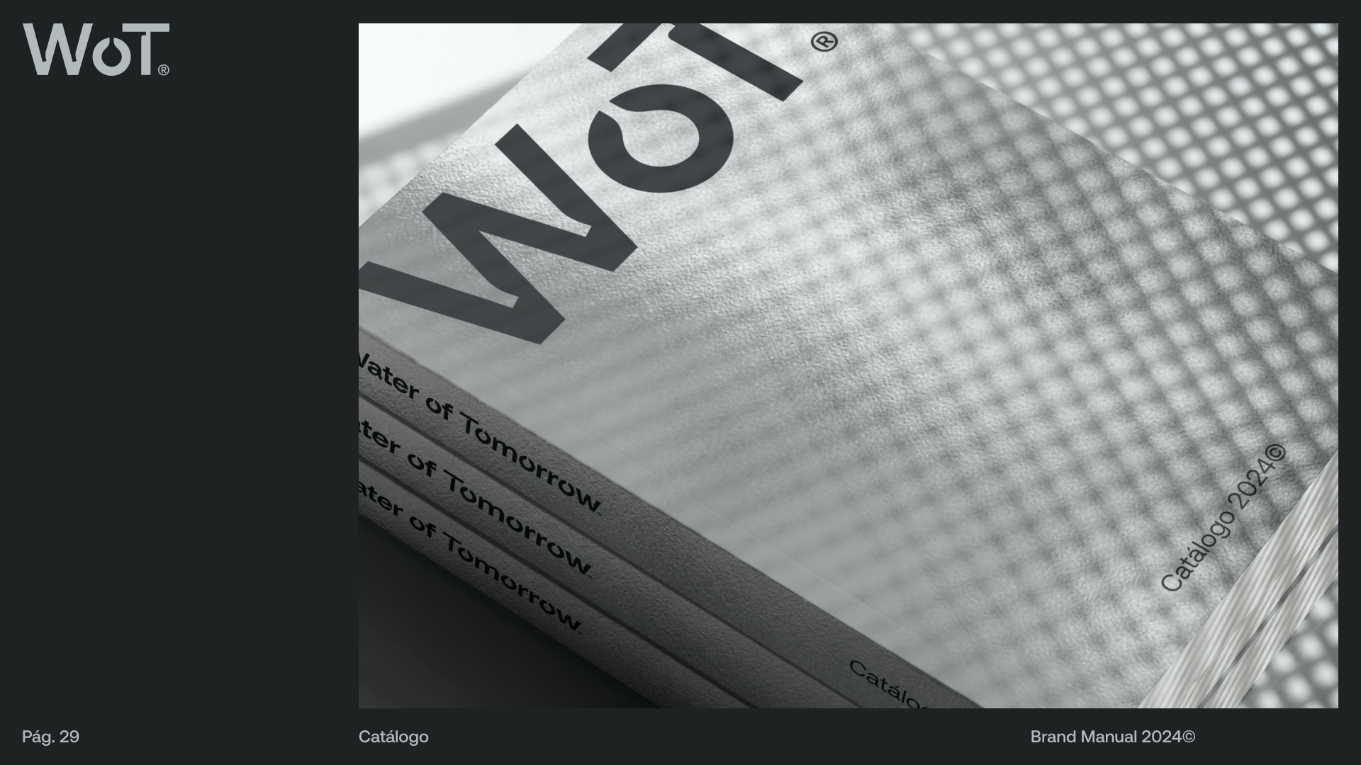
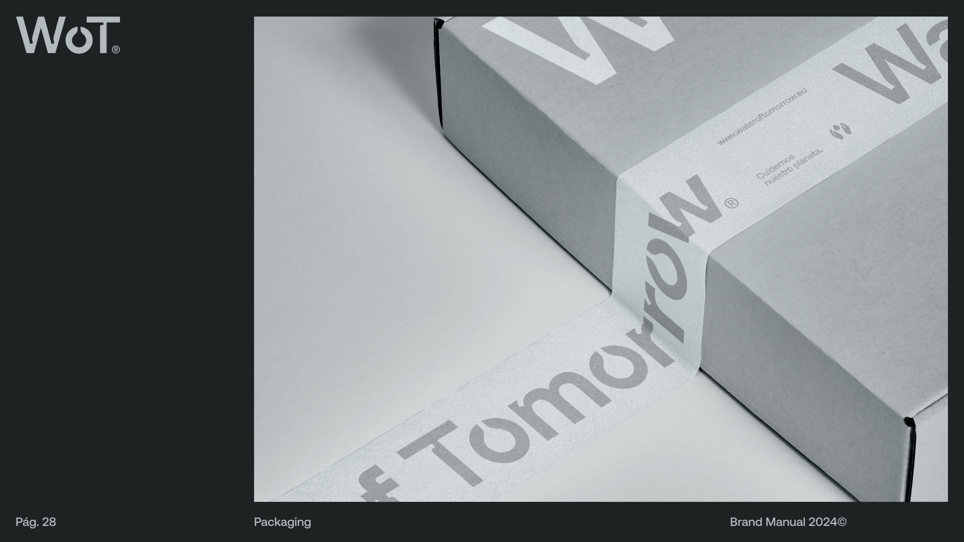
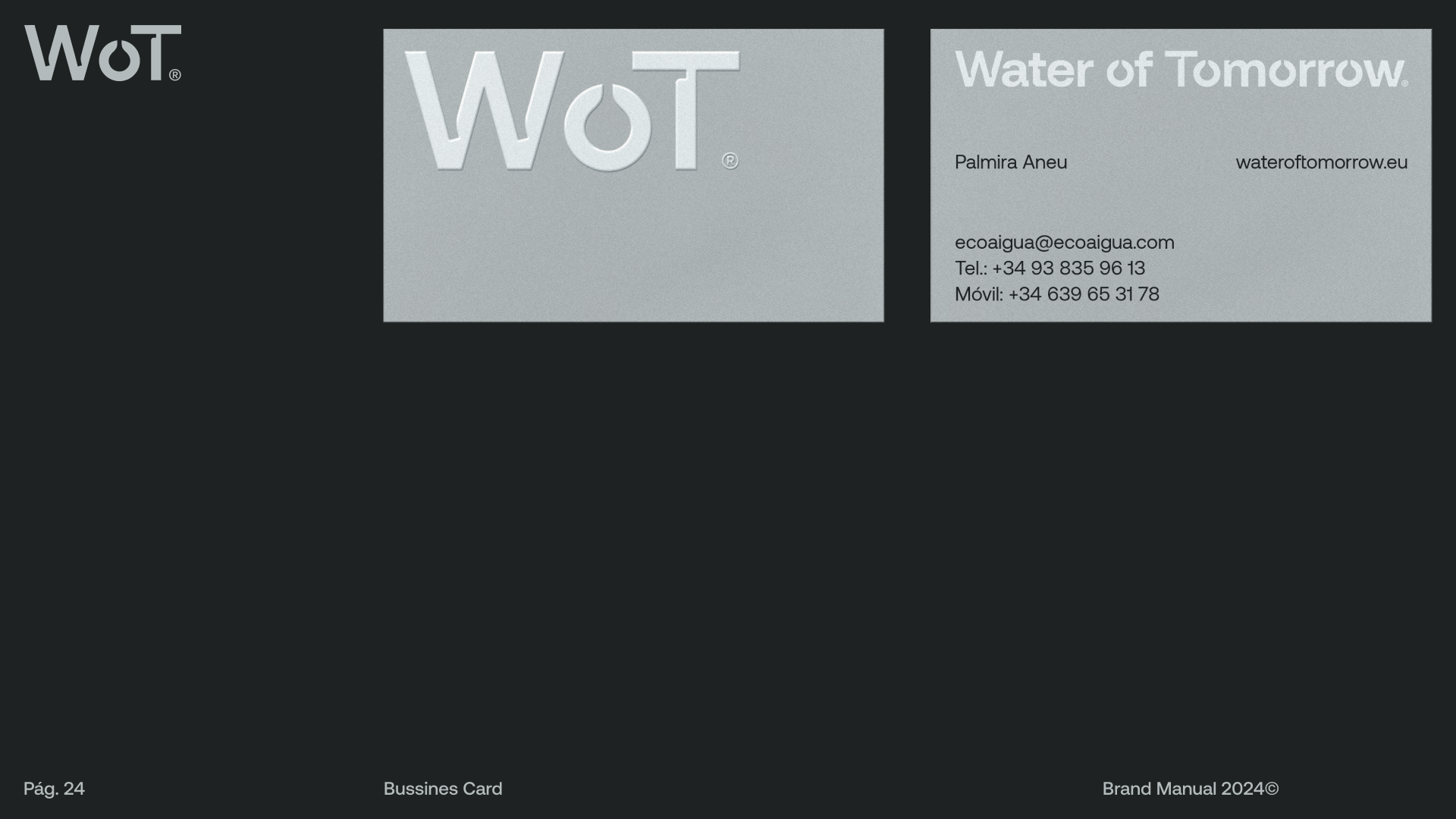
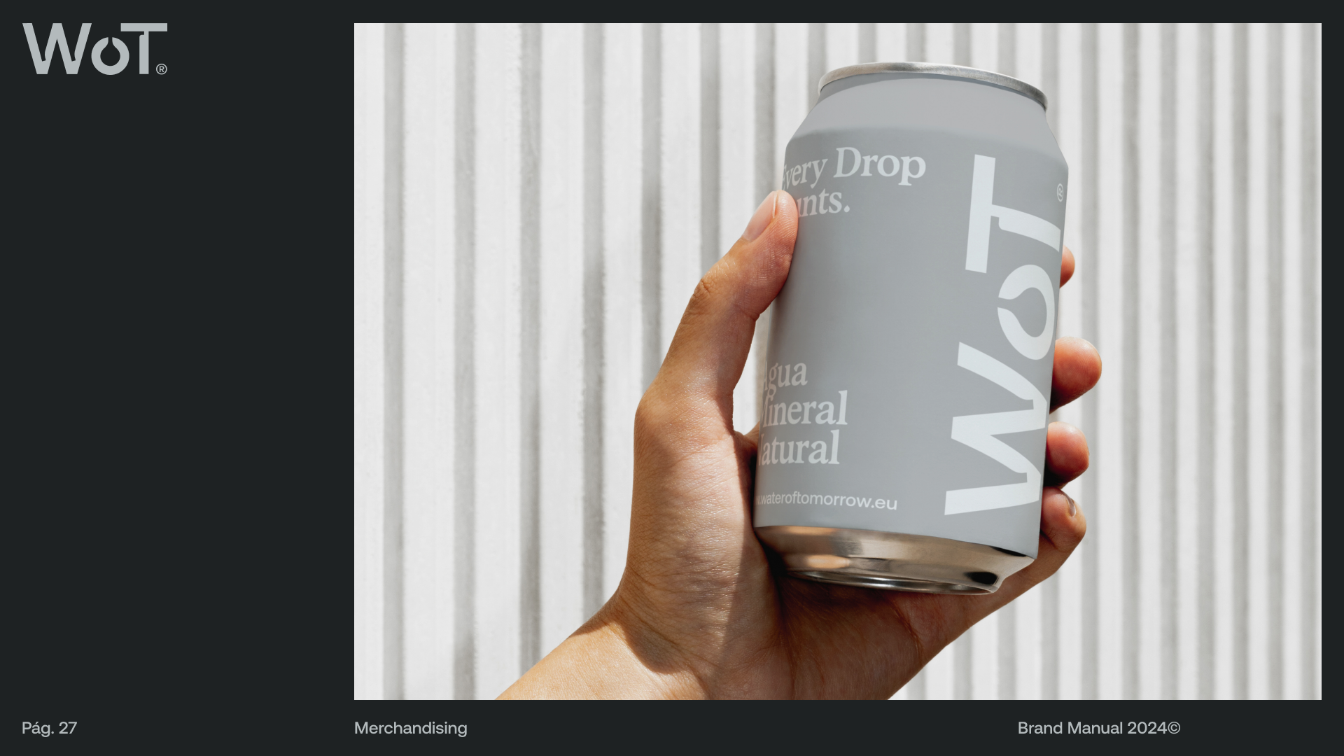
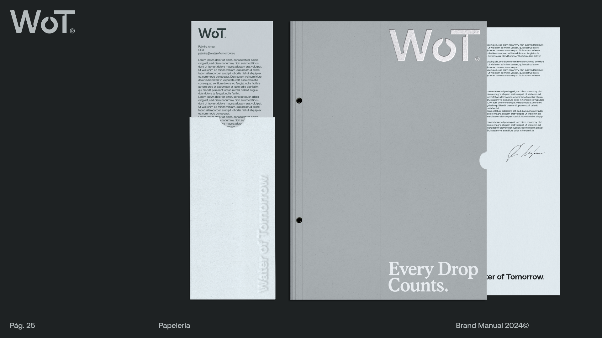
In physical applications, it's crucial to consider the brand's mission to be environmentally conscious. Therefore, one of the brand's strategies is to use sustainable materials and techniques, such as recycled papers or eco-friendly inks.
“ Water of Tomorrow” is a brand committed to respecting and preserving the planet.
“ Water of Tomorrow” is a brand committed to respecting and preserving the planet.
“has donat una segona vida a l’empresa, moltíssimes gràcies!!!!”
I designed a brand identity manual outlining all usage guidelines to ensure the client continues to apply the brand responsibly and consistently. This is possibly one of my best works to date, and the client is very satisfied and grateful.
I designed a brand identity manual outlining all usage guidelines to ensure the client continues to apply the brand responsibly and consistently. This is possibly one of my best works to date, and the client is very satisfied and grateful.
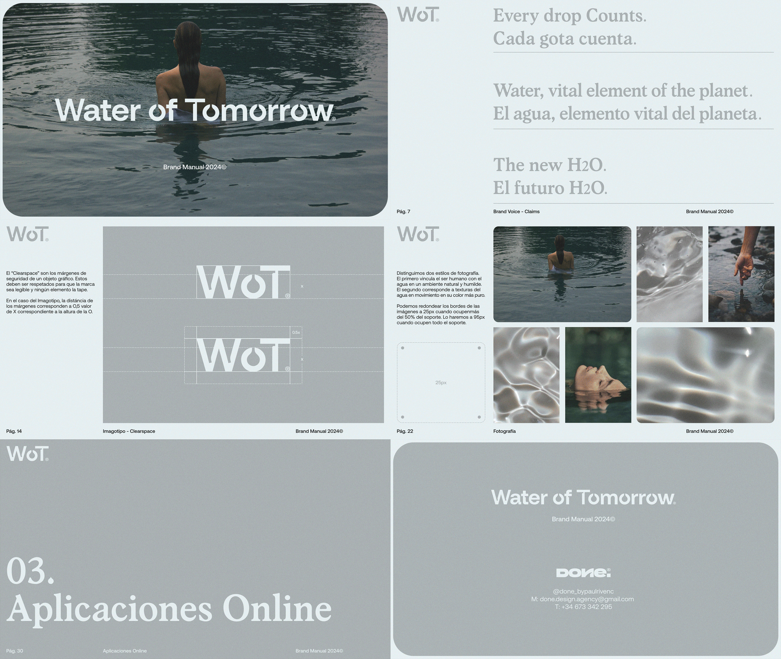
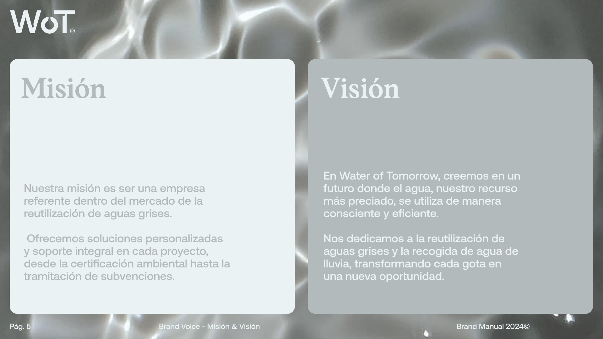
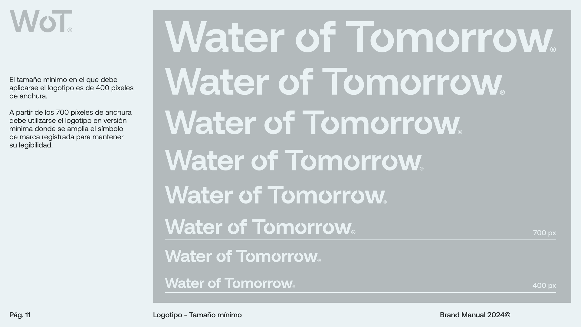
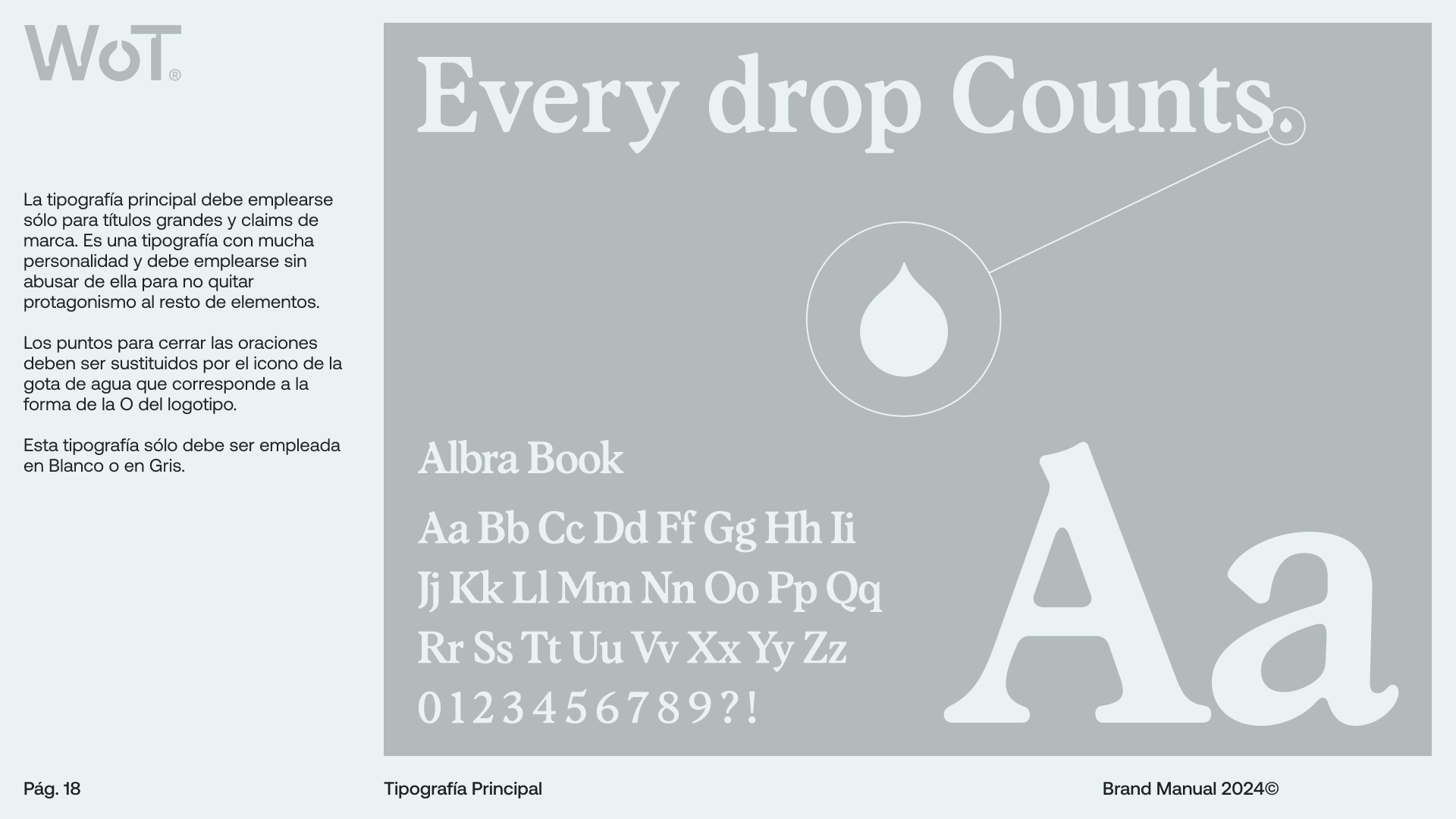
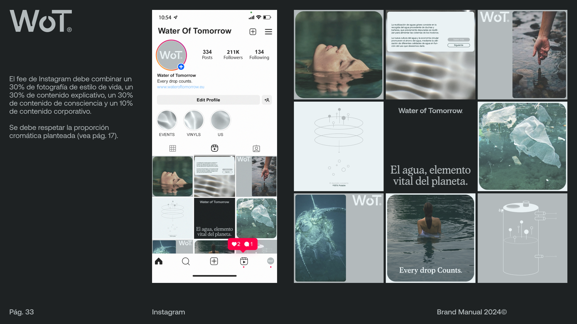
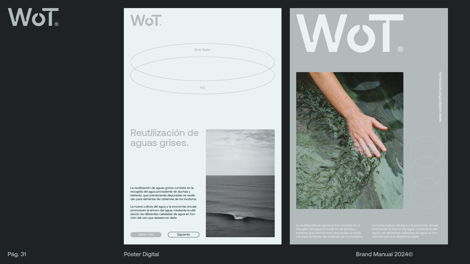
These are some of the most notable pages from the brand identity manual. The level of detail and depth in the usage guidelines ensures the client has great ease with the brand. One of my goals for this special project was to create a brand that is easy to apply yet highly dynamic.
