NEW BRAND, NEW CONCEPT
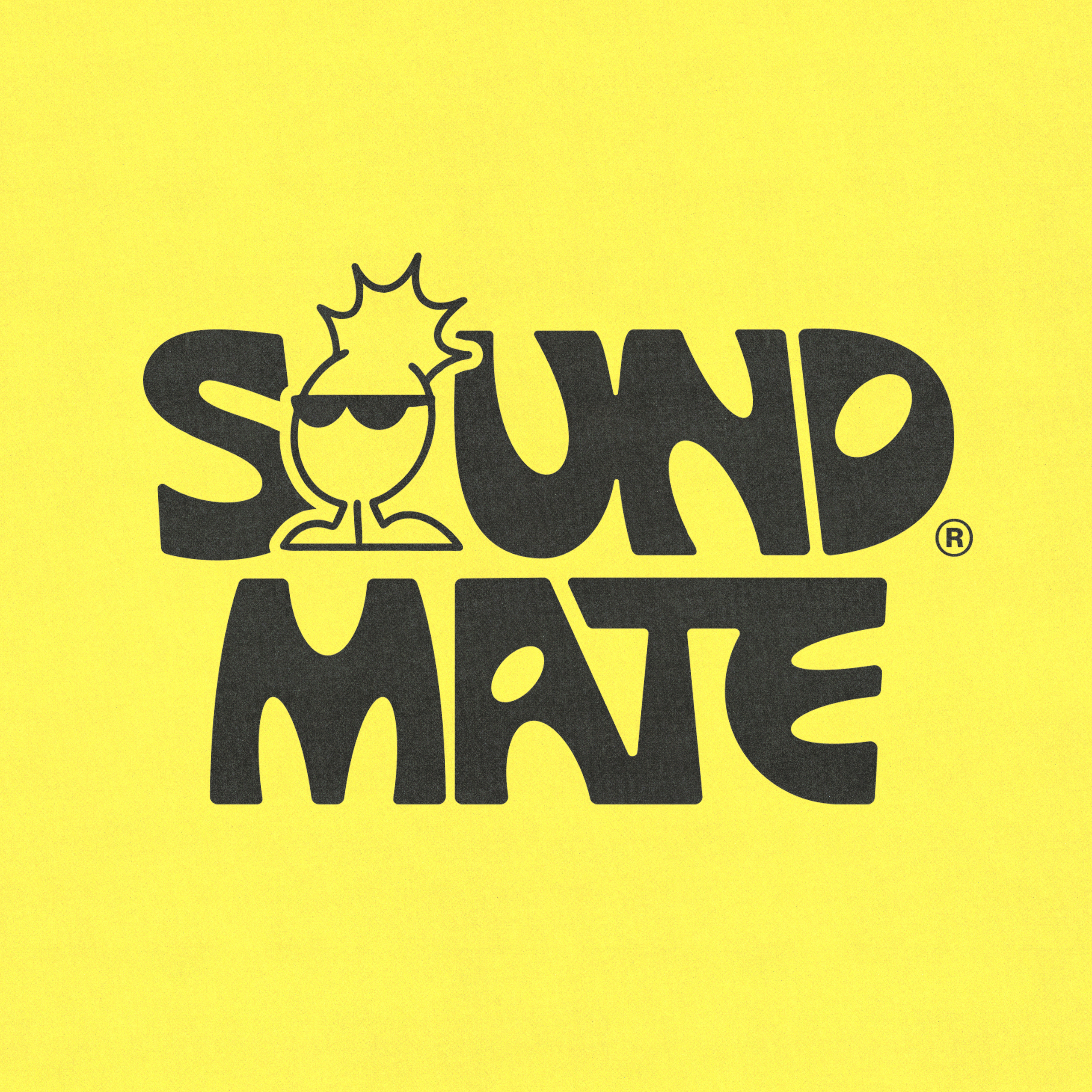
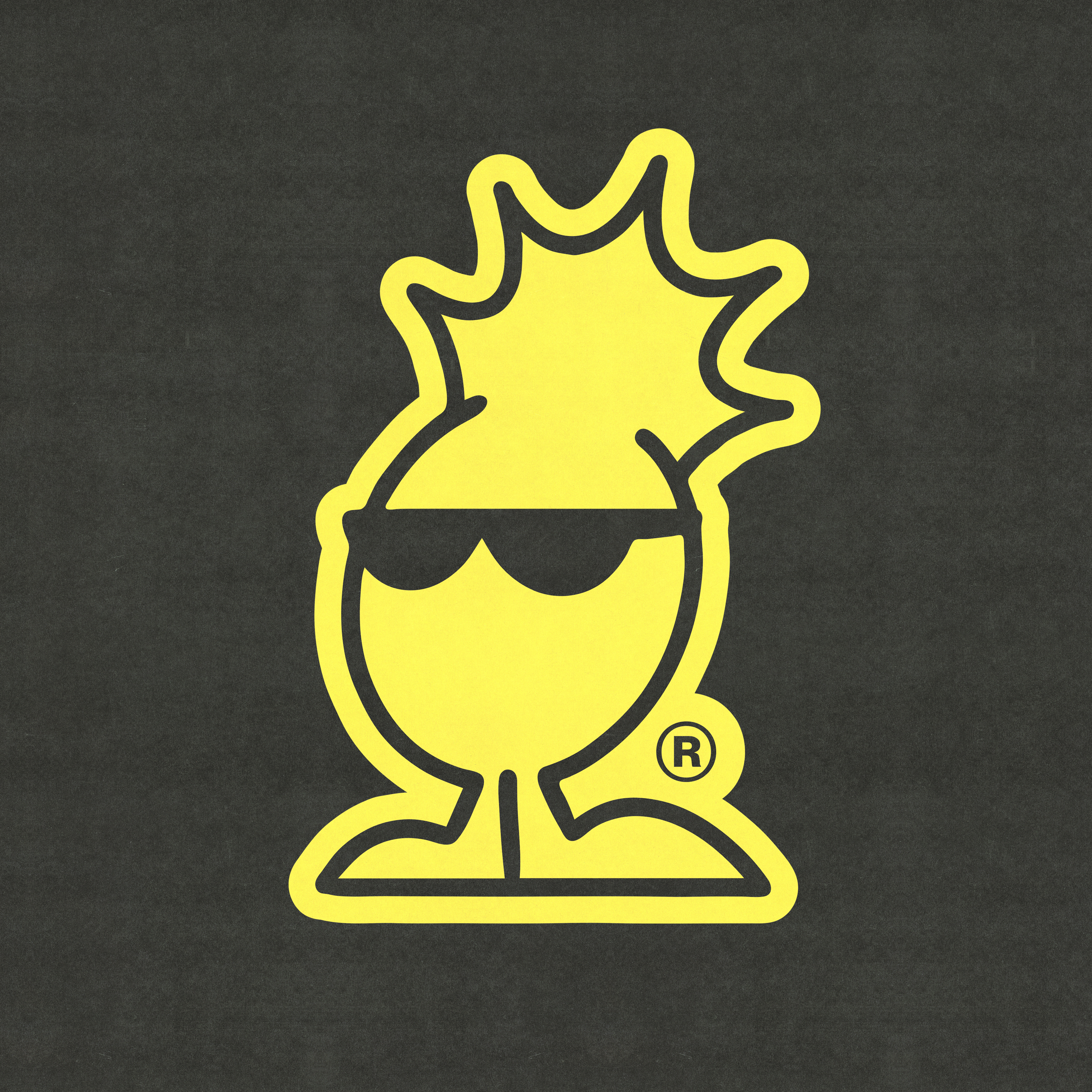
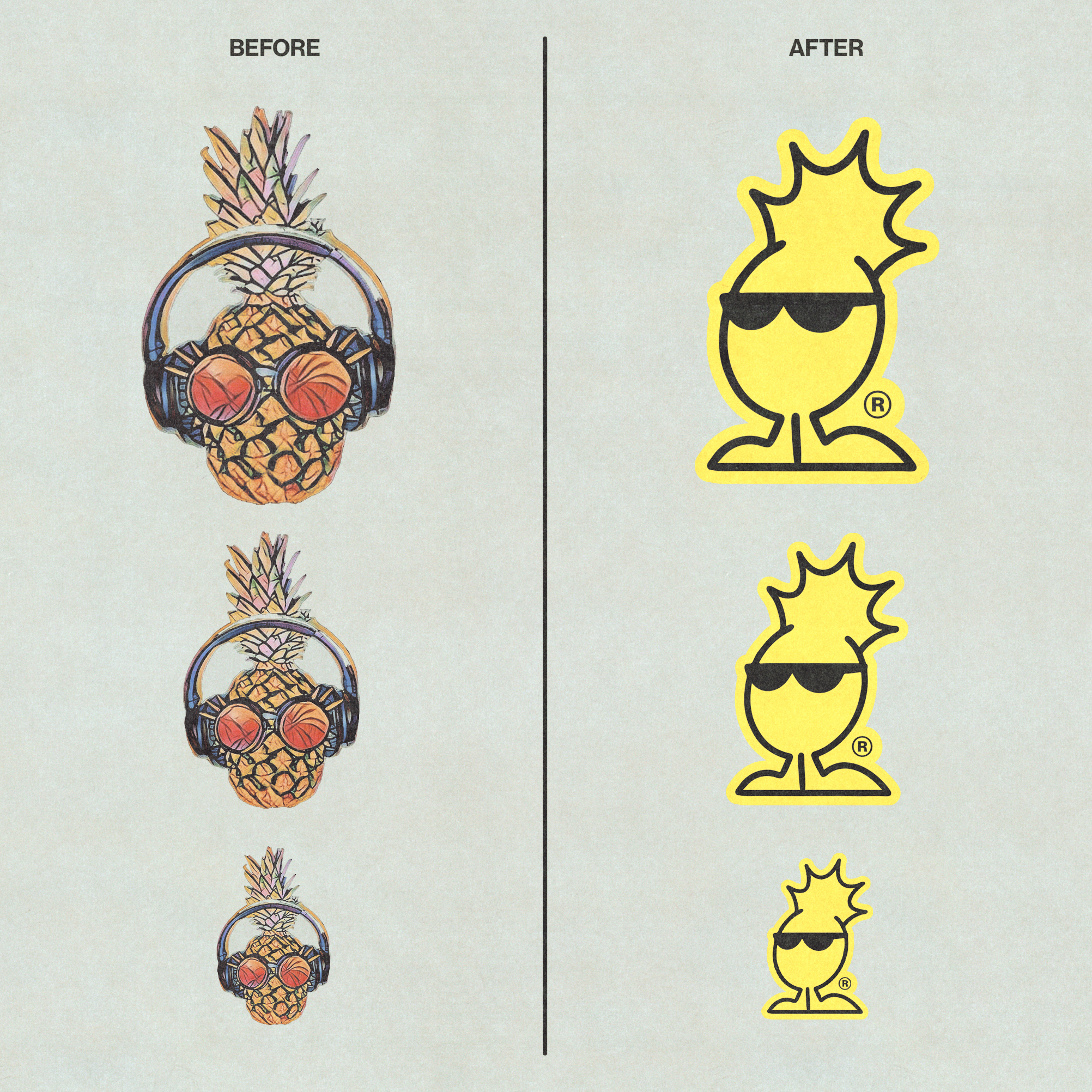
The original image of the Soundmate 31 brand was an illustration of a pineapple with glasses and headphones. Although I convinced the client to remove the 31 from the brand name, they insisted on keeping the pineapple as an icon because they associated it with their origins and fun.
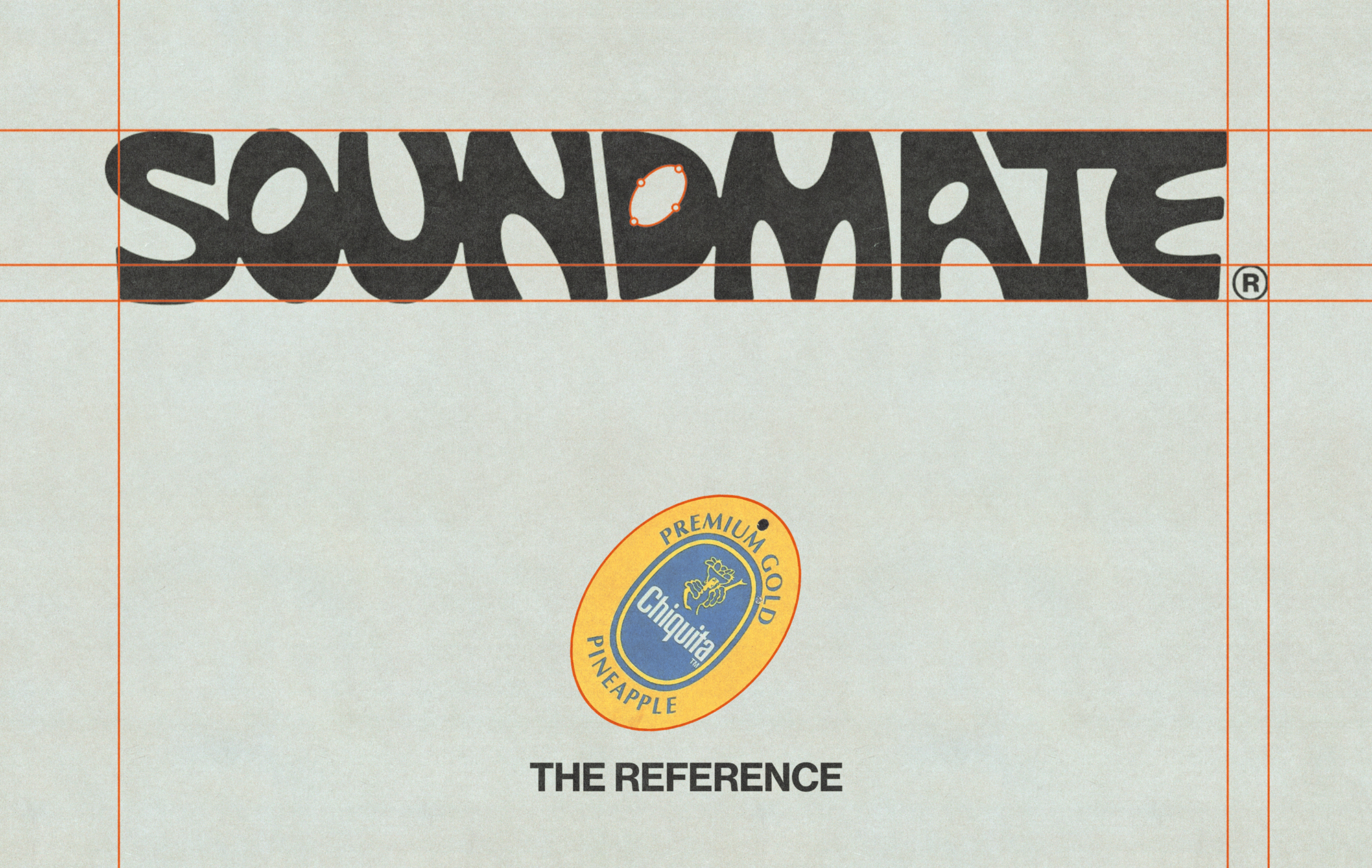
The first thing I considered in the proposal was to have a concept that linked the fruit with the current youth lifestyle. That's how I remembered the famous meme of the "Zespri" sticker on a child's head.
Something simple and characteristic of the fruit sticker is the way they are die-cut, generally elliptical. So, I used the ellipse to construct the shapes that will define the brand's identity.


USING HANDS BEFORE SOFTWARE
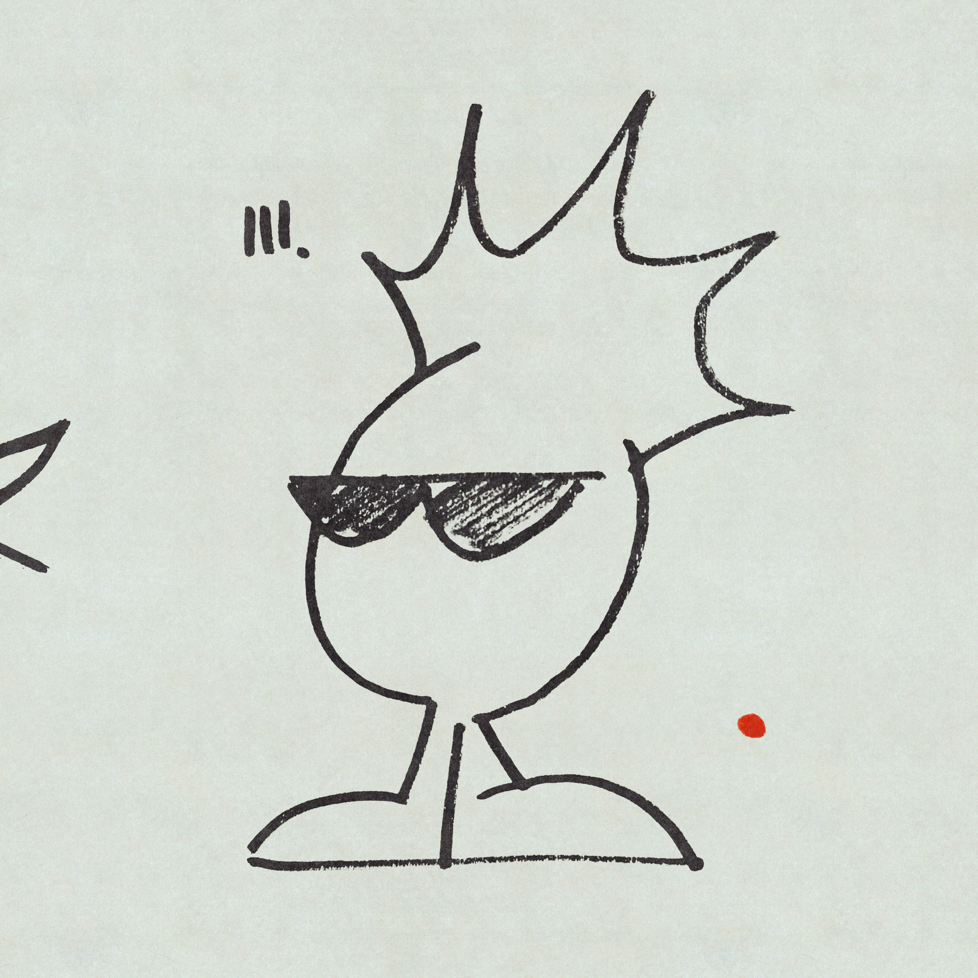
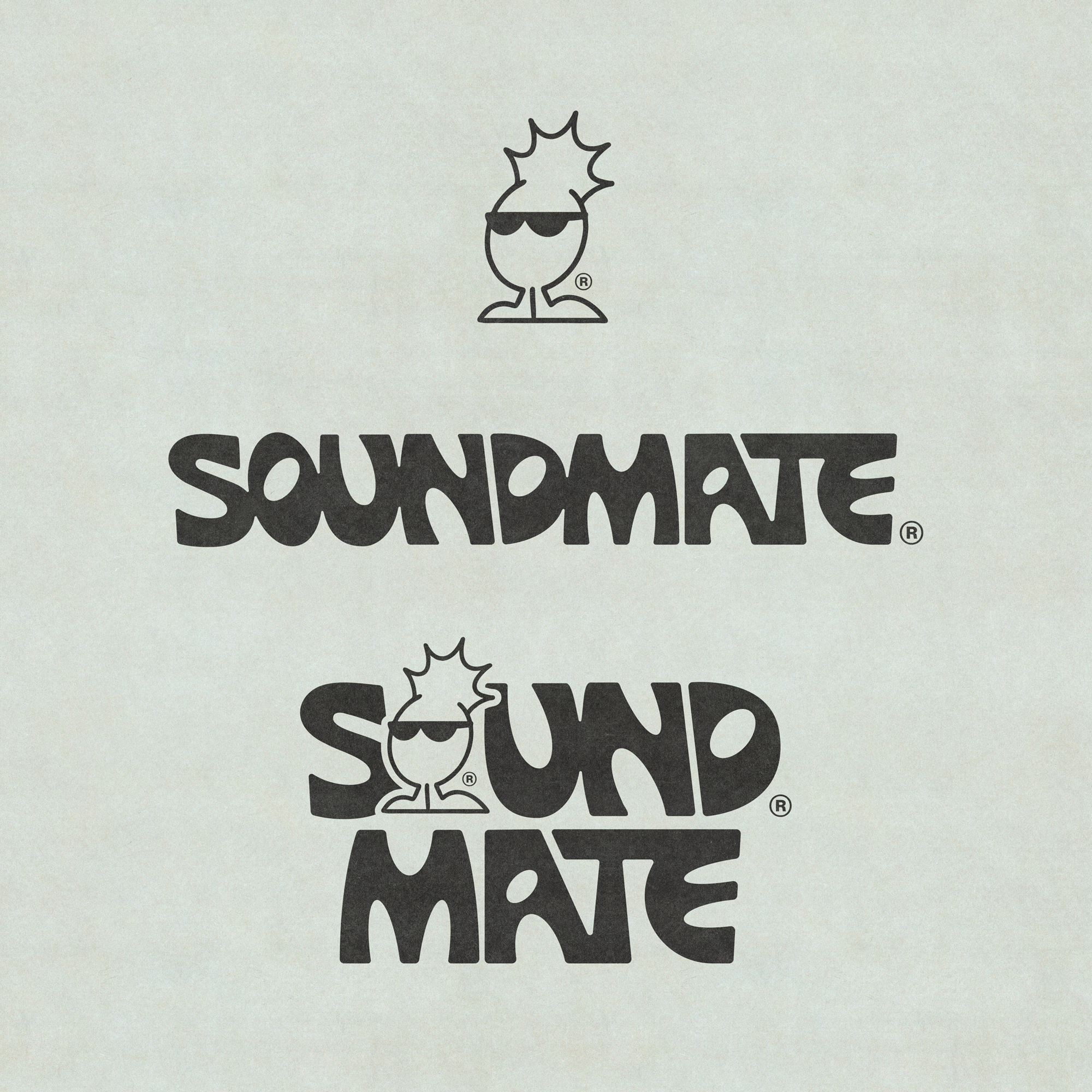
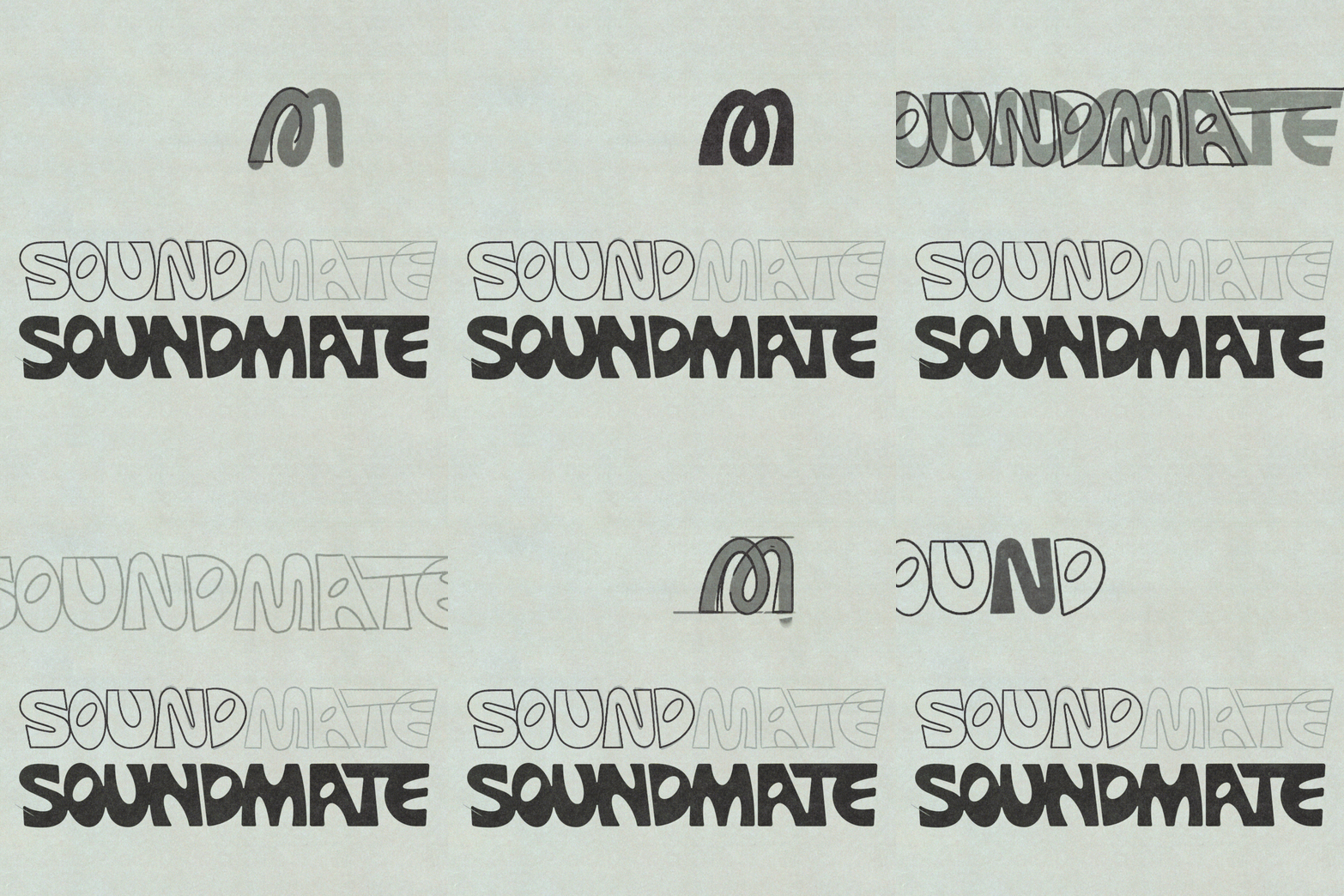
I began by manually drawing the new letters for Soundmate while simultaneously exploring ways to integrate the ellipse into the main icon.
For the pineapple, I simplified it as much as possible, giving it a cheekier expression with the glasses and the perspective of the feet. The most distinctive feature is the leaves, drawn with ellipses, creating a sense of explosion or electricity that ties it to electronic music.

the icon must be alive
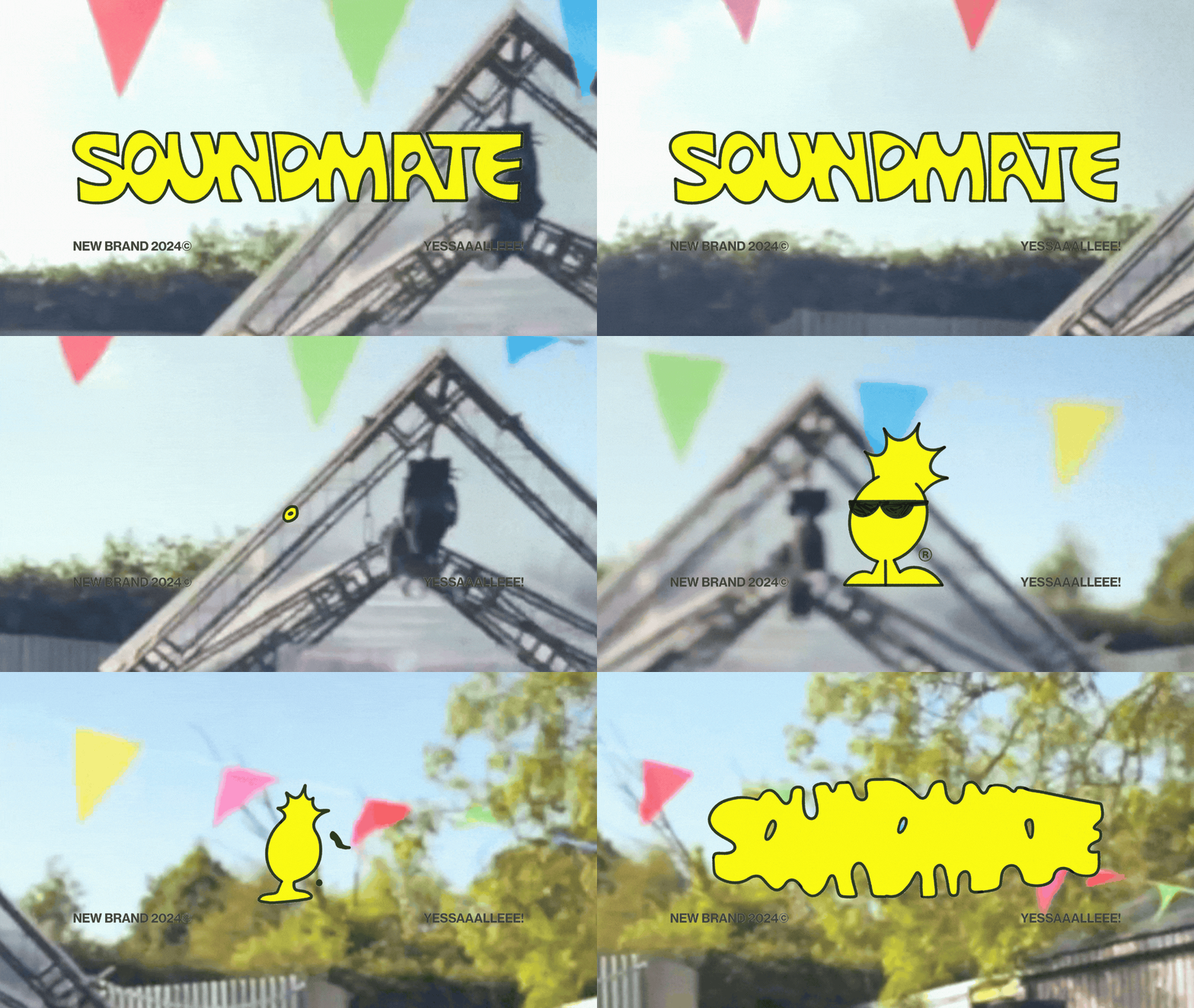
To give the brand more dynamism, I began to imagine our protagonist coming to life through animation and illustration.
color palette and typography
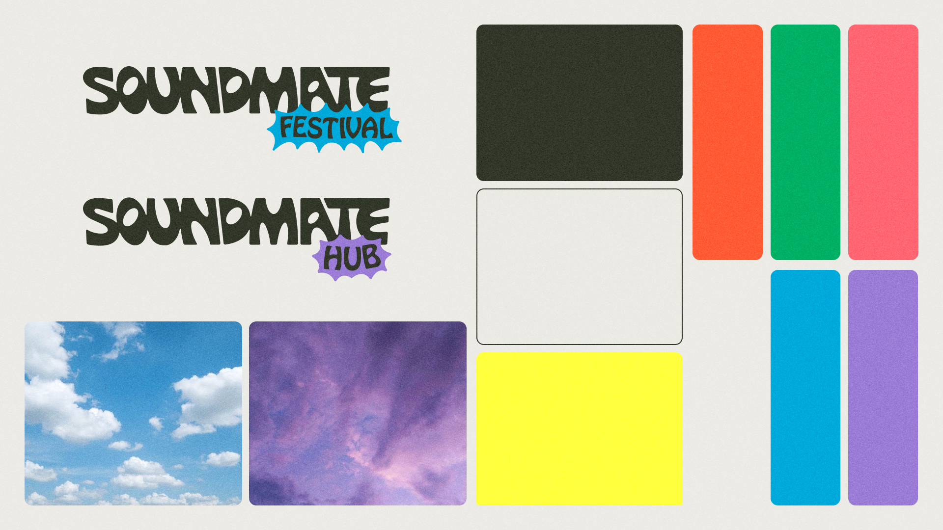
Regarding the colors, I needed variety to distinguish the different events covered by the brand. What better way than to draw inspiration from the original concept of the proposal? Thus, I used a fruit market as a reference to obtain the color palette. The primary color is the original yellow of the pineapple, but with more saturated tones to adapt it to digital formats.
As for the typography, I quickly thought of the iconic and playful Hobo Font, which shares similar shapes to the proposed logo. Since Hobo has a lot of personality, I decided to pair it with a versatile and easy-to-read grotesque typeface.

OFFLINE APPLICATIONS
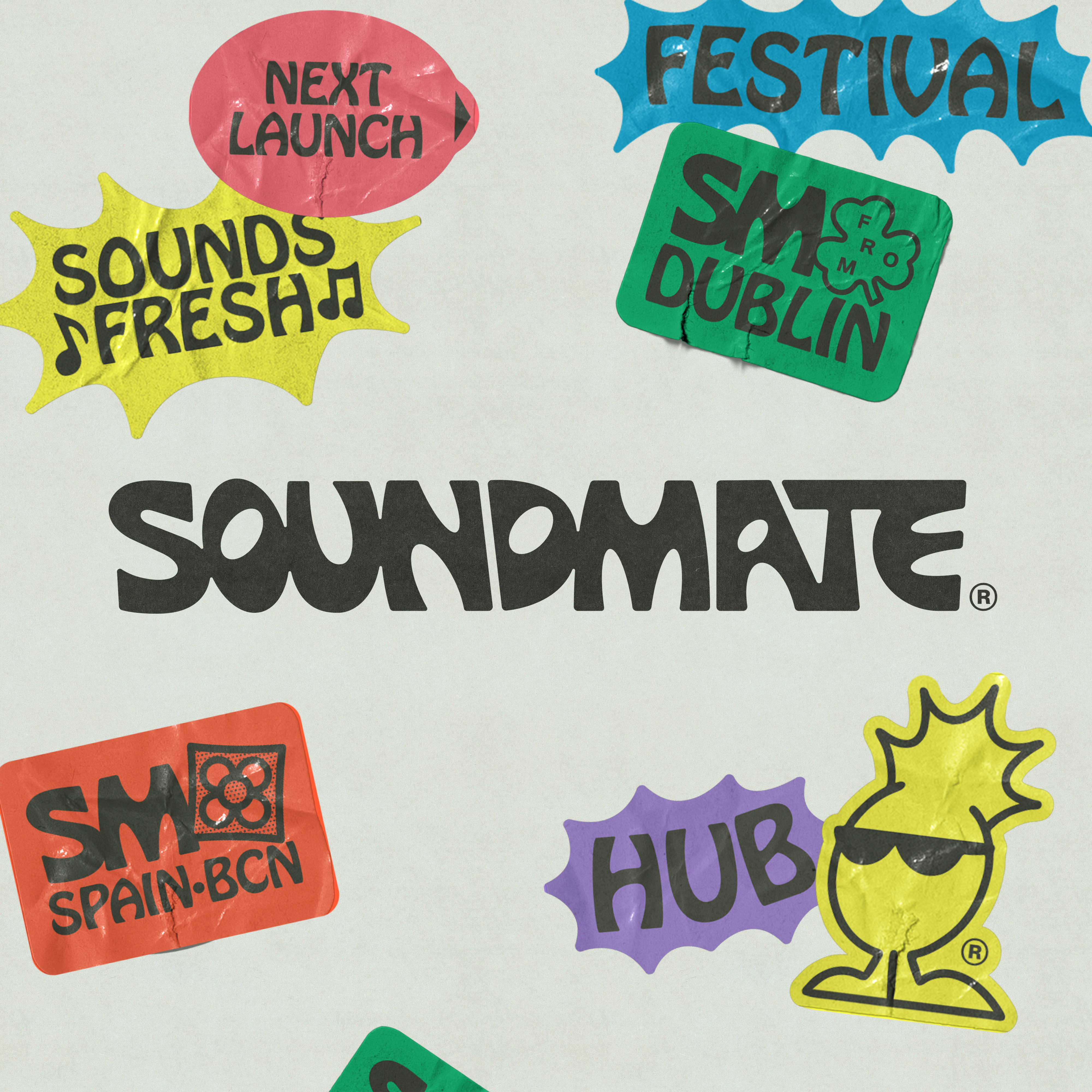
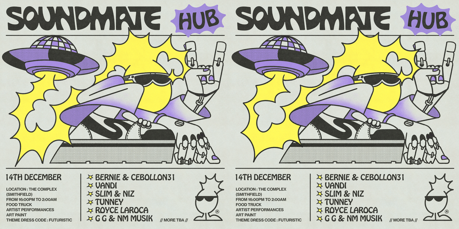
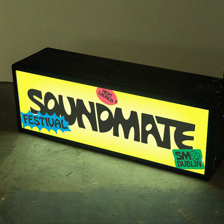
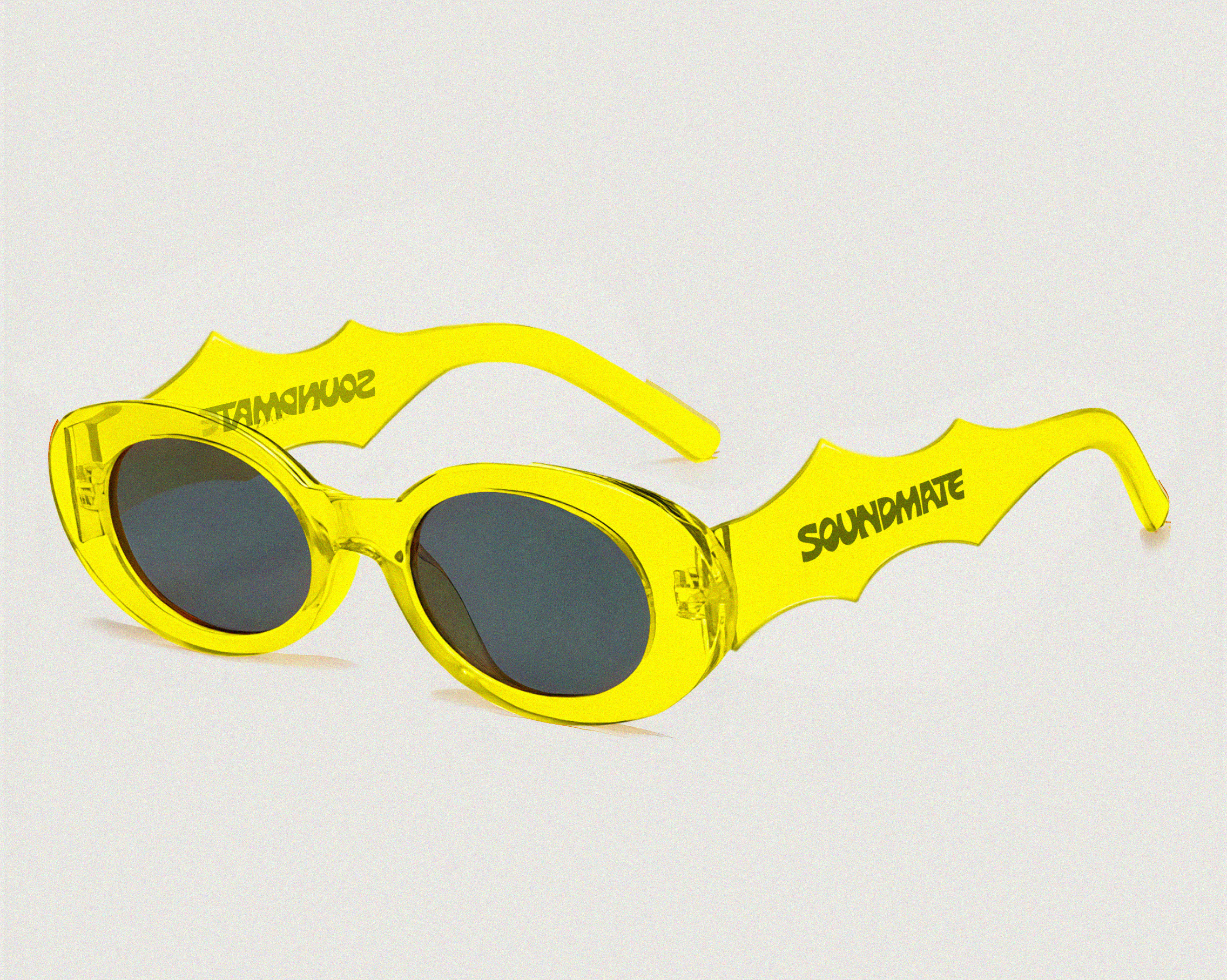
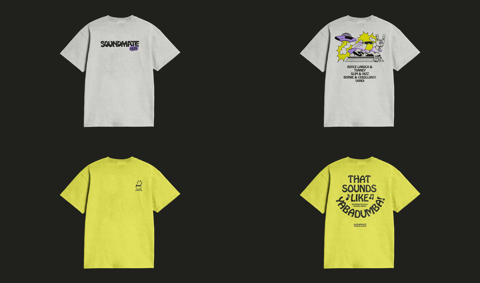
In the applications, we can see how this set of interconnected elements functions. Overall, we have achieved a dynamic, colorful, and fun brand that is linked to music.


SOCIAL MEDIA
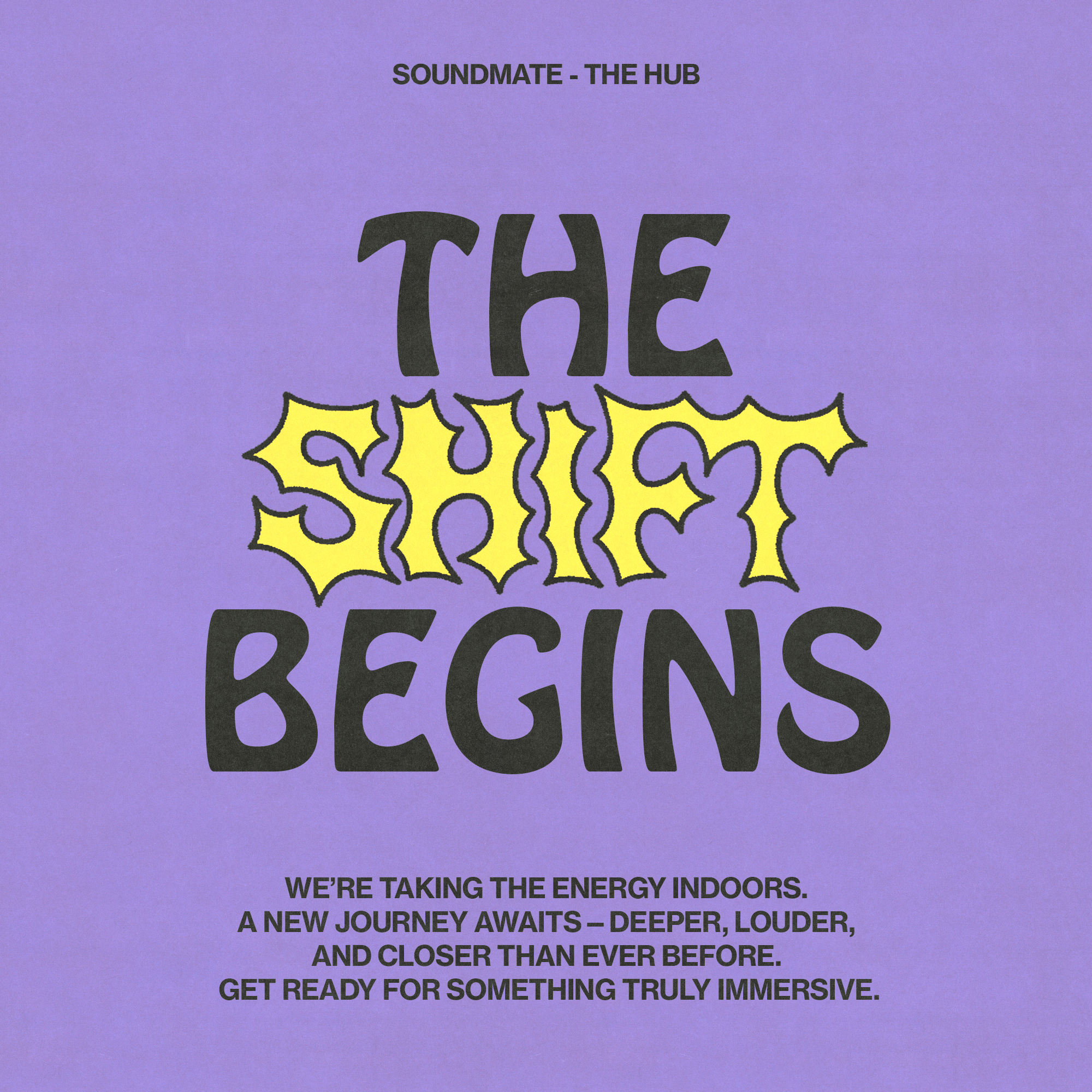
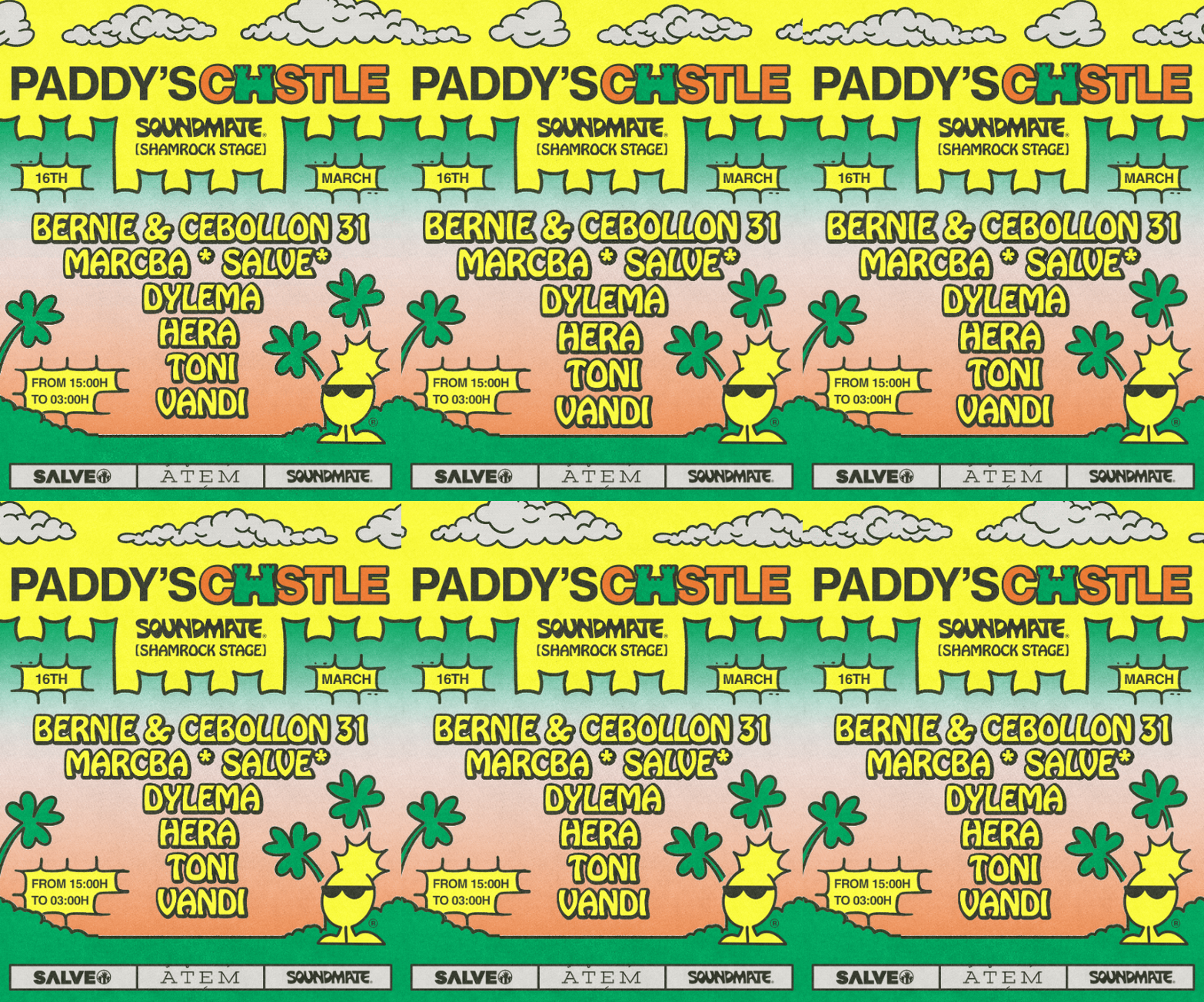
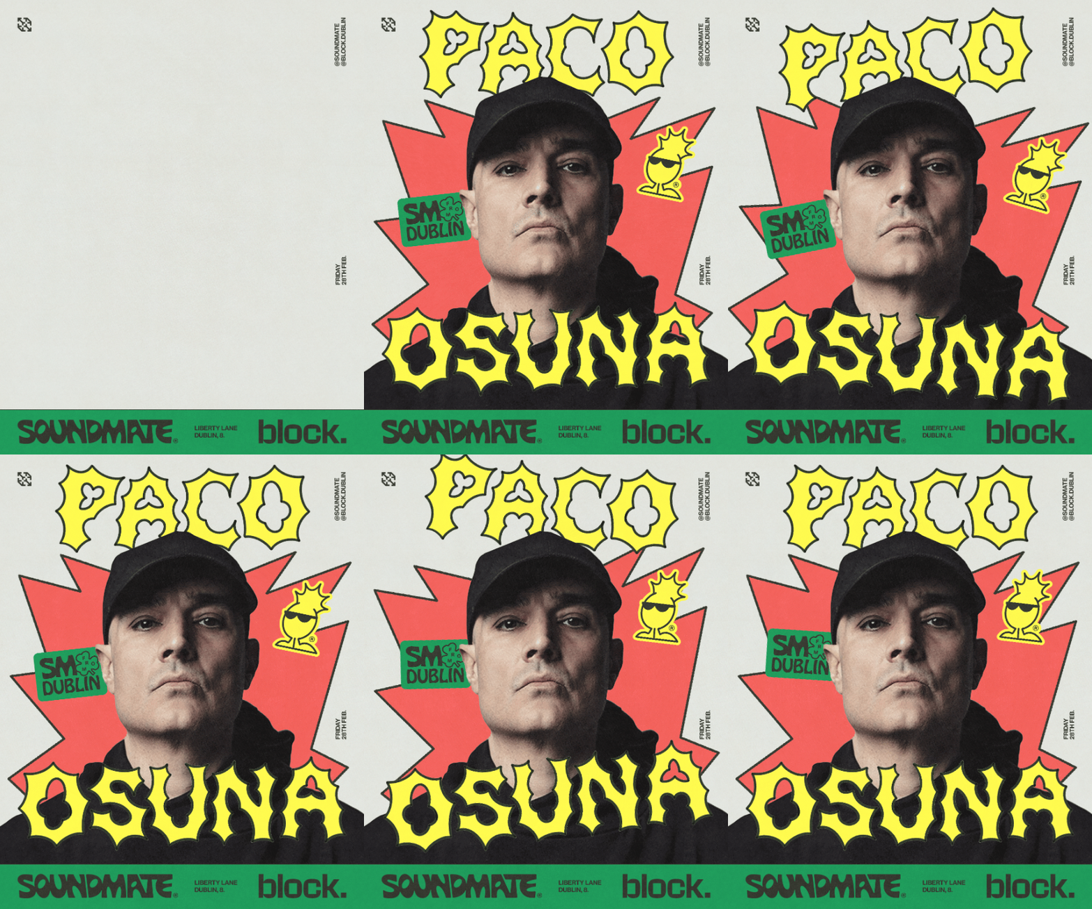
To announce the rebranding, I designed a communication strategy that worked wonderfully, resulting in a sold-out event promoted alongside the new brand launch. People showed a lot of support for the brand and felt that the new image accurately represented the festival's lifestyle.
