For this project, I had the opportunity to design the cover of an EP for a London-based music producer. I thoroughly enjoyed the project, using illustration, artificial intelligence, and creating a small identity for a figurative result inspired by 80s futuristic movies.

Creative process
In this short video, you can see how I combined layers and retouching to achieve the final result, using various digital art techniques.
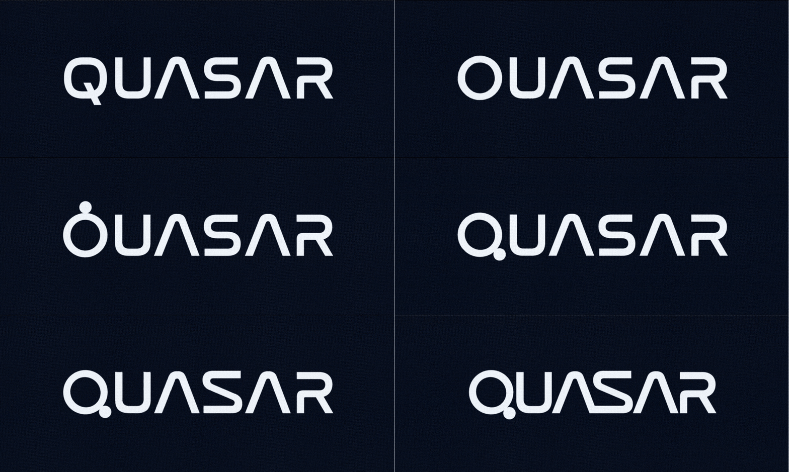
logotype
It's also interesting to see how we constructed the logo for the cover. The initial idea was to integrate the concept of a galaxy into the glyphs. So, we redesigned some of the letters from the base typography to make it more contemporary. The most significant change is in the Q, where the reference to planets is more evident.


