mama ly - branding
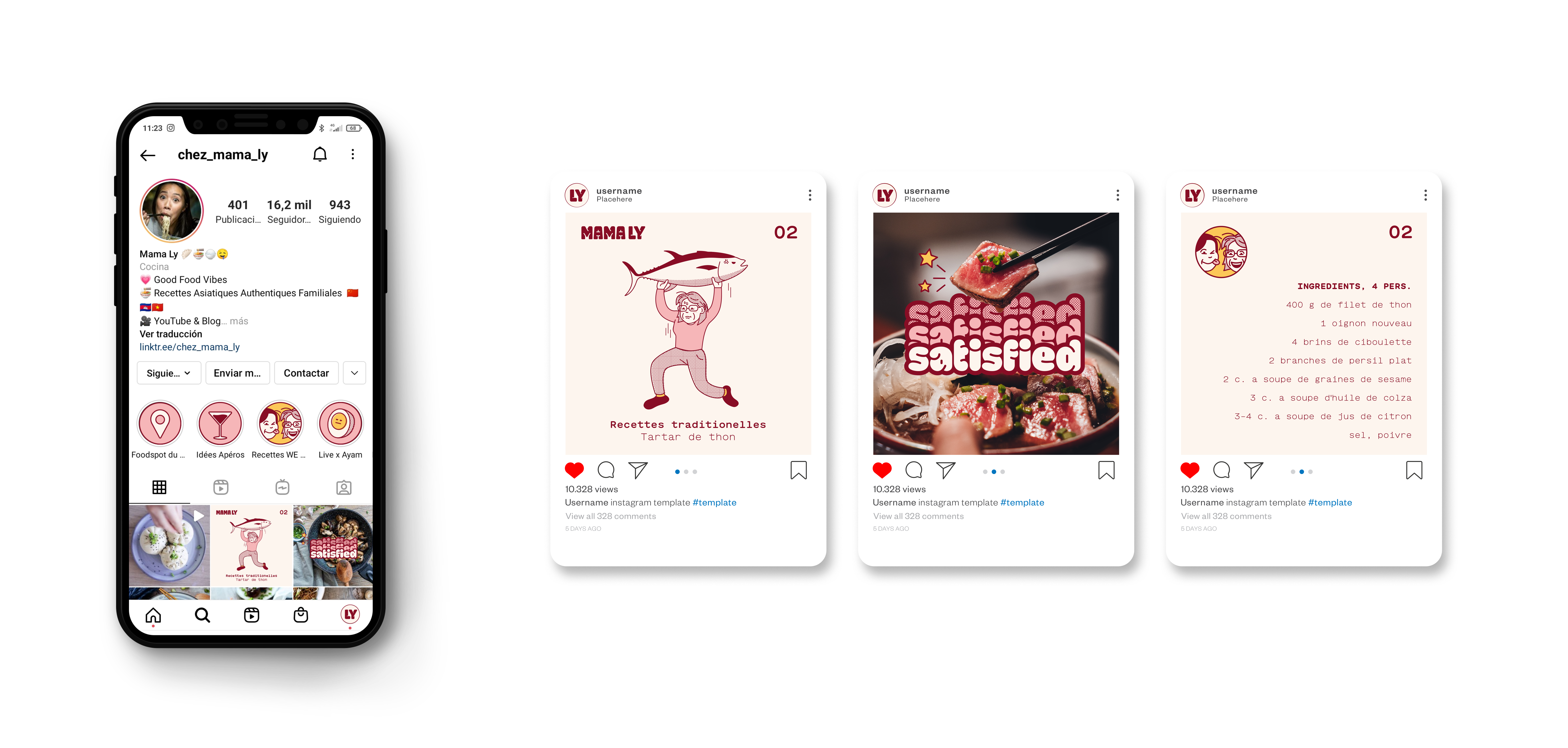
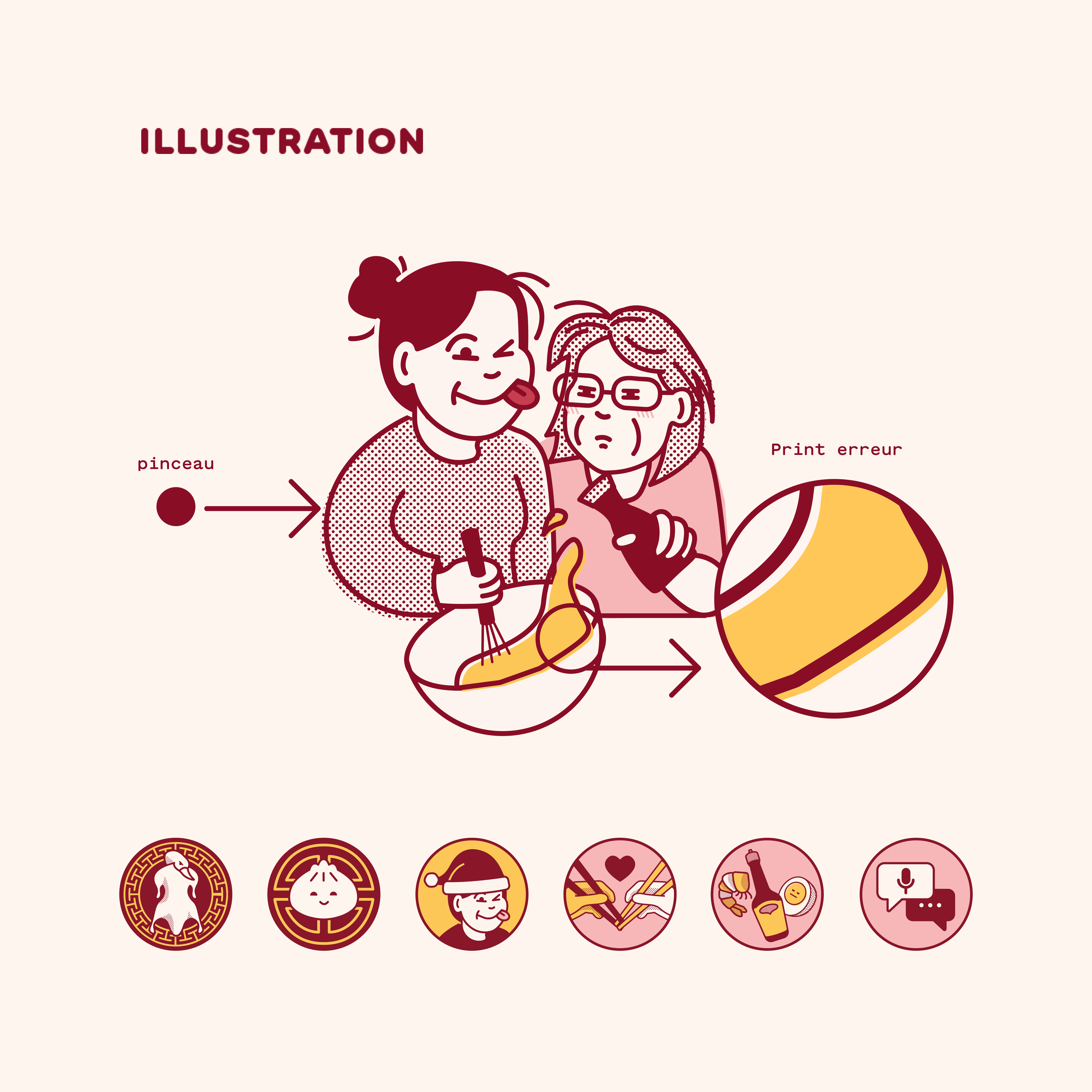
I was asked to design a new brand for Diana Chao. Diana is a french asian food influencer who contacted me to improve the status of their own brand. I analyzed their situation and observed that their audience was predominantly female and lovers of Asian cuisine, many of whom displayed a very friendly and cheerful personality on their social networks. For this reason, I was inspired by minimalist Japanese illustration and risography to create the graphic system.
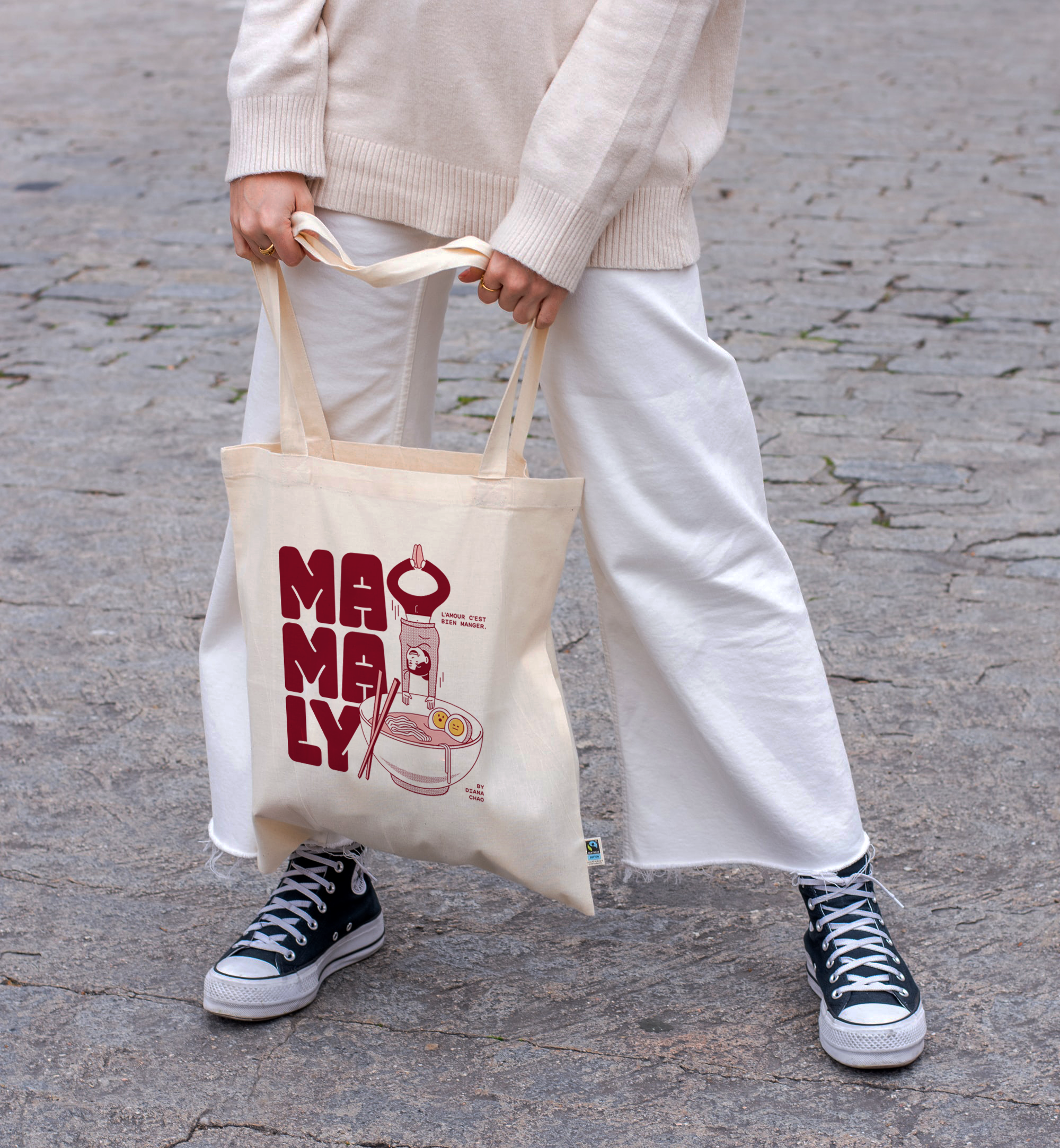
Simple, colorful and friendly
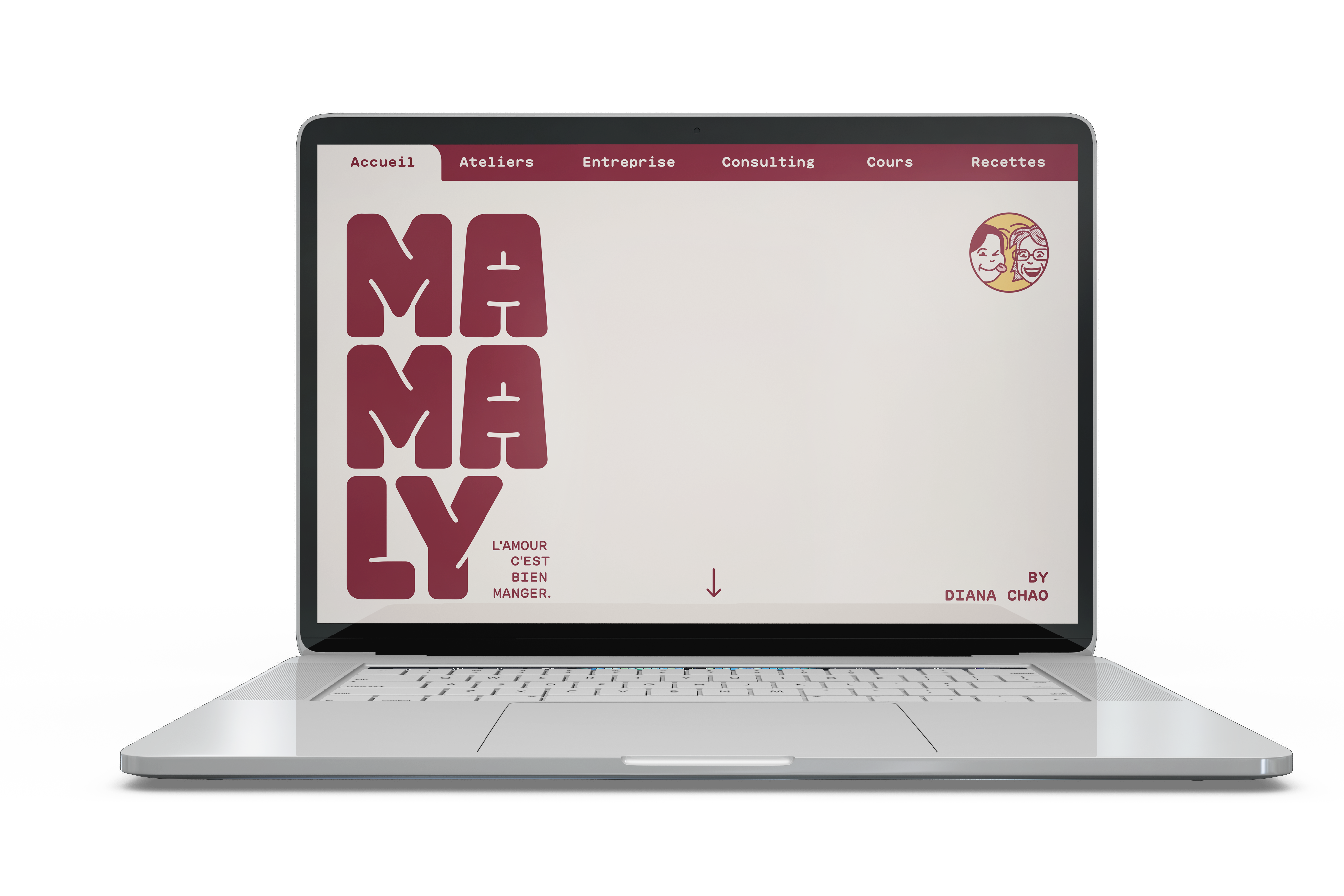
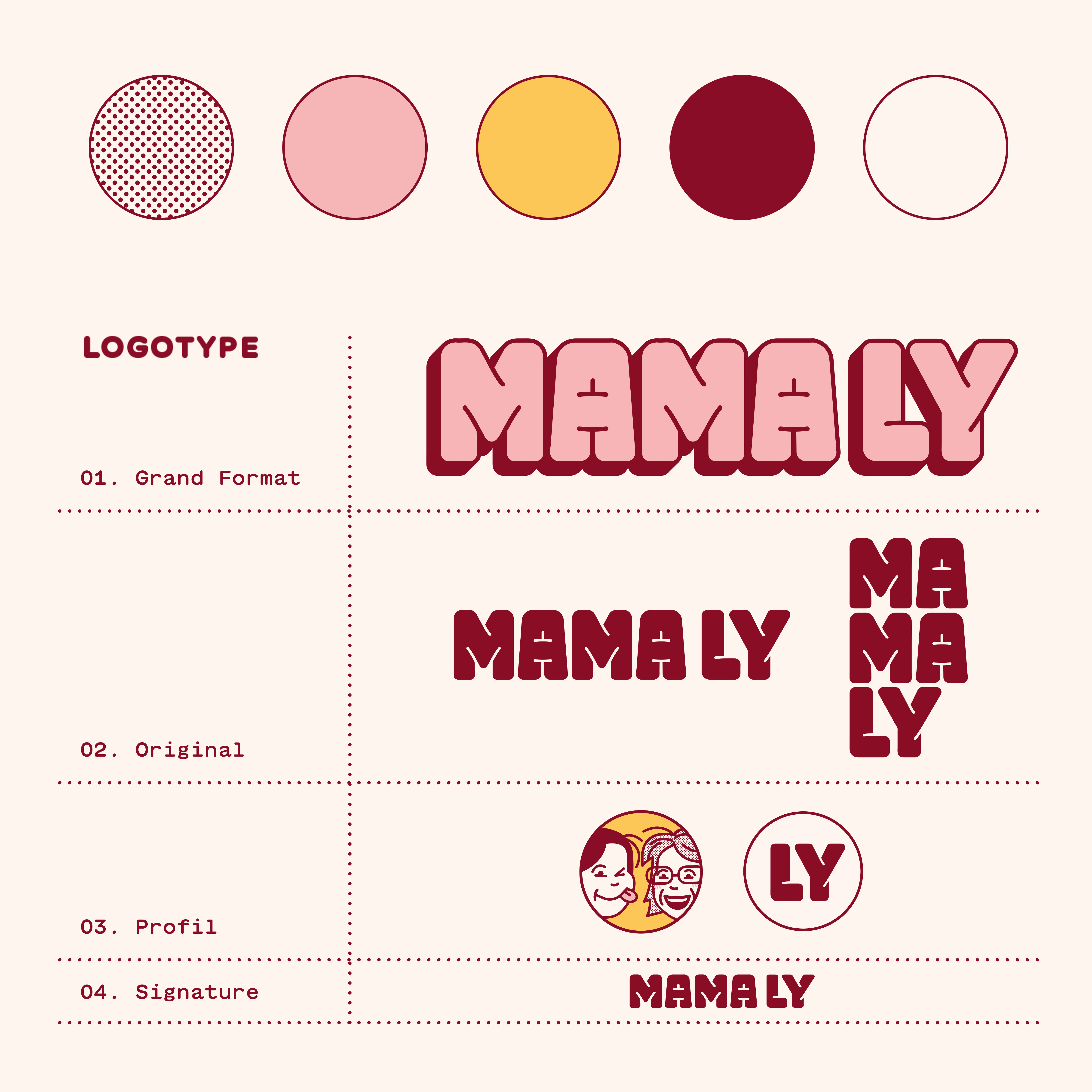
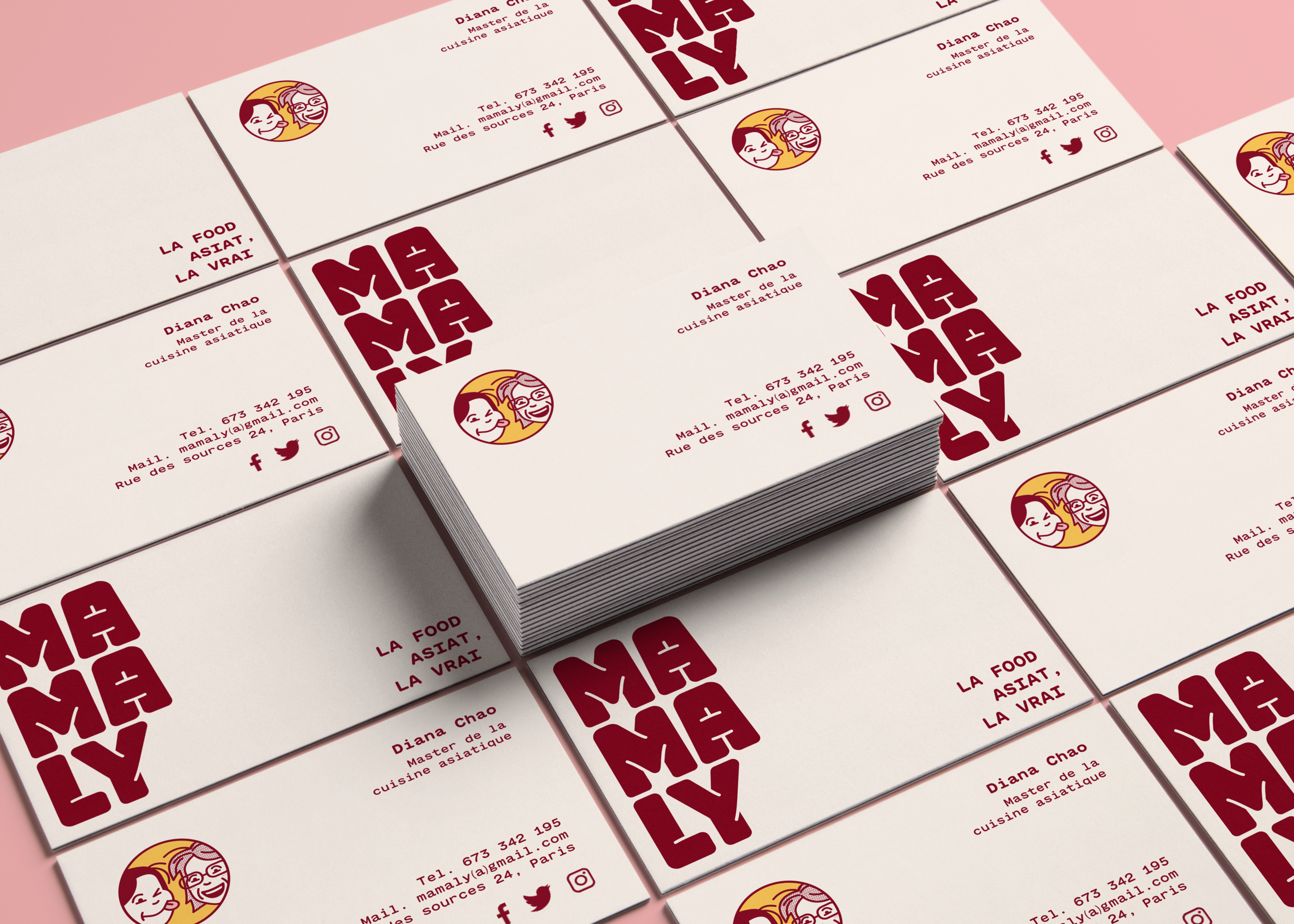
I built the logo from scratch, giving it an edible look with bold and rounded shapes. The logotype has different variations according to the format of the application, from the social media profiles to the smallest versions with bigger detail spaces on the shapes. The color palette is designed to convey femininity and a friendly appearance, considering that burgundy is the brand's main color due to its significance in Chinese culture. As for the compositions, the texts are right-aligned to give the whole a more oriental look.
asian pop style
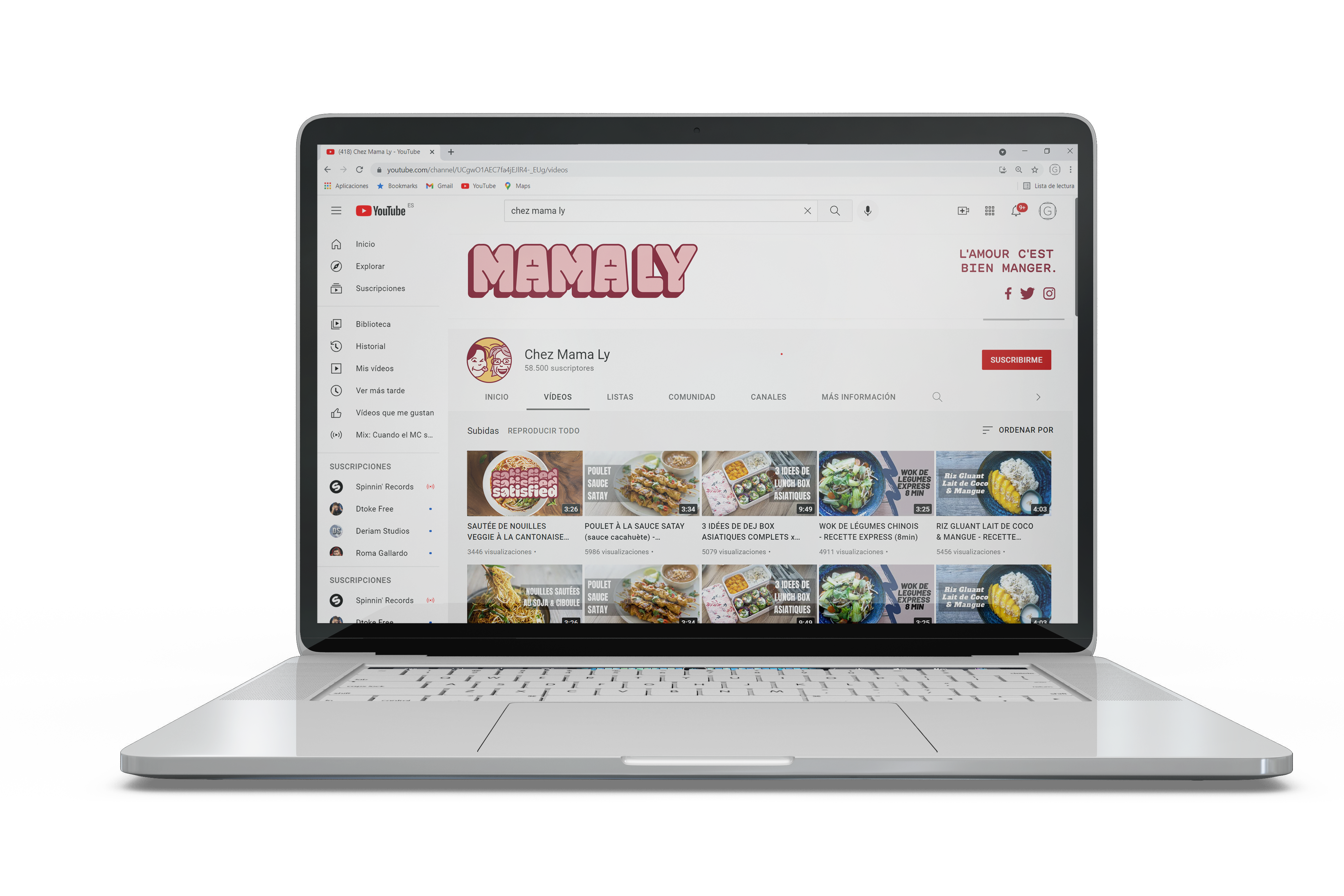
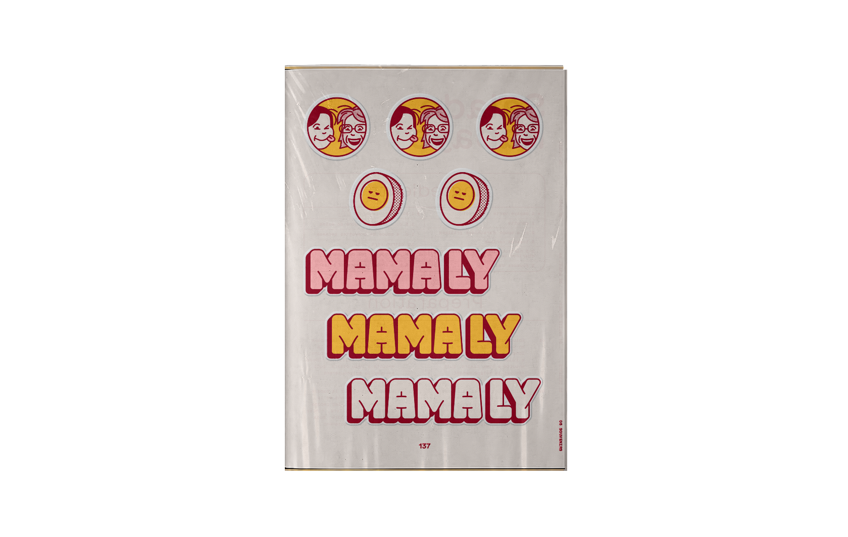
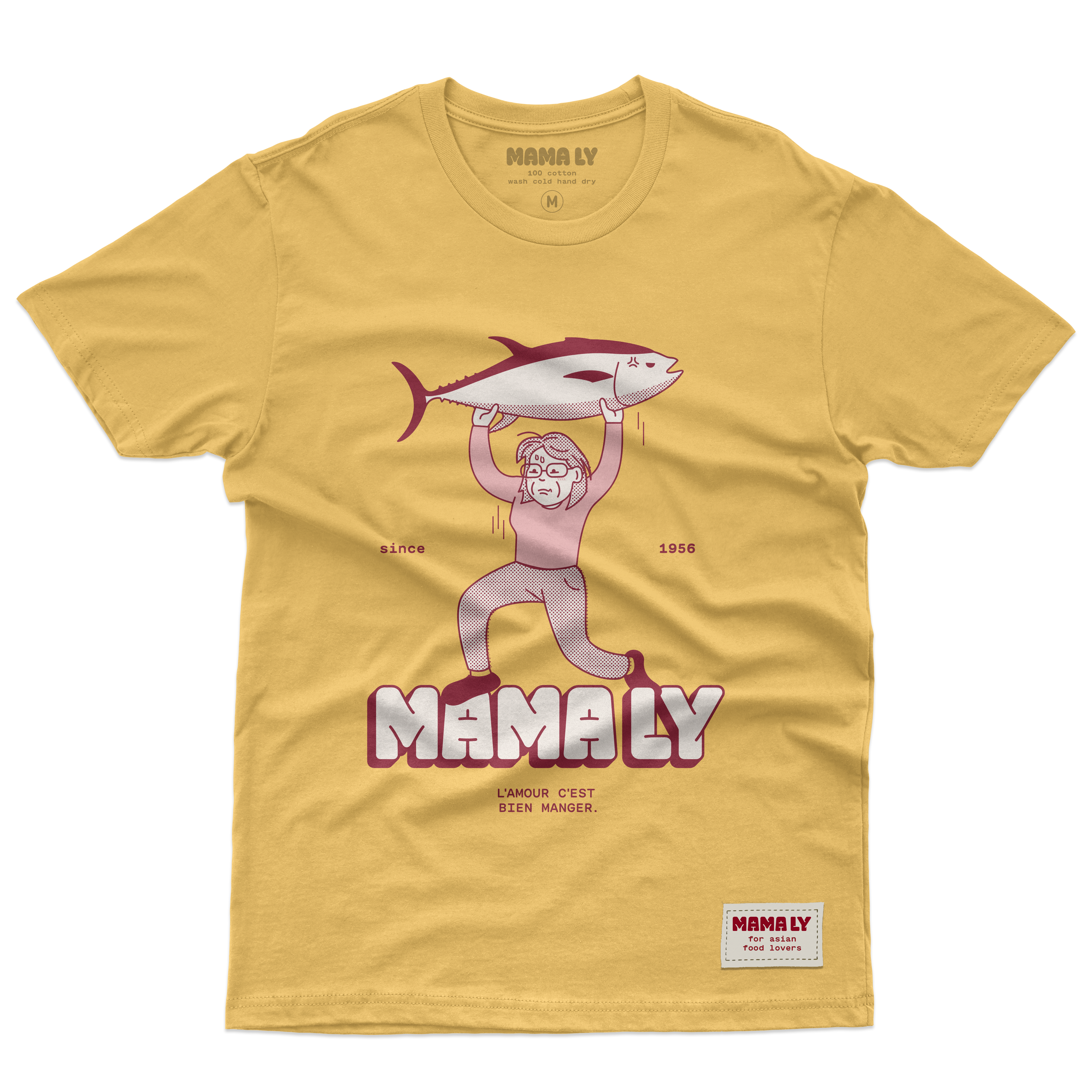
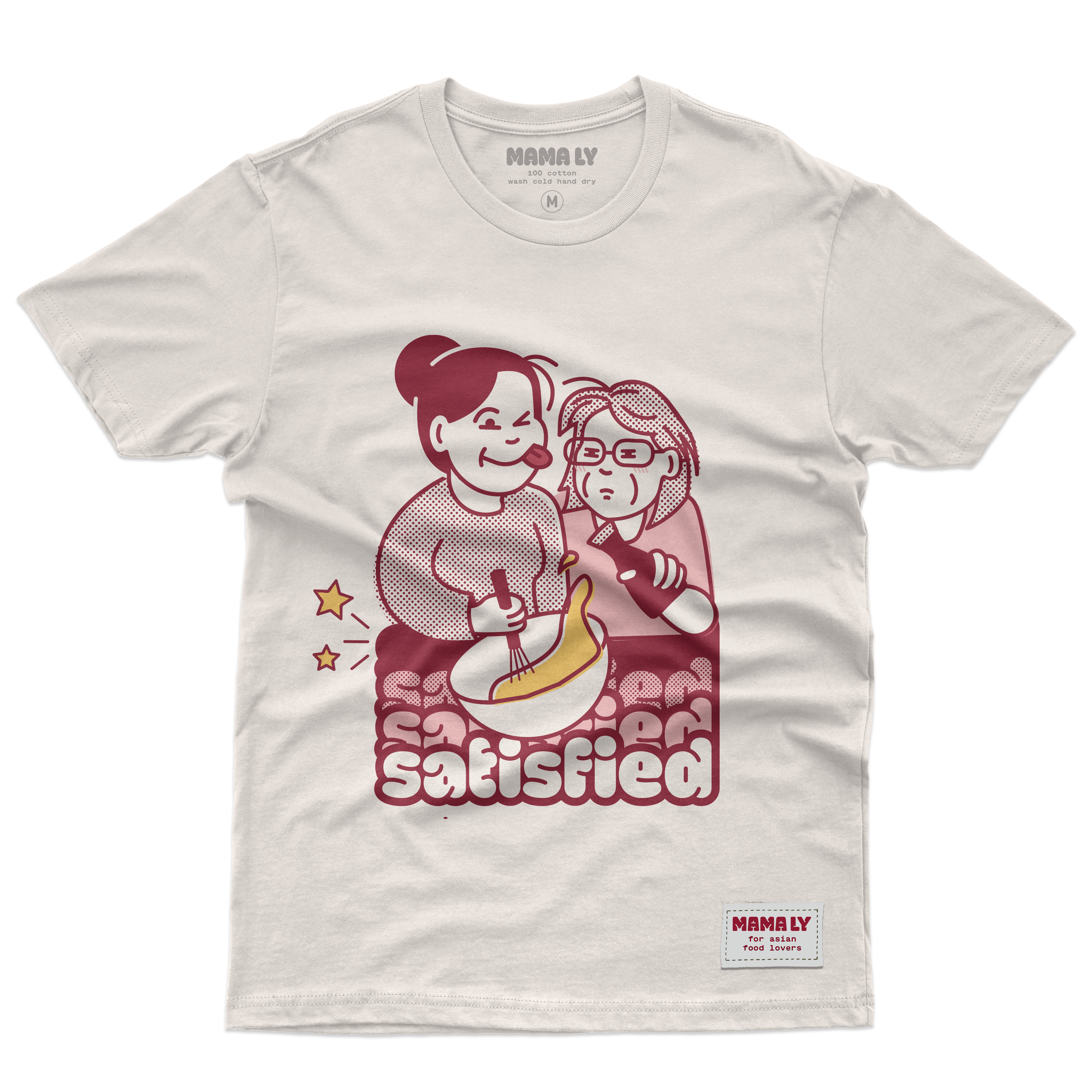
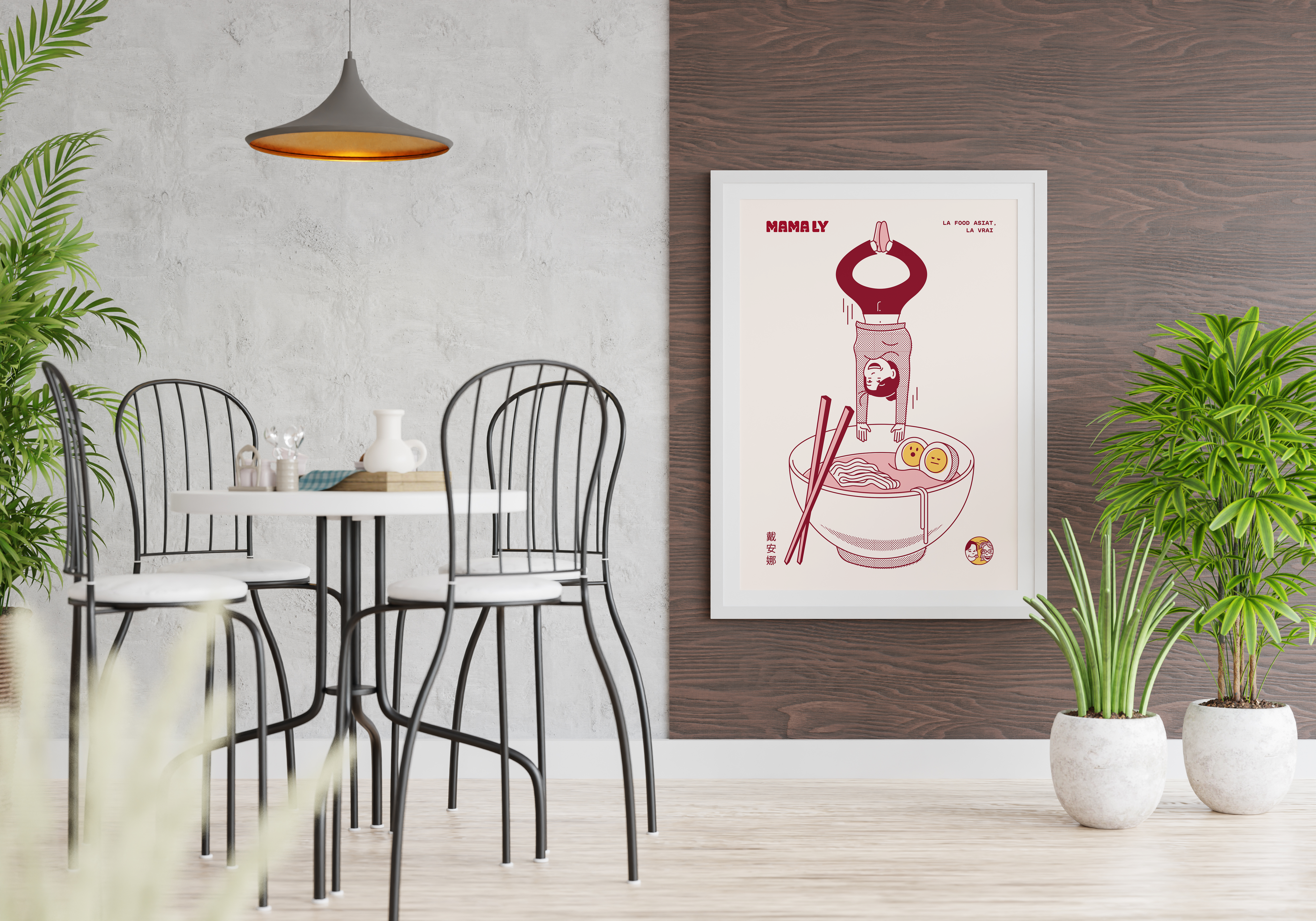
The set of resources gives a pop look closely linked to Asian culture. In the following applications, we can see how the illustrations work alongside the typographic compositions with GT Maru, a rounded monospaced typeface that works very well with the logo.
digital applications
