
🐻 ⛓️ Hola Bera NEW IDENTITY ✨
The first Spanish-speaking international event of Berachain —the most be(ary) cult— now has a face.I had the pleasure of developing a graphic identity that celebrates diversity—not only the variety of collections orbiting the Berachain ecosystem but also the vibrant Spanish-speaking community that drives it.
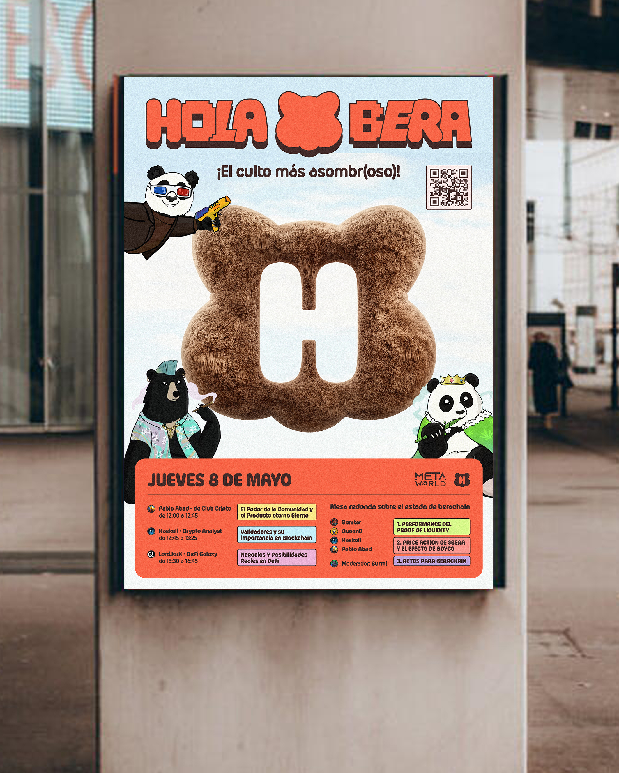
The concept is built around a dynamic typeface where each letter represents a different voice. A visual mix that expresses plurality, energy, and character—just like our community.

Berachain is an innovative Layer 1 blockchain built using the Cosmos SDK, fully compatible with the Ethereum Virtual Machine (EVM). It introduces a unique consensus model called Proof of Liquidity (PoL), designed to align incentives between validators, users, and decentralized applications by allowing liquidity providers to participate directly in network security and governance.
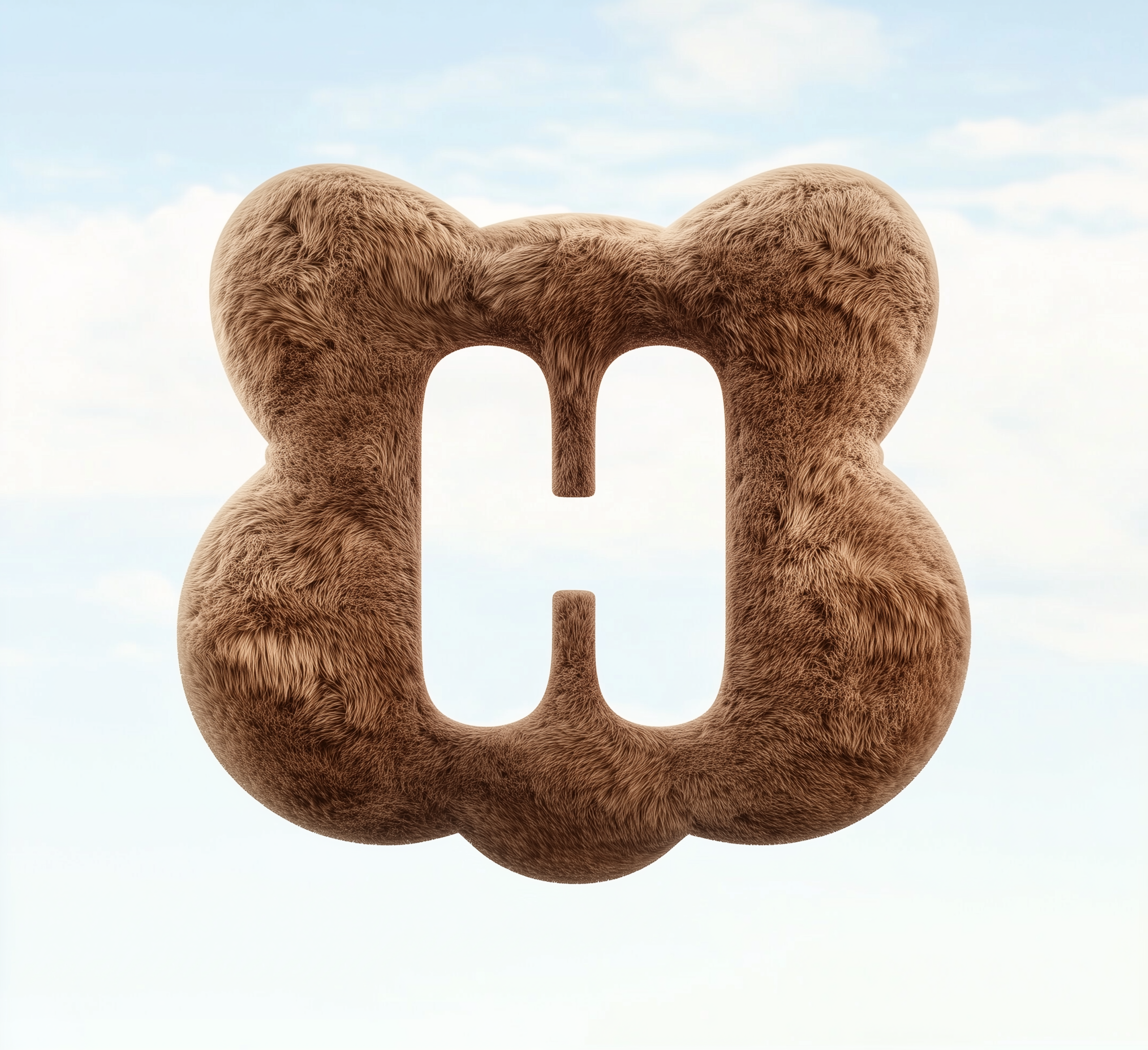
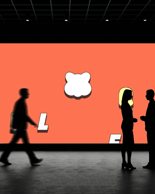
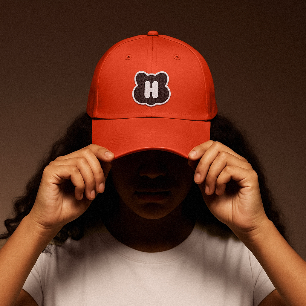
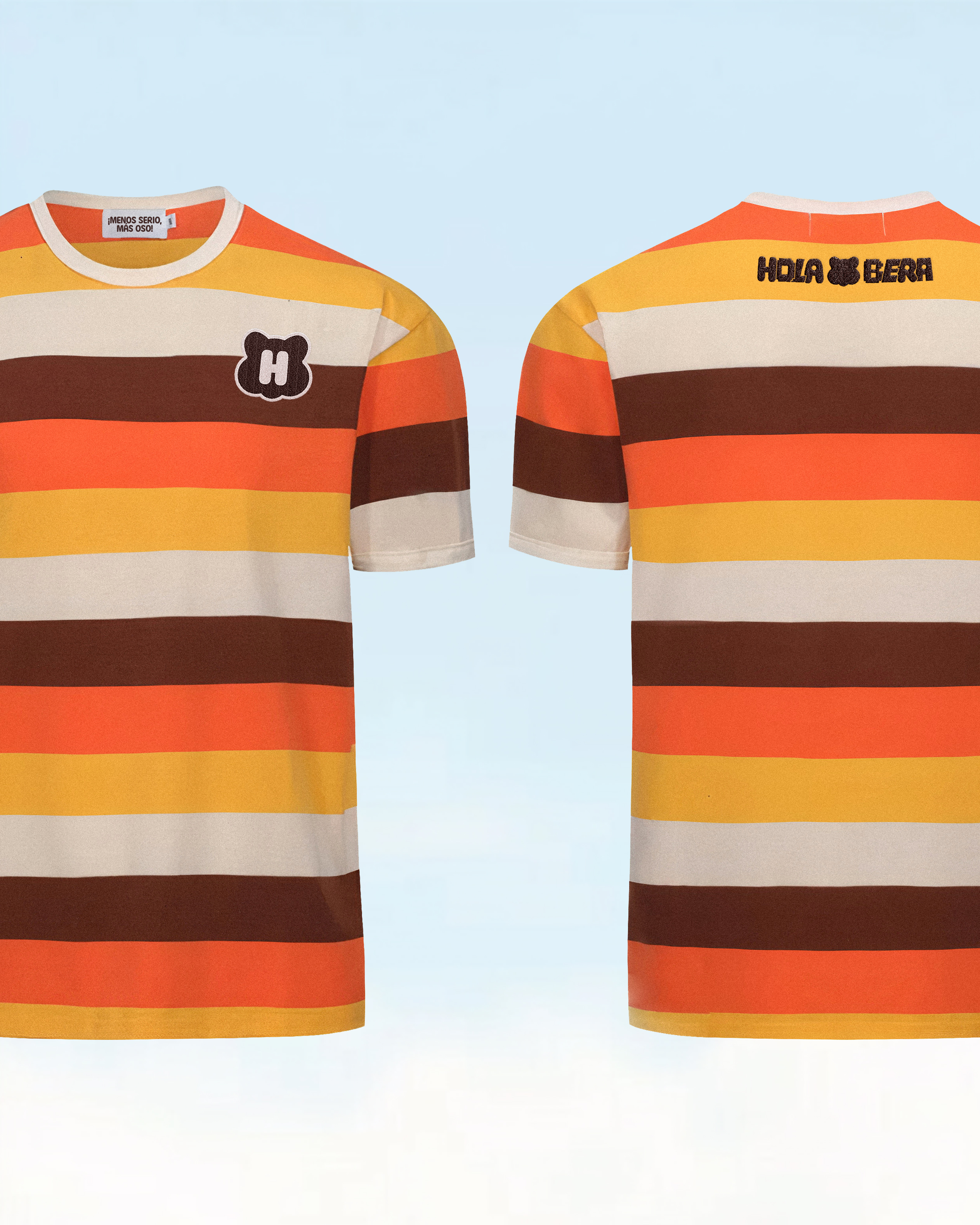
My work focused on preserving Berachain’s iconic meme-driven aesthetic centered around the bear, while adapting it to the context of a Spanish-speaking event. The first step was to integrate the letter H into Berachain’s original logo, creating a bold icon that remains true to its roots while connecting it directly to the Spanish-speaking community.
My work focused on preserving Berachain’s iconic meme-driven aesthetic centered around the bear, while adapting it to the context of a Spanish-speaking event. The first step was to integrate the letter H into Berachain’s original logo, creating a bold icon that remains true to its roots while connecting it directly to the Spanish-speaking community.

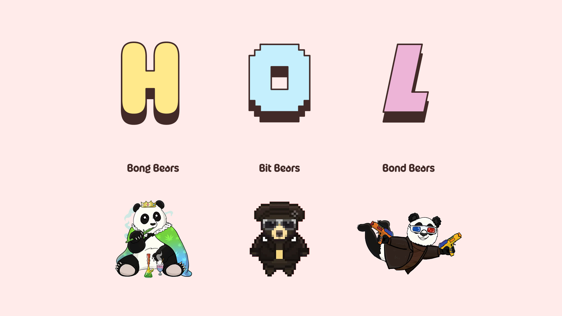
DIVERSITY AS MAIN VALUE
To reflect that sense of diversity—both in the various NFTs that represent Berachain and in the Spanish-speaking community—I designed a logotype with custom-modified letters, each portraying different bear-inspired situations.
This approach allowed the identity to feel playful, plural, and closely tied to the universe of Berachain.
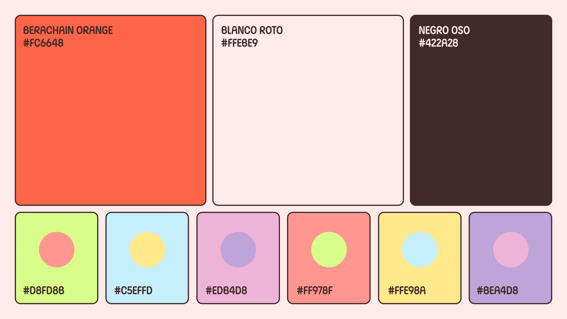
Additionally, I developed a varied, friendly, and colorful palette to emphasize both diversity and fun.
The vibrant tones help reinforce the playful spirit of the event while reflecting the richness of the community.

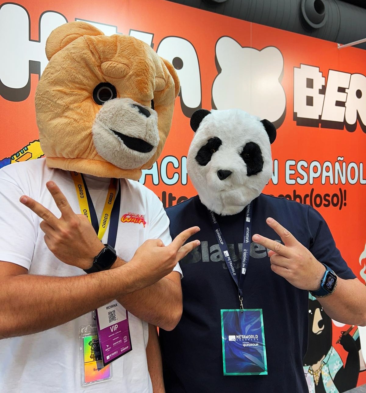
The magic is in the bears
The entire proposal had to coexist with the iconic bears from Berachain’s original branding.
Therefore, every designed and selected asset was strategically crafted to seamlessly share space with the brand’s signature bears, ensuring visual harmony and brand consistency throughout all applications.

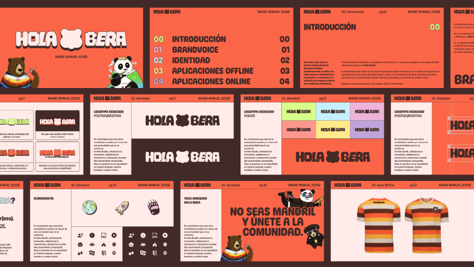
YOU NEED A BRAND MANUAL
I never imagined a branding project could come together in such a short time...
The client approached me with only two weeks to go before the event, urgently needing a logo to present themselves.
To ensure they wouldn’t find themselves in such a situation again, I also created a brand manual—a practical guide designed to help them apply the brand consistently, even in fast-paced or high-pressure scenarios.
AND THE CLIENT WAS SATISFIED...