DELTIS - TOKENIZING WHAT MATTERS
Deltis is a brand identity project aimed at introducing a new, younger audience to the world of blockchain, creating a more democratic and accessible business model within the Web3 space.

NAMING AND CONCEPT
The name Deltis originates from the Greek letter Delta. I chose this direction because the delta symbol takes the shape of an upward pointing arrow and a triangle, the most stable and solid geometric form. This symbolism was essential to convey trust and reliability, especially in the emerging and often misunderstood world of tokenization, where many still feel uncertain.
The goal of the brand was not only to connect with a younger audience and make blockchain feel more appealing and contemporary, but also to communicate a sense of strength, security, and institutional credibility, almost like a modern digital bank.
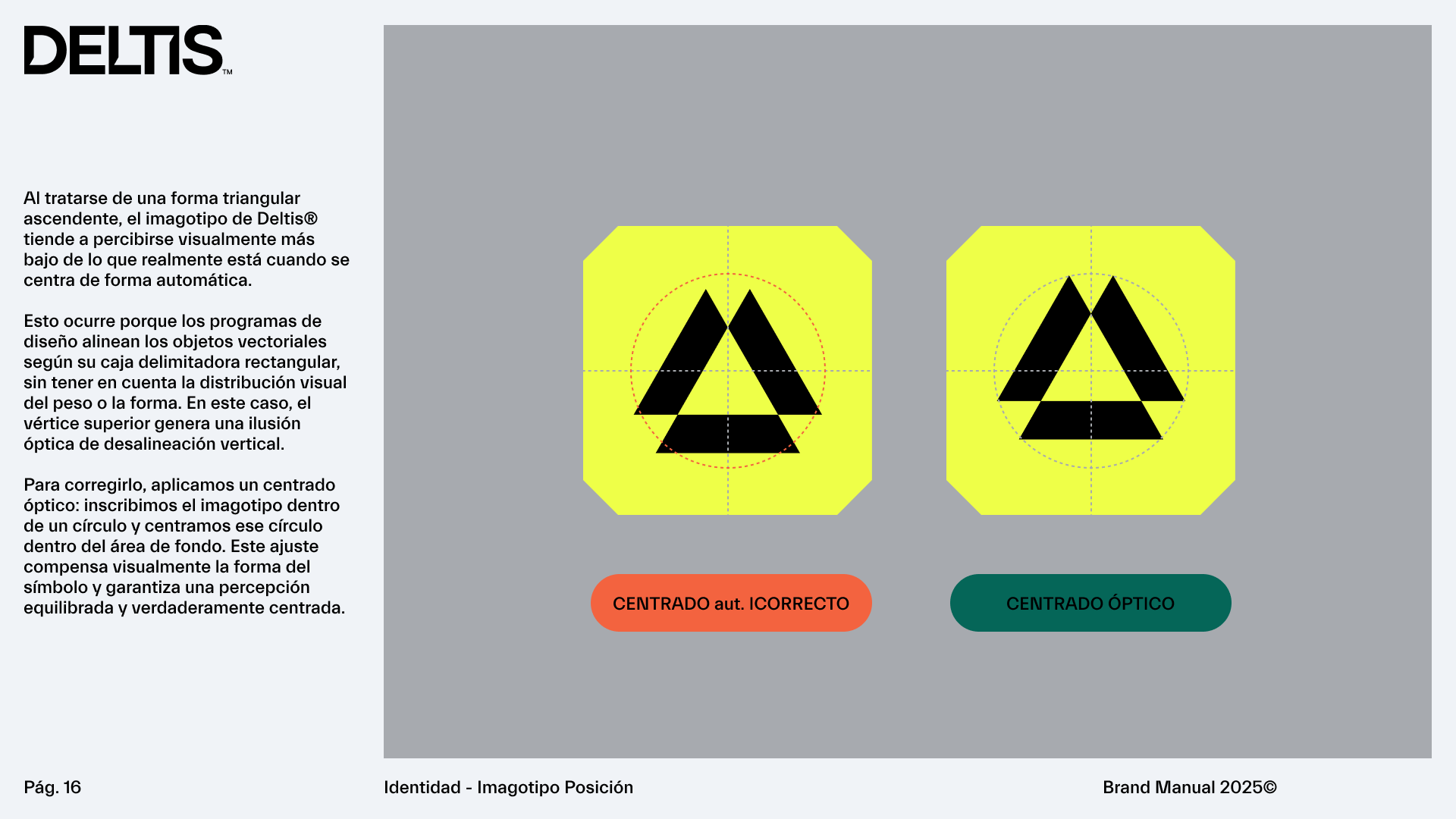
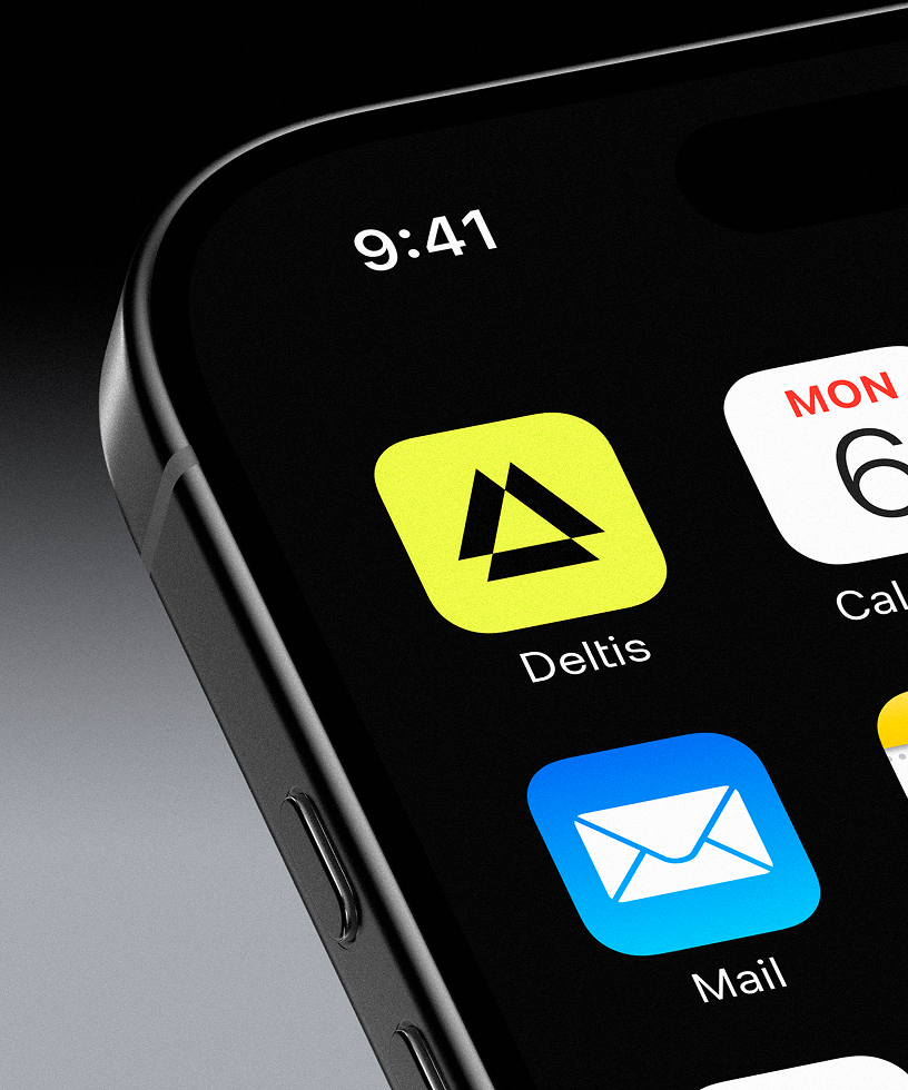
That is why the triangle became the foundation of the visual identity. And since Deltis suggests a plural form, multiple deltas rather than just one, the logo was constructed using three interlocking triangles, reinforcing the idea of balance, unity, and stability.


NAMING AND CONCEPT
The name Deltis originates from the Greek letter Delta. I chose this direction because the delta symbol takes the shape of an upward pointing arrow and a triangle, the most stable and solid geometric form. This symbolism was essential to convey trust and reliability, especially in the emerging and often misunderstood world of tokenization, where many still feel uncertain.

GRAPHIC SYSTEM
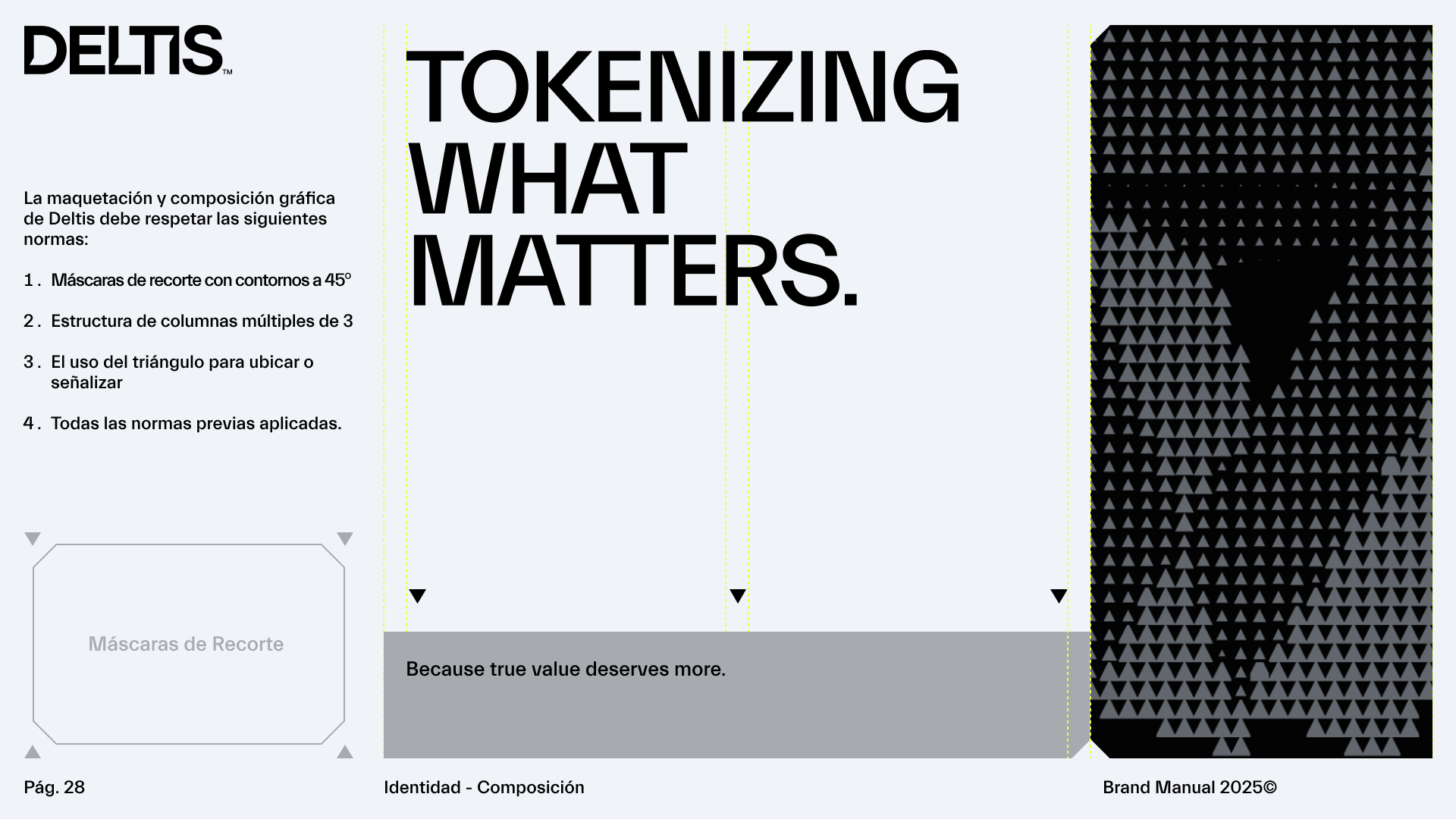
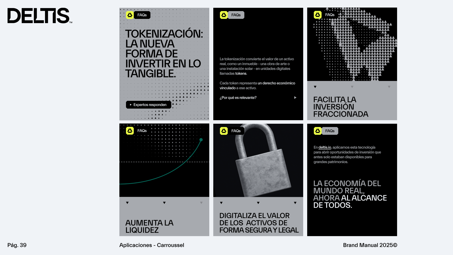
The graphic system is built around the triangle, used as the foundation to create grids, patterns, visual elements, and supporting resources.
The typographic approach is deliberately simple. We use Lausanne as the sole typeface, chosen for its sharp angles, clarity, and structural solidity, which align perfectly with the brand’s geometric concept and tone of confidence.
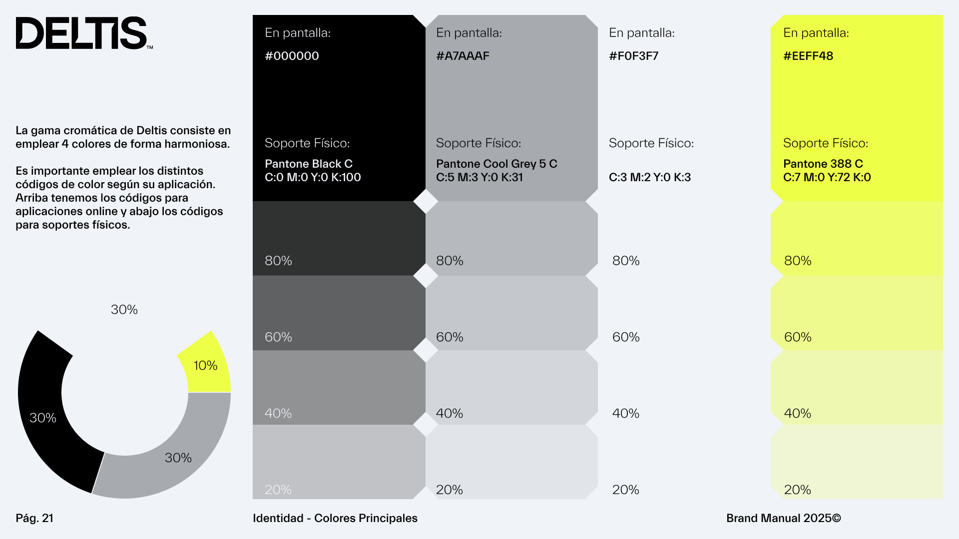
For the color palette, we introduced a vibrant yellow to stand out against the predominantly blue tones of competitors, giving the brand a stronger visual presence and a more striking, contemporary identity.



BRAND MANUAL
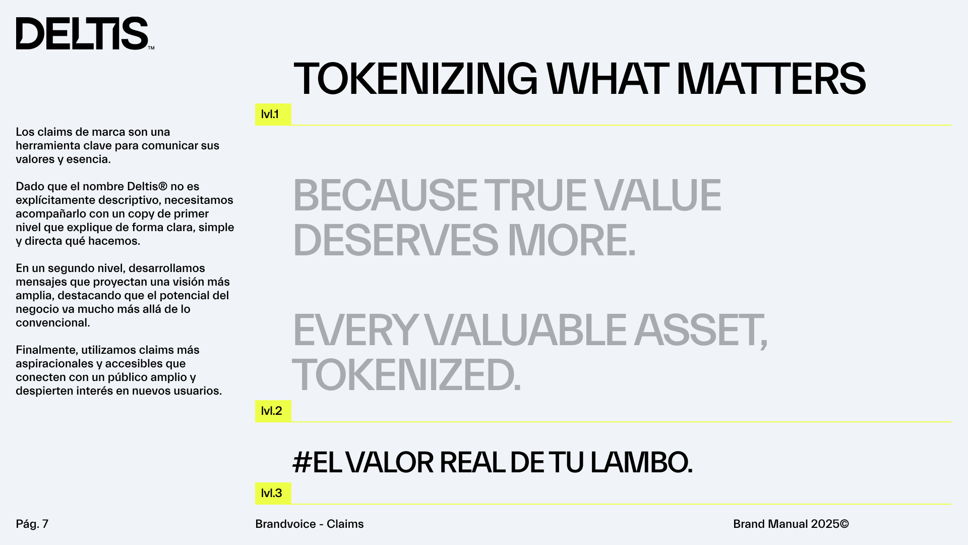
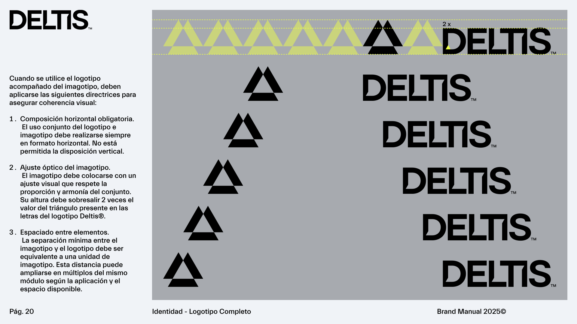
A complete brand identity manual was developed, including the brand voice to connect with this new audience. It also features all graphic resources with precise usage guidelines to ensure consistency, strength, and coherence across every brand application.
Here you can see many of the brand manual pages:
