


butzi - his new era
Butzi is a keynote speaker, trainer, and AI expert whose professional evolution has been unfolding alongside his former identity.
This rebranding project aims to reflect that evolution by expressing the values that now define him: magic, artificial intelligence, and creativity, brought together into a single, coherent personal brand.

FROM THE BULB TO THE ABSTRACT LIGHT
The core concept of the brand is based on the evolution of its original symbol: the light bulb.
The light bulb is traditionally associated, metaphorically, with light, ideas, and intelligence.
The challenge, therefore, was to rethink what a light bulb looks like in 2025.
Artificial intelligence, creativity, and magic are all deeply connected to the idea of light. However, the traditional light bulb no longer represents how light is experienced or used today.
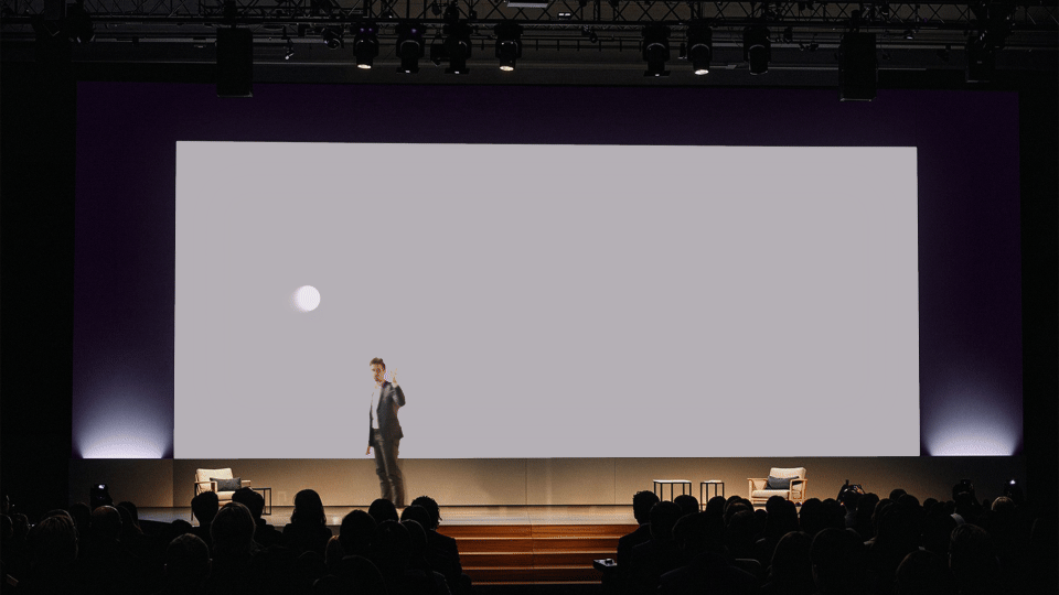
Staying true to the same conceptual foundation, we continue to use light as a metaphor, but expressed through a simpler and more contemporary form: a circle.
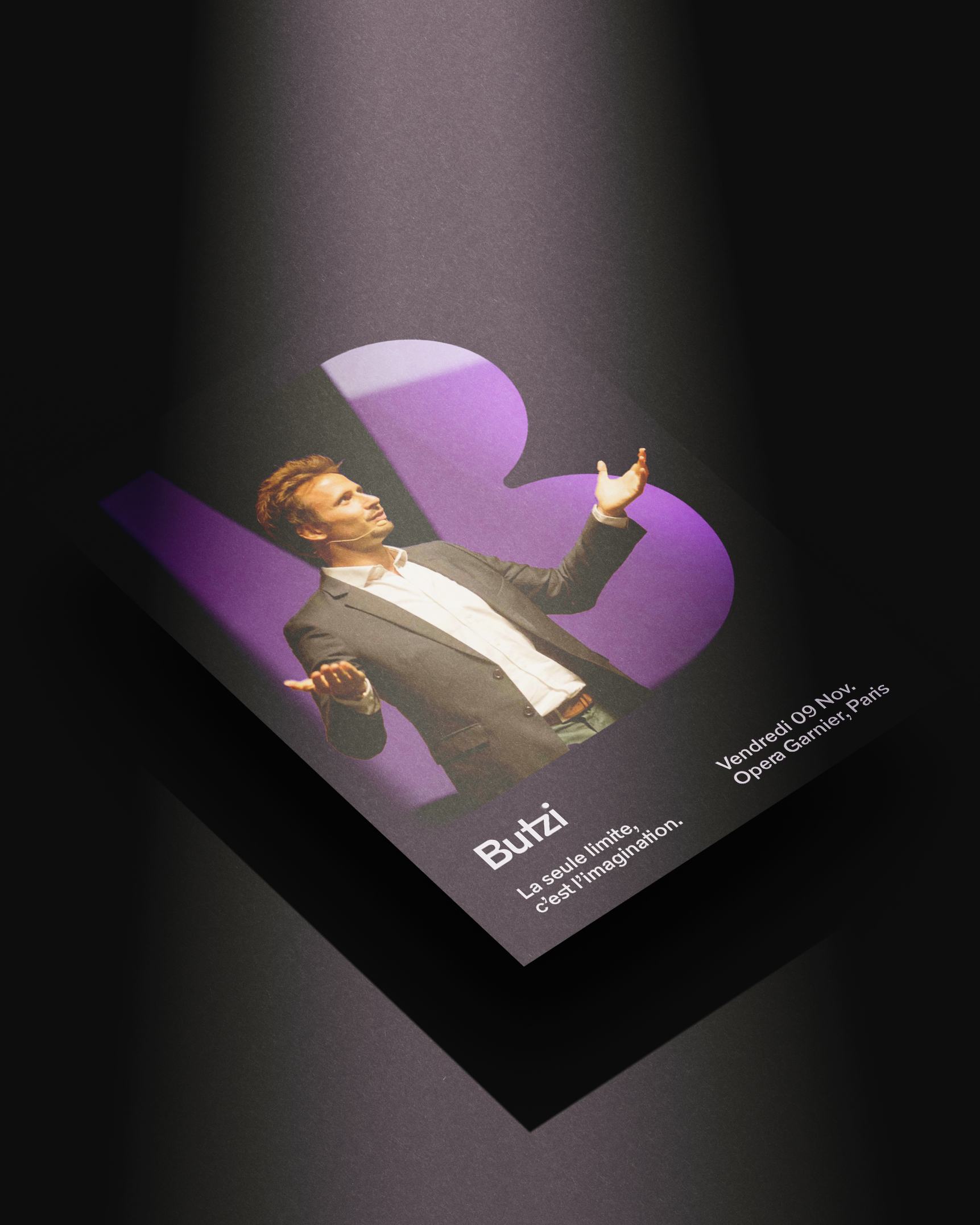
This circle of light becomes a constant presence throughout the brand. It reveals and conceals elements, punctuates the “i” in “Butzi”, and guides us across the different brand applications, acting as a visual thread that connects the entire system.


NEW MAGIC COLOR PALETE
The previous color system no longer reflected the brand’s current positioning or its close relationship with technology, creativity, and innovation. The new palette introduces unique, contemporary colors that feel native to digital environments while remaining warm, expressive, and human.
Alongside the solid colors, the identity introduces a gradient system that reinforces the concept of light as an active and evolving element. These gradients are not decorative but conceptual: they represent the intersection between artificial intelligence, creativity, and magic, where ideas emerge, transform, and fade.
Together, the color palette and gradient system create a flexible visual language that adapts seamlessly across digital platforms, presentations, stage visuals, and motion assets, reinforcing a strong, contemporary, and recognizable brand presence.


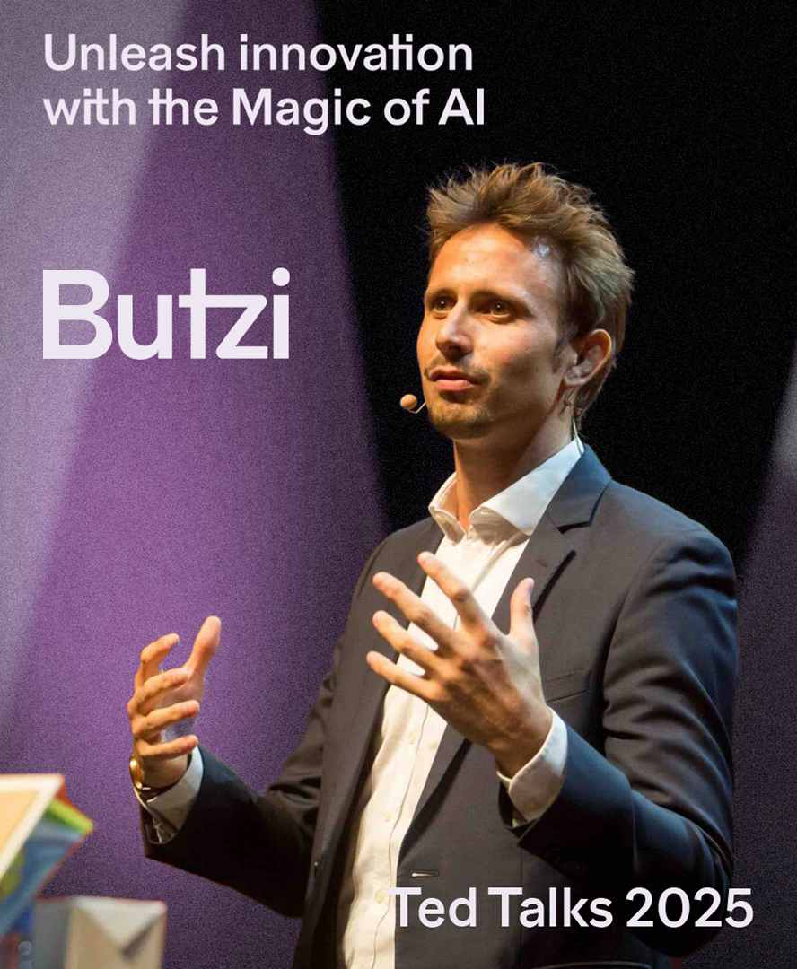
Brand applications are built around simple compositions with a strong presence of moving luminous forms.
The modular imagotype (B) adapts flexibly across different formats, while a dominant use of deep violet reinforces a magical and immersive atmosphere.
The result is a brand that feels closely aligned with the contemporary digital trends explored by Butzi, offering a more refined, elegant, and expressive way to present his conferences and content.
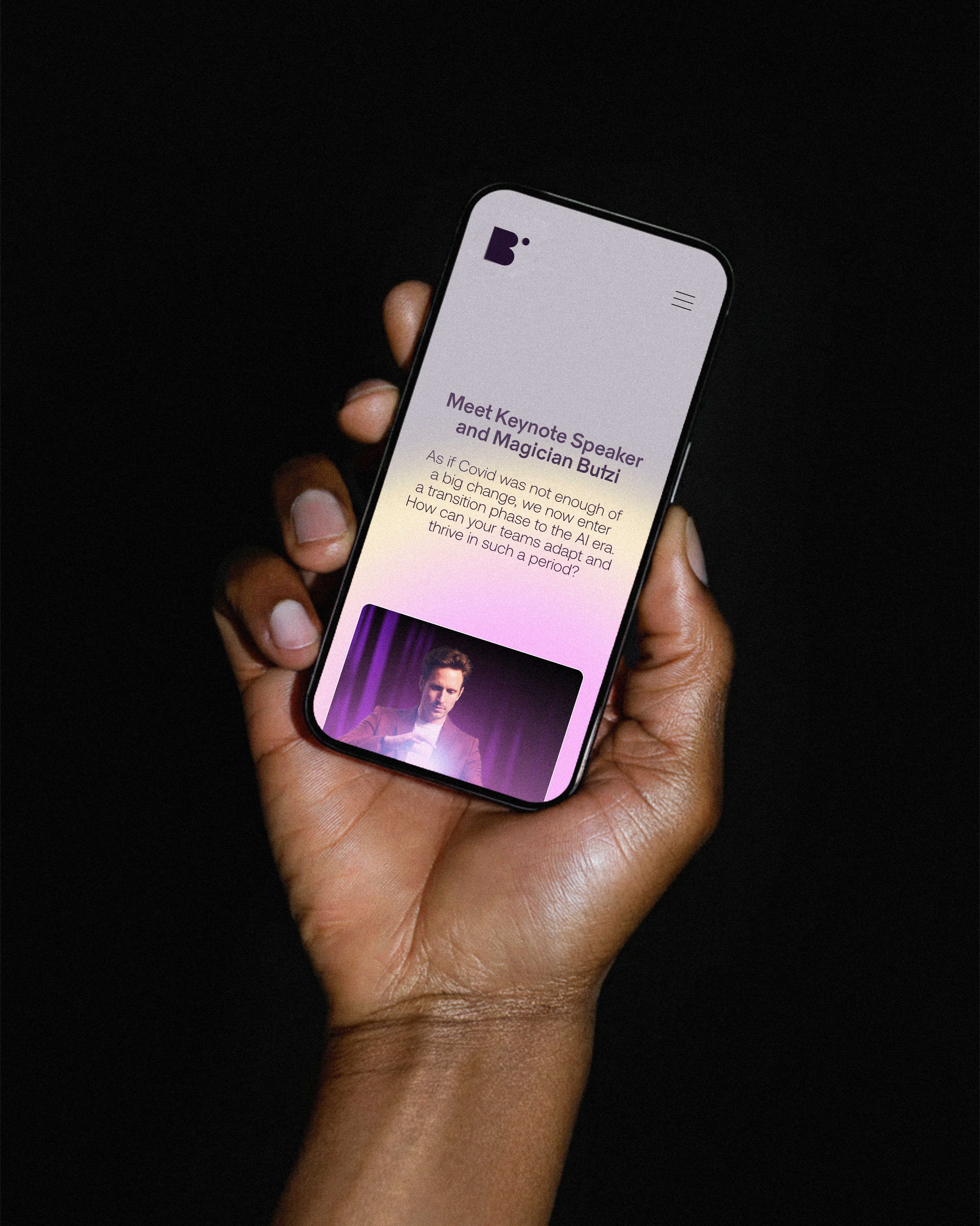

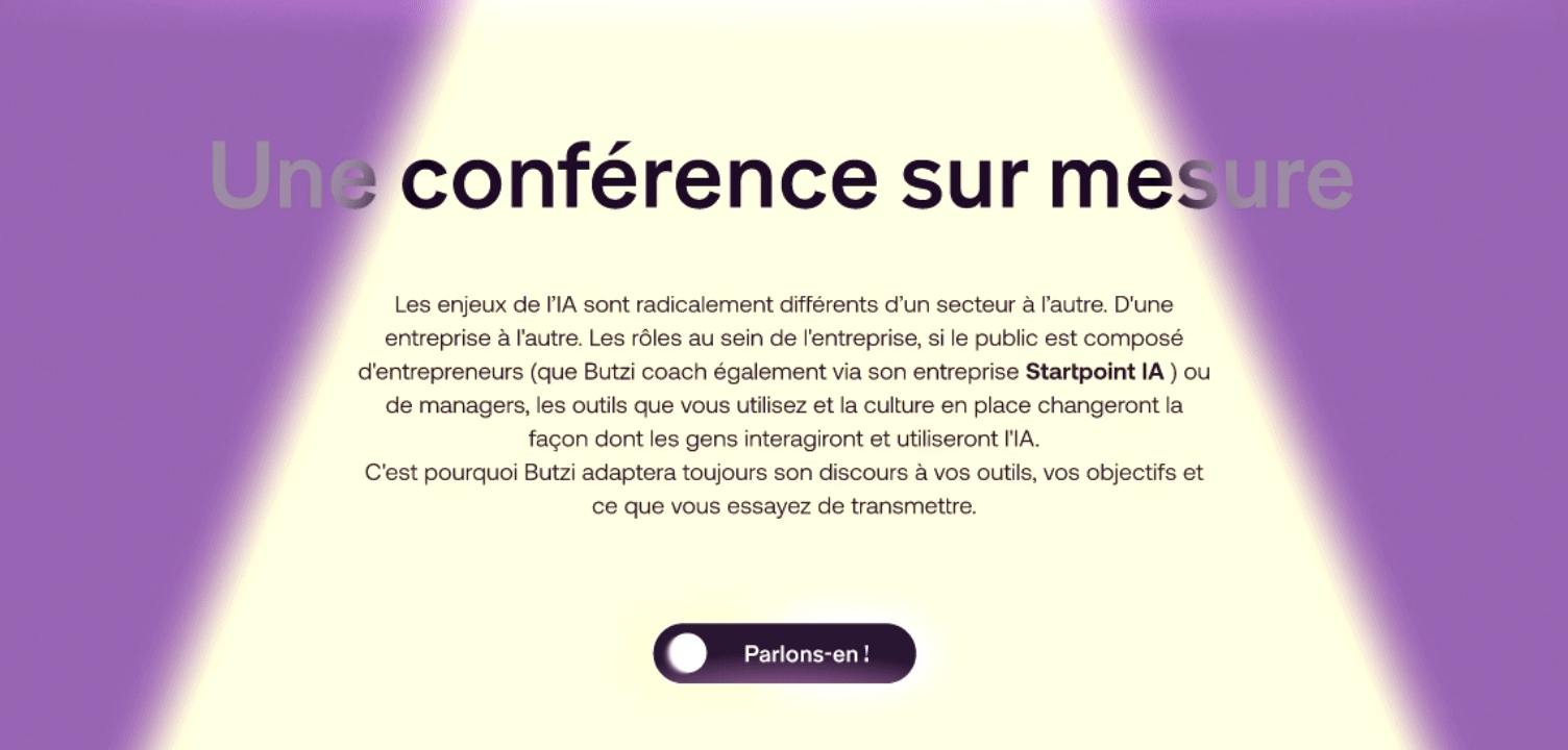
WEB DESIGN
Below, we can see the new Butzi landing page in its rawest state, as it is currently still a work in progress (WIP).